How Harvey Jones' Christine Farrington designed her daughter's kitchen
Thu 7th Oct 2021 by Emma Hedges
How Harvey Jones' Christine Farrington designed her daughter's kitchen
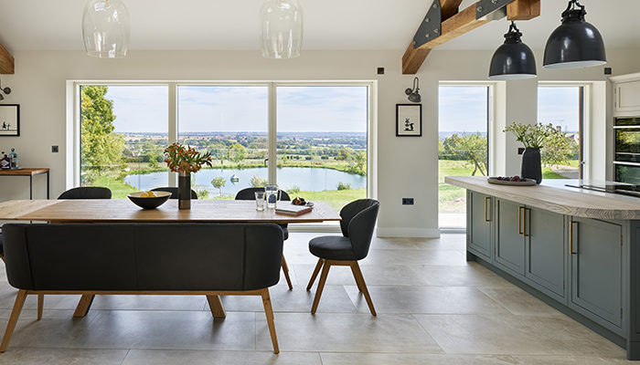
Working on a kitchen in a new-build house with panoramic views of the idyllic Warwickshire countryside sounds like the dream. There was, however, an extra dimension to this project for Harvey Jones showroom administration manager Christine Farrington – the house belongs to her daughter, Sarah. Emma Hedges hears all about it.
You might think that designing a new kitchen for a family member would give you a head start when it comes to understanding their requirements. After all, if you already know them, the shape of their family, their habits, their interests, and their cooking loves and hates, that should bypass the whole initial consultation, right? Well, not exactly. Christine's daughter Sarah has her own design business and Gamekeeper's Lodge was her dream home. "There was a lot of pressure," explains Christine. "Sarah is an interior designer, and has quite firm views of what she wants. We had lots of mother and daughter time on all aspects though, which made it enjoyable."
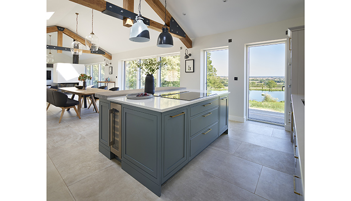
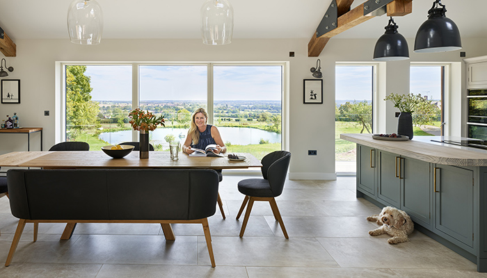
The four-bedroom property enjoys lakeside views, and the kitchen has floor-to-ceiling windows along one side. Naturally enough, one of Sarah's key requirements was to maximise this asset, so Christine positioned the breakfast bar so that it was possible to see down the driveway approach as well as the lake while sitting on the bar stools. She also suggested Harvey Jones' Arbor kitchen.
"Sarah wanted a modern and contemporary look but with the house being built in a six-acre countryside plot, she wanted a classic feel that would endure," says Christine. The clean, simple silhouette of Arbor allows the visual emphasis to be on the stunning surroundings, while also being inherently practical.
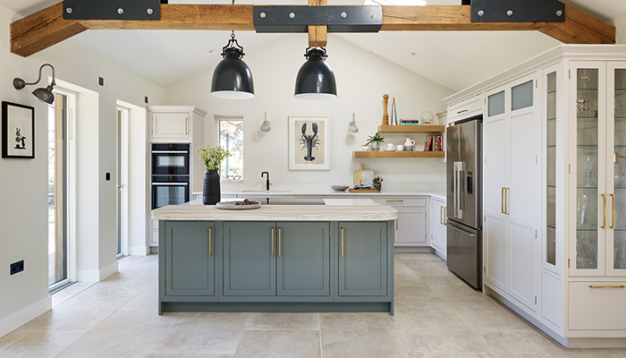
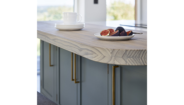
The starting point for the layout of the space was in the room's architectural features. "Sarah's design was centred around the dominant oak and steel architect-designed beam," says Christine. "To define the kitchen area we used a Spekva breakfast bar with curved corners, providing a natural break between kitchen and dining, and positioned it directly under the contemporary oak and steel beam to enhance the break effect."
The decision was taken to install glass display cabinets and use no tall units on the back wall. Instead open shelving softens this wall and allows for artwork to be hung to create more of a living room feel.
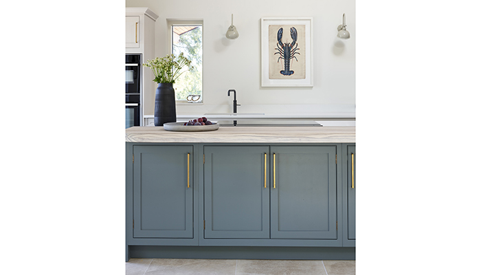
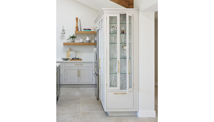
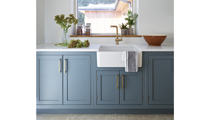
"We decided only one wall could be used for tall units as we didn't want to spoil the effect of the apex wall and oak beam," says Christine. "A concession was made by putting the oven stack on the left of the apex wall but this was balanced with a rectangular window over the sink."
The focal point of the space is the blue-grey island with seating for casual dining at the breakfast bar, and with storage and a designated working corner on the other side between the sink, hob, ovens and double fridge-freezer.
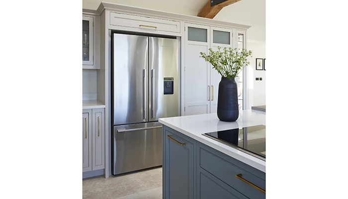
So now the project is finished, how does Sarah feel about the space and are there any particular elements that stand out for her? "The Harvey Jones larder is my daughter’s favourite," says Christine. "She has her Hotel Chocolat Velvetiser and Nespresso coffee machine set up on the Silestone worktop that we continued into there. The doors are filled with nibbles and jars – it really is a cupboard of delights!"
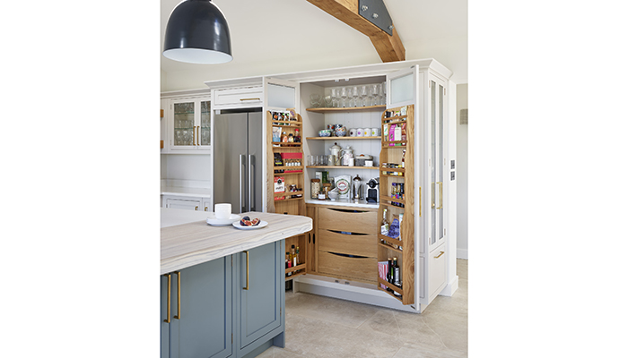
And what does Christine herself think? "For me, the Spekva breakfast bar is tactile and calming. It's a wonderful place to sit and admire the view. Using different wood and worktop softens the kitchen and makes for a good talking point. Installing specially made slim cabinets below provides useful extra storage for salad bowls and kitchen equipment. We worked hard to maximise storage options as Sarah likes to cook!"
Tags: kitchens, features, harvey jones, christine farrington, sarah farrington


