How Kütchenhaus met the high expectations of a former kitchen designer
How Kütchenhaus met the high expectations of a former kitchen designer
Annabel Smith, designer for Kütchenhaus Shrewsbury, reveals how she came up with an open-plan multifunctional space complete with a home office area for her clients – and felt honoured to be trusted with a project for a retired kitchen designer.
Q: Who was this kitchen designed for?
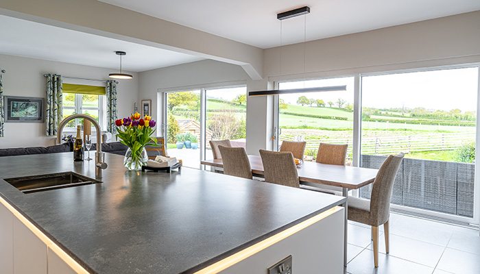
A: Michael and Jan are a retired couple and The Patch is their large modern Dorma bungalow, surrounded by immaculately manicured gardens and benefitting from amazing panoramic views of the Shropshire countryside. They have many hobbies – one of Michael's is painting – and Michael is actually a retired kitchen designer, so it was an absolute privilege to be entrusted with his kitchen project.
Q: Can you tell us a bit about the project?
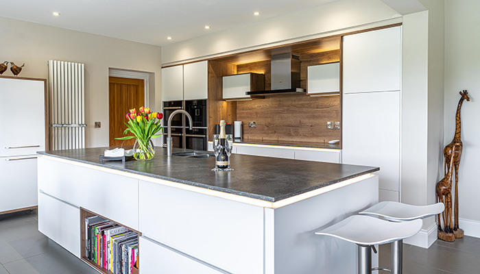
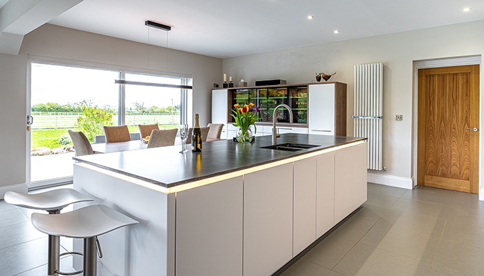
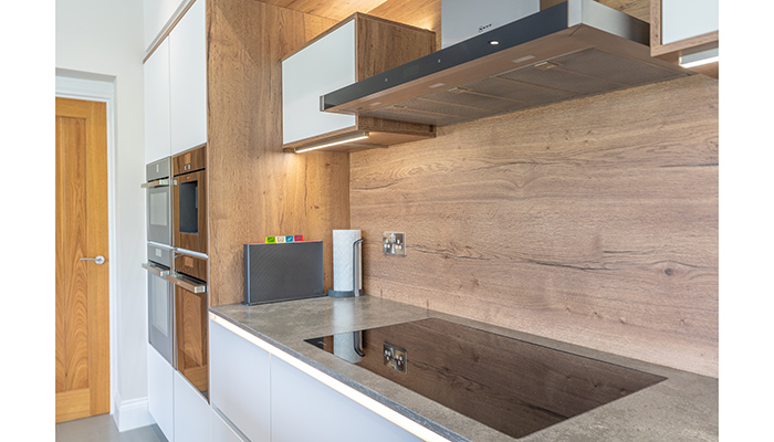
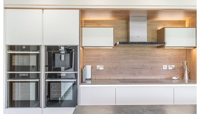
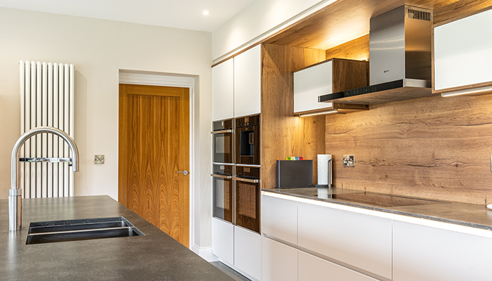
A: The property oozes with personality, so ensuring this special home got the kitchen it deserved took much thought. Believe it or not, the kitchen was originally designed in ‘Nero Oak’, a dark wood door, as the large bi-fold doors flood the room with light. But after much consideration, the bright ‘Fashion’ Alpine white Line-N doors mixed with the rich tones of ‘Havana Oak’ wood just ticked all the boxes within the space, making it very inviting no matter what the weather's doing.
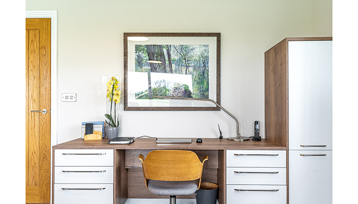
As the kitchen furniture continues into the living, dining, and study areas the subtle two-toned kitchen complemented all areas of the space, due to its simplicity and class. The new desk area allows enough storage to maximise their organisational needs, and the matching sideboard unit looks so impressive with the record player on top, displaying the customers' personality and interests.
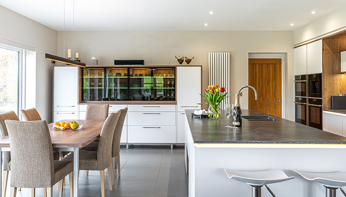
The dining area had the opportunity to house a lot of furniture, and the dramatic dresser unit with matching table works so well. The dresser unit was customised to allow enough space for their dining sets and crockery, along with lit-up display cabinets to show their beautiful crystal glasses and china. By removing the plinth in the non-kitchen area we took the kitchen vibe away from the separate spaces, creating natural zones. The island was positioned to also create a natural divide between the kitchen and dining areas, and the use of drawers on the island completed the handleless style so well.
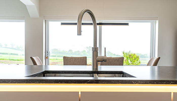
The worktop colour was chosen to bring together the flooring as well as including elements of grey into the design. The concrete-effect work surfaces worked well with the wooden elements to bring a contrast and additional interest into the space. The undermount sink and flush fit hob then showed off the Quartz in its full glory.
Q: What were the particular challenges you faced and what did you do to overcome them?
A: Working with this lovely couple was no challenge, but the design took many weeks to ensure the kitchen measured up to their high expectations. In fact, the Patch’s kitchen went through an extensive journey before the final design was perfected. The couple work extensively in their kitchen and have collected many crystal glasses and cookware over the years, so storage was a big part of the design, and as the room is open plan we wanted the kitchen to have the 'wow' factor more than being just a storage solution. The kitchen furniture was designed to flow into the additional areas of the room such as the living and dining areas, for a fully open-plan living space.
Q: What is your favourite part of the finished project?
A: I absolutely love the dresser unit! The mix of the tinted glass, with the Havana wood is just perfection. We added multiple lighting sources to the dresser so at night it will be a stunning feature. I have to mention the extra added storage too – it holds so many beautiful glasses and crockery.
Q: How about Michael and Jan?
A: The central island has given them a large prep space with plenty of flow around it, and they love how the dining area and kitchen form a co-ordinated design, with the office area integrated into the whole look and feel of the room. Above all they said that the design has delivered everything that was promised, which is high praise indeed!
Tags: kitchens, features, kütchenhaus, kütchenhaus shrewsbury, annabel smith


