How Krantz Designs listened to clients to achieve kitchen perfection
How Krantz Designs listened to clients to achieve kitchen perfection
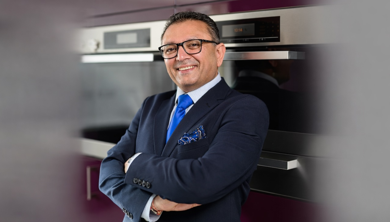
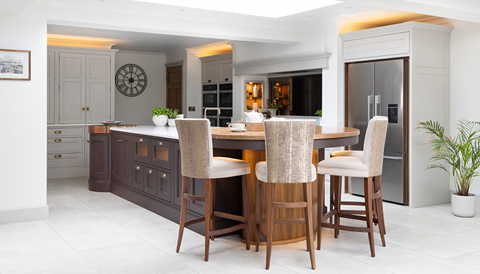
Maria Constantinou, creative director of Krantz Designs, reveals how she talked to clients about the intricacies of their kitchen needs to then transform their dreams to reality.
Q: When starting a new project, what’s the first thing you focus on?
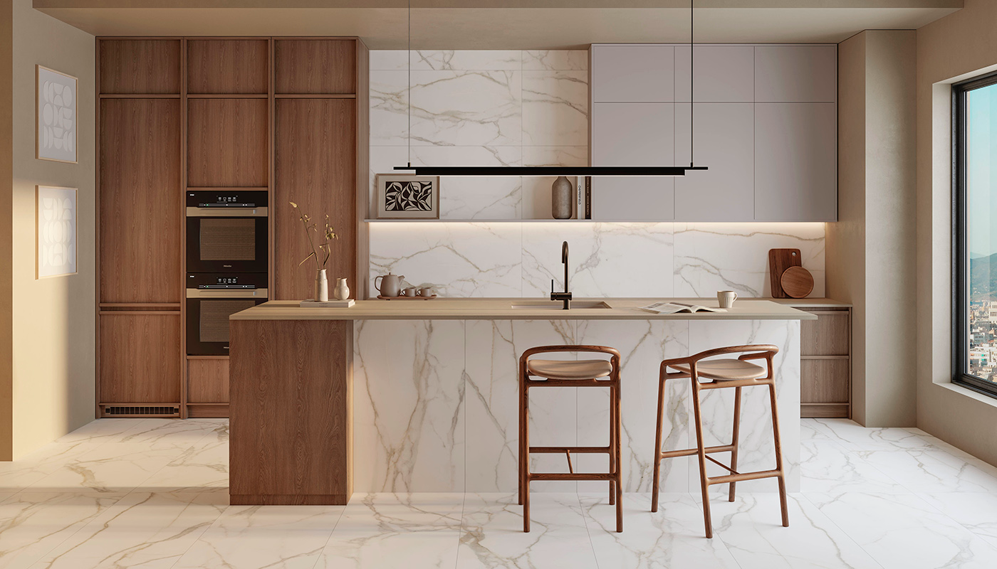
A: My first consideration is always how the space is going to be used. Many designers focus on aesthetics, materials, and colour palettes, but I begin by thinking about how my clients will move through their kitchen, whether they’ll use certain areas for certain activities, and what those activities might be. Once I’ve created the perfect layout, I’ll start on establishing the key aesthetic features.

Q: How closely do you work with your clients?
A: For this project in particular, my close relationship with the clients really helped to take the kitchen from excellent to spectacular. The more I got to know them, the more I could tailor their designs for their particular use. I felt like every time we spoke, I learned something new about their lifestyles or their preferences. This always prompted a follow-up call with me pitching a new idea on how we could make the kitchen even more bespoke to them.
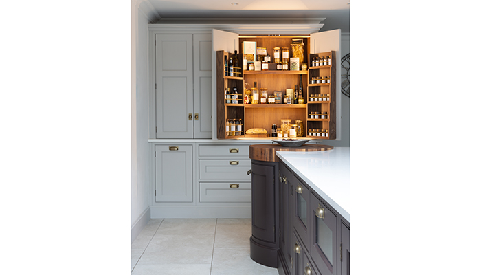
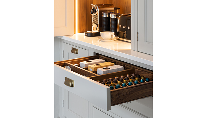
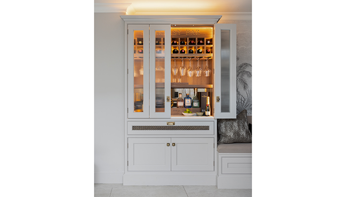
For example, they love visiting speakeasys, and we had been talking about one of the bars they had visited. That brief conversation set the ball rolling for a completely bespoke home ‘speakeasy’, which we cleverly concealed within a tall cabinet.
Q: What was your biggest challenge when creating this design?
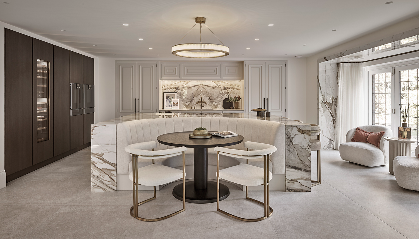
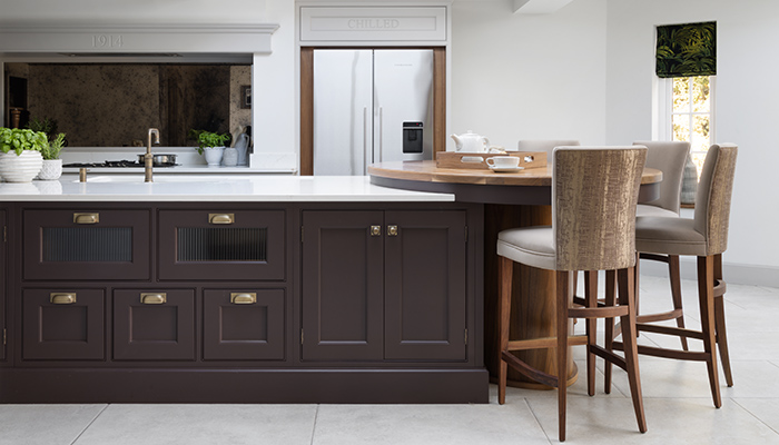
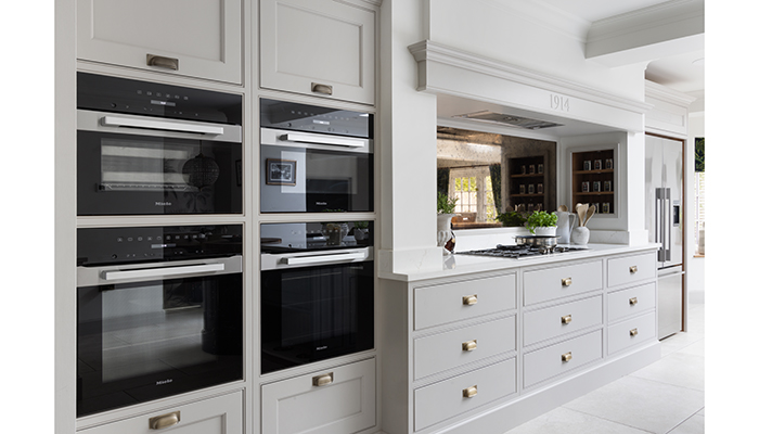
A: Katy and John’s house was full of character, but with extra character comes additional challenges. We had support beams to conceal and pillars to consider. One pillar in particular had the potential to interrupt the flow of movement throughout the space. However, by incorporating the pillars and beams into the designs, we managed to make them features rather than problems. They now contribute to the kitchen’s aesthetics without hindering them.
Q: What is your favourite element of this design?
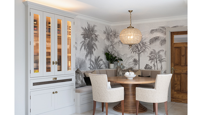
A: I love the stunning mural wall coverings near the banquette seating area. The contrast of the seat colour against the detailed black and white print really stands out and creates an interesting focal point.
Q: How has your approach to design changed since working at Krantz?
A: I used to approach kitchen design from an aesthetic perspective, as I believed we were adding something beautiful to our clients’ homes. However, as the brand has grown and I’ve worked with more clients, I now see that we give people a new lifestyle, rather than just something that’s visually stunning. And this was especially the case for Katy and John with this project.
Q: How has the new kitchen design gone down with Katy and John?
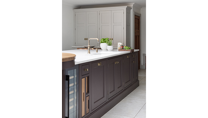
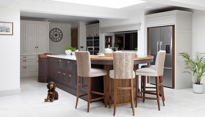
A: They feel that it's not just changed how they use their kitchen but how they use their entire home as they now use the kitchen as a place to relax. They said that as soon as they get home from work they both head straight to the kitchen! But their favourite element is the 'speakeasy' bar as it feels like a real indulgence and is such a hit with guests.
Tags: kitchens, features, krantz designs, maria constantinou


