How Nathan Kingsbury mixed colour and texture to create a unique space
How Nathan Kingsbury mixed colour and texture to create a unique space
When Nathan Kingsbury set about creating a kitchen for a professional couple with a love of vivid colour and artwork he immersed himself in their aesthetic to make sure he hit the brief – we find out how he did it.
Q: What type of property was this kitchen in and who was the project for?
A: The property is a detached Victorian villa in Clapham built in 1896. The owners are a professional couple who work in trading and the energy industry, who live in the home with their twin daughters who are aged 10.
Q: What was the brief from the client for this project?
A: Marsha and Glen describe their style as ‘punch you in the face with colour and pieces that always make you smile’, and love clashing unexpected colours with interesting artworks. The brief for the kitchen was to redo it completely. The only stipulations were a strong use of colour, a metal-effect island, practicality with having a young family and absolutely nothing boring. The rest was left for me to create something special.
Q: How did you go about meeting the brief?
A: The brief allowed me a lot of freedom to get creative and the kitchen was a super-exciting project from the start – we all knew we’d have some fun! The first thing I did was to take a fresh look around the house, taking photos of their artwork and existing furniture, and to begin building up inspiration. I then began pulling together colours and materials that would complement the existing palette.
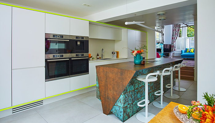
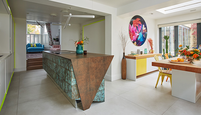
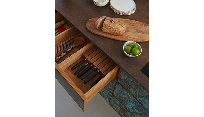
Knowing that the outcome had to make a statement and that the island was central to this, I realised that the main area from which the kitchen would be visible was the living room which is elevated via a couple of steps. From this viewpoint, the end of the island unit was the only part that would be visible, making it crucial that the design for the ends of the island were impactful. I had in mind Iron Corten from Neolith as the work surface, and Verdigris patinated brass to be used in the kitchen which has a beautiful mix of tones, including a vivid teal.
I put together one idea with one set of colours and materials – a complete design with all the materials and colours chosen and considered, and then presented this to Glen and Marsha. They saw the design on a Friday morning, and then called me a day later to tell me they wanted to go ahead.
Q: What type of cabinetry did you choose and what made it the perfect choice?
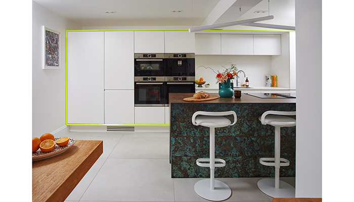
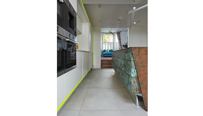
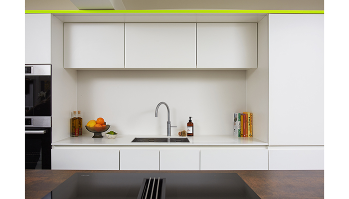
A: We chose sleek, contemporary cabinetry in a minimalist style to sit against the stylised, metallic, geometric island. The concept that I developed, once I had identified the island and fluorescent frame as the two strong, stand-out features, was to create cabinet doors, surfaces and a room colour that would be really minimal in the background, accentuating those colourful and textured centrepieces as much as possible. I selected Loft White (No 222) from Little Greene for the cabinets, which were sprayed in a dead-matt finish. This sat perfectly alongside the super minimal matt-white quartz countertops and splashback around the sink.
Q: What materials did you use? Did you use anything different or unusual?
A: The Verdigris Corten steel-style porcelain and fluorescent paint are the standout materials but I think that the combination of these is what makes it unique.
Q: What were the particular challenges that you faced?
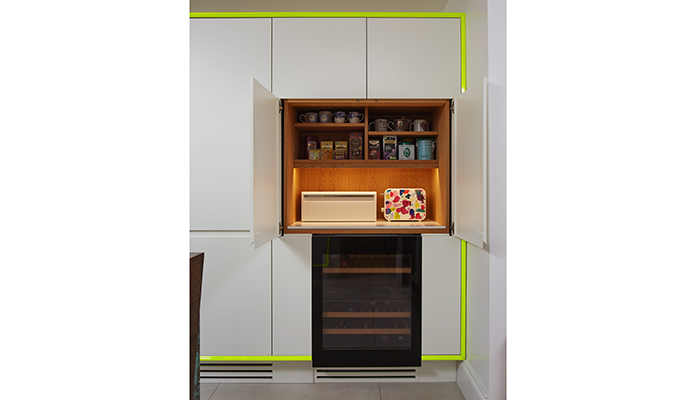
A: One of the biggest challenges with the kitchen design was that their existing kitchen was already in the only logical layout. I knew that I would not want to change this, so the pressure was on to design something that would be completely unrecognisable from the original. In addition, there was a bulkhead running across the ceiling which the existing kitchen had been fitted around, but I wanted to design a scheme that would not be inhibited by the beam. As is often the case, the space had what seems like a hurdle, but unexpectedly a key aspect was born from it with the neon frame.
Q: Are there any design elements that you’re particularly proud of?
A: The island is my favourite part – it’s a true centrepiece and its sculptural form is completely functional too. The cabinets are part of the form and integral to the design, rather than the form covering part of the design with standard cabinets slotted within. I also love the intensity of the Verdigris – it is a live surface that will age uniquely over time. Another favourite element is the prominent neon yellow frame because its concept was a resolution to a challenge enforced by the architecture of the room. It is bold and unexpected, and this is why organic projects are so much fun and so individual.
Q: What is the client's favourite part of the finished project?
A: The couple have different favourite parts. Marsha loves to see the harmony between the kitchen and smaller lounge and finds sitting at the island chatting with friends and family really is the heart of their home. Glen loves the island and has never seen one like it, and he really appreciates that I spent a lot of time making sure the patination on each piece was exact.
Tags: kitchens, features, nathan kingsbury, neolith


Sign up to our newsletter
Most Read