How Sheraton Interiors created a sleek kitchen with concealed elements
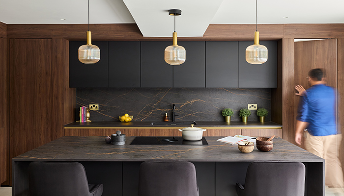
How Sheraton Interiors created a sleek kitchen with concealed elements
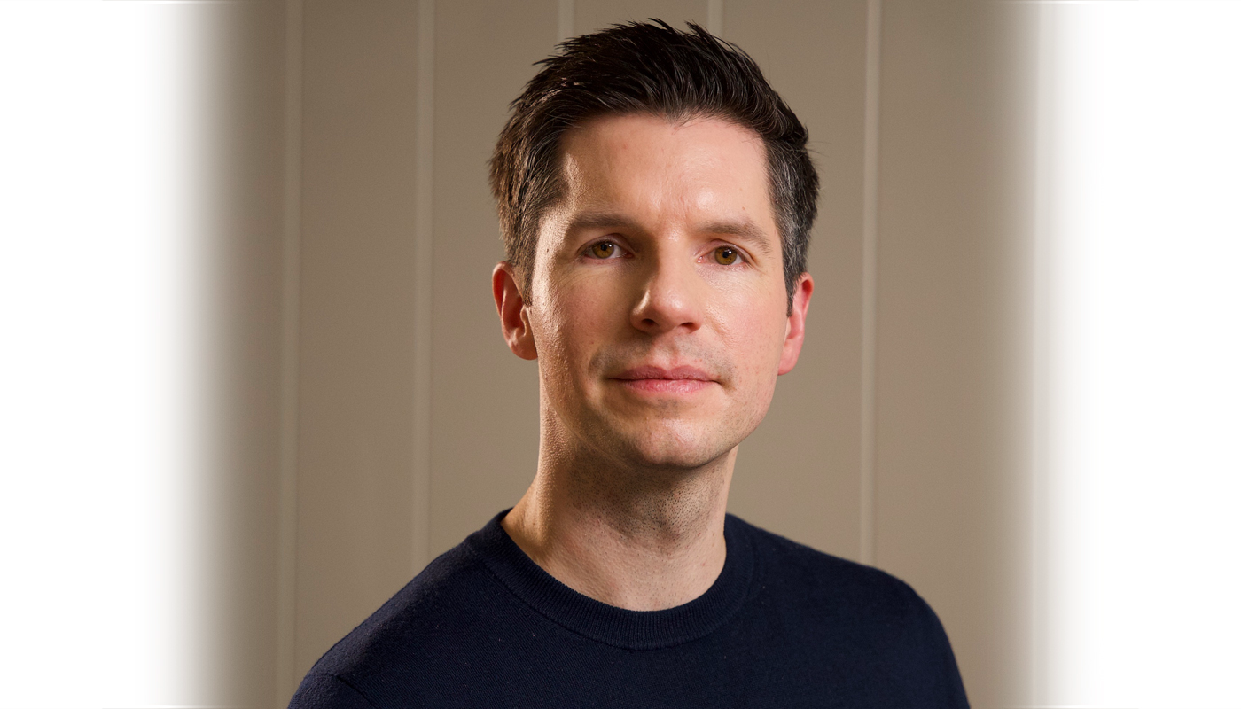
Shehryar Khan of Sheraton Interiors reveals how coming up with ingenious devices to hide the utility and office spaces contributed to a seamless, clutter-free kitchen.
Q: What type of property was it in and who was the project for?
A: The project was for a newly built property commissioned through the architect, Studio Jayga. The clients were a husband and wife, both of whom work in healthcare – one is a surgeon, and the other is a doctor in the NHS. The couple were keen on creating a modern, functional home that matched their professional lifestyle.
Q: What was the brief from the client for this project?
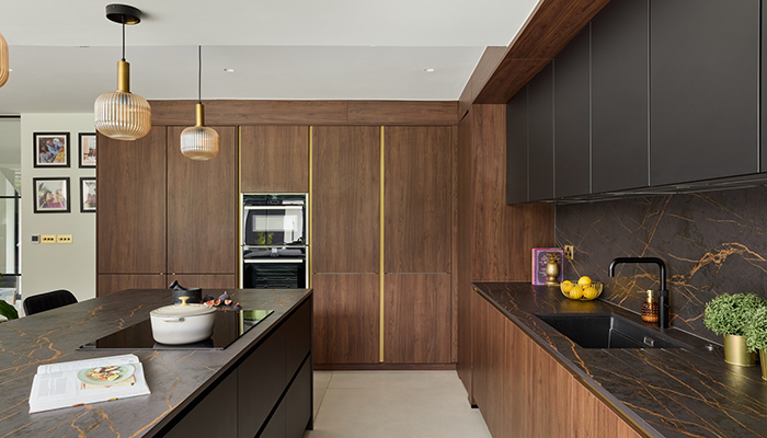
A: The brief was to design a contemporary, open-plan kitchen with specific features that aligned with their needs. The clients wanted an island as a focal point, a breakfast pantry for convenience, and a hidden entrance to the utility room and office. They also emphasised the desire to incorporate wood tones to introduce warmth and texture into the design, making the space both stylish and functional.
Q: How did you go about meeting the brief?
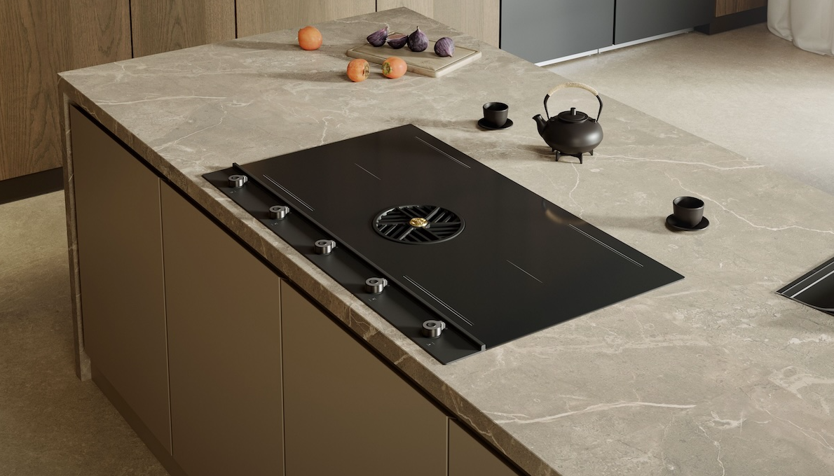
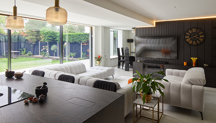
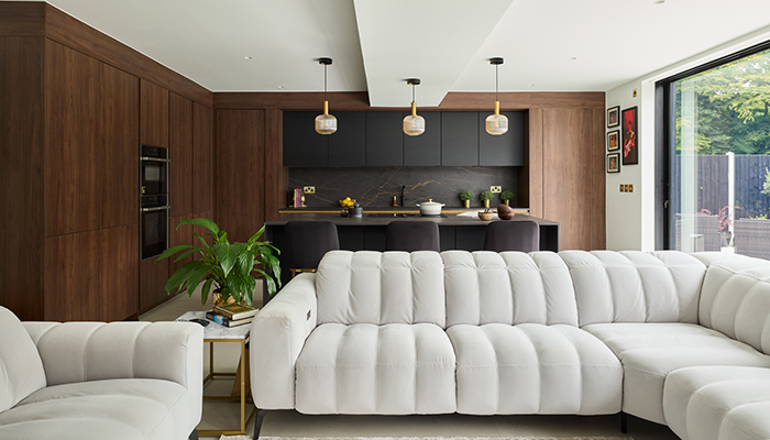
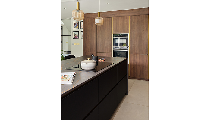
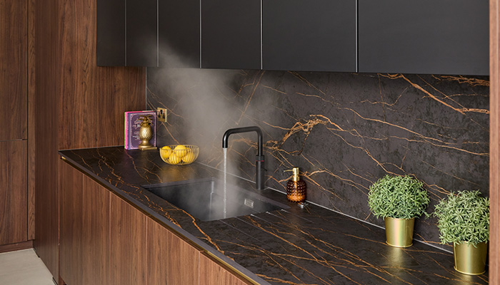
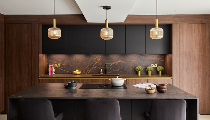
A: We began the design process with a mood board to capture the desired aesthetic, focusing on rich, dark wood tones and dark Dekton Laurent surfaces. Brass accents were used to lift the modern design, and careful planning guaranteed that the layout fulfilled the functional requirements, such as the hidden office entrance and utility space. The result was a luxurious yet practical space that matched the clients' vision.
Q: What type of cabinetry did you choose, and what made it the perfect choice?
A: We chose handleless cabinetry with warm red wood tones, which complemented the worktops perfectly. The clients fell in love with the combination of these materials because it offered a sense of warmth while maintaining a modern, streamlined look. It was also great value for money, offering both aesthetics and functionality at a reasonable price point for them.
Q: What materials did you use? Did you use anything different or unusual?
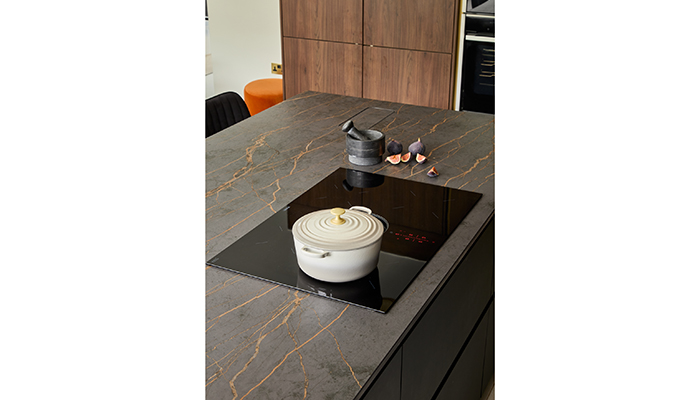
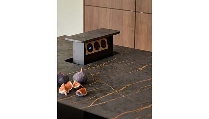
A: We used Dekton Laurent for the worktops due to its remarkable durability, making it an ideal choice for a high-traffic kitchen. This material stood out for its resistance to stains and scratches, while also providing a striking visual effect. The cabinetry’s warm wood tones contrasted beautifully with the surfaces, giving the space a unique character.
Q: What were the particular challenges that you faced?
A: One of the main challenges was sourcing custom pivot doors, as our usual supplier didn’t offer them. To solve this, we sourced a suitable pivot mechanism elsewhere and integrated it into the furniture range. This maintained the clean, hidden look that the clients desired, without compromising on quality or aesthetics.
Q: Are there any design elements that you’re particularly proud of?
A: My favourite part of the project are the hidden entrances to the utility room and office. It not only functions really well but also adds an element of surprise and sophistication to the overall layout. It's a practical yet very well-thought-out design.
Q: What is the client's favourite part of the finished project?
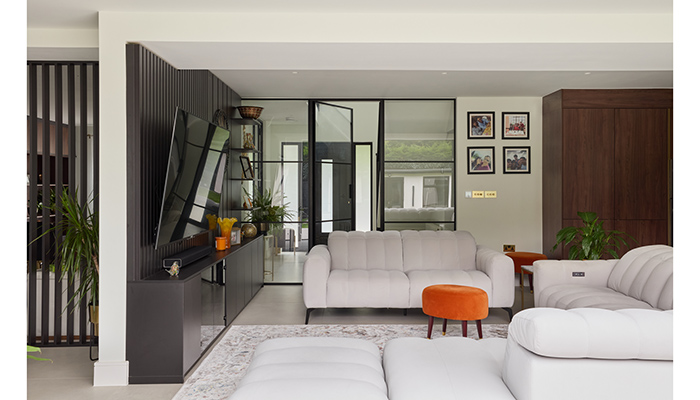
A: The clients were particularly pleased with the seamless transition from the kitchen to the utility room through the hidden door. They appreciated how this design feature allowed for an uninterrupted flow within the space, blending functionality with aesthetics in a way that suited their busy lifestyles.
Tags: kitchens, features, sheraton interiors, contemporary, shehryar khan


