How Krantz Designs devised a bold space full of glamorous touches
How Krantz Designs devised a bold space full of glamorous touches
Jessica Sroga, design manager at Krantz Designs, reveals how working with a light-filled space enabled her to opt for black cabinetry balanced with gleaming bronze accents.
Q: What type of property was it in and who was the project for?
A: The property was an original Georgian-style stone-built rectory. It was undergoing a conversion of the original outbuildings to become the new main kitchen and entertaining space – the client is a mother of 2 who loves having people over and entertains a lot.
Q: What was the brief from the client for this project?
A: The client's vision was to create a multifunctional space for family life and hosting. She wanted it to be a statement design with a 'wow' factor, that was timeless but also exuded a touch of glamour.
Q: How did you go about meeting the brief?
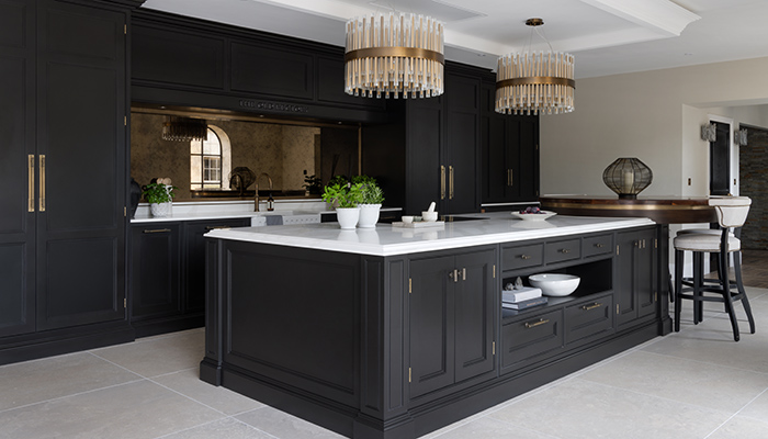
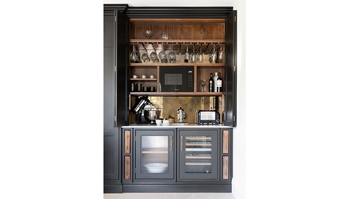
A: It was important to create different zones for my client – the main cook’s space has a back-to-back hob and sink area in the centre, with a food pantry and fridge-freezer on either side. There is a dedicated breakfast station on the right-hand side, which doubles up as a bar for evening use, situated right beside the feature breakfast bar.
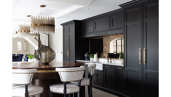
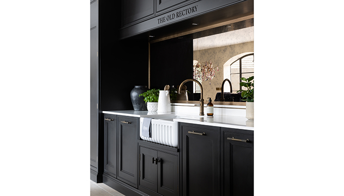
Having a large open-space with so much natural light meant that we could go really bold with the cabinetry colour so we chose Farrow & Ball's Pitch Black. You don’t see many black kitchens, so this really makes a statement.
Q: What type of cabinetry did you choose and what made it the perfect choice?
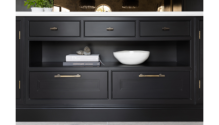
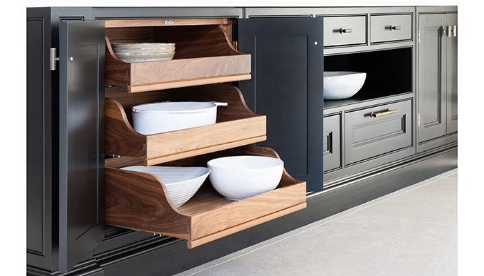
A: This design features our double-step Shaker moulded door, which offers a contemporary take on the traditional Shaker kitchen.
Q: What materials did you use?
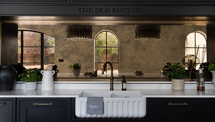
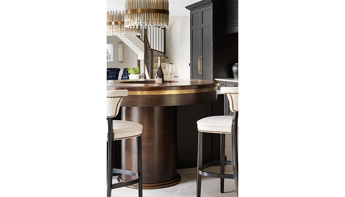
A: Antique brass was the running theme of the design, from the feature handles by Armac Martin, to the metalwork wrapping the walnut breakfast bar and framing the splashback. The splashback itself is a bronze antique mirror too, creating a really standout piece.
Q: What were the particular challenges that you faced?
A: Designing the extraction into the ceiling in a way that still looked seamless – I worked with the builder on a bespoke bulkhead design to incorporate the hood, and integrate a decorative coving detail to match the cabinetry cornicing. It also created a foundation to hang the 2 feature chandeliers.
Q: Are there any design elements that you’re particularly proud of?
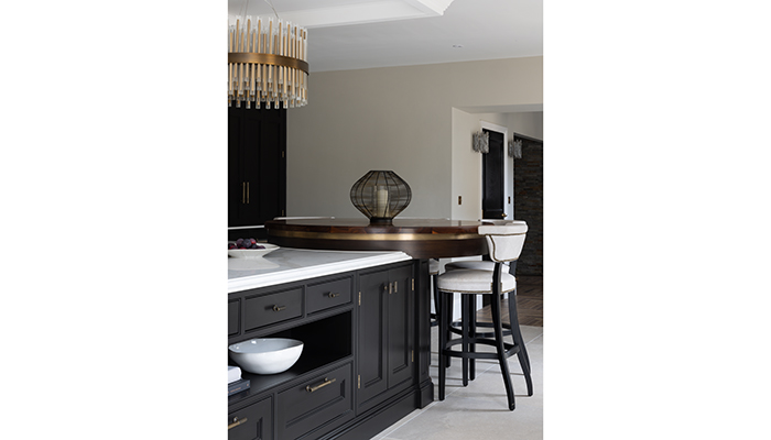
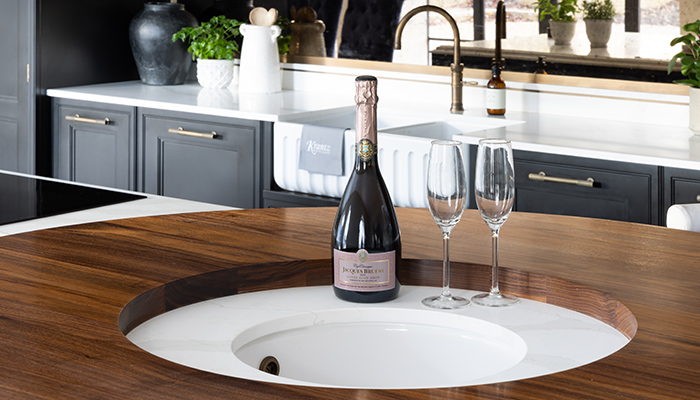
A: The raised breakfast station bar – I think every kitchen needs one of those! The round breakfast bar with built in champagne sink has become a bit of a Krantz signature piece, but for this one we constructed it all out of timber – American walnut with a dark stain – and even rebated antique brass metalwork into the pelmet.
Q: What is the client's favourite part of the finished project?
A: She loves the functionality – whether it’s making breakfast for the family, or hosting a dinner party the space works well for every occasion. And the design style is exactly what she wanted to achieve – bold impact with a little luxury.
Tags: kitchens, features, krantz design, jessica sroga, bold kitchens, black kitchens


