Why pale kitchens are appealing to homeowners after a 'new neutral'
Tue 3rd Jun 2025 by Sally Smith
Why pale kitchens are appealing to homeowners after a 'new neutral'

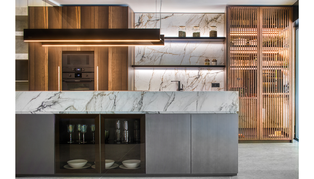
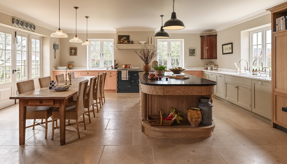
White kitchens are back in vogue with consumers wanting to create elegant, calming spaces designed with longevity in mind – Sally Smith talks to the experts.
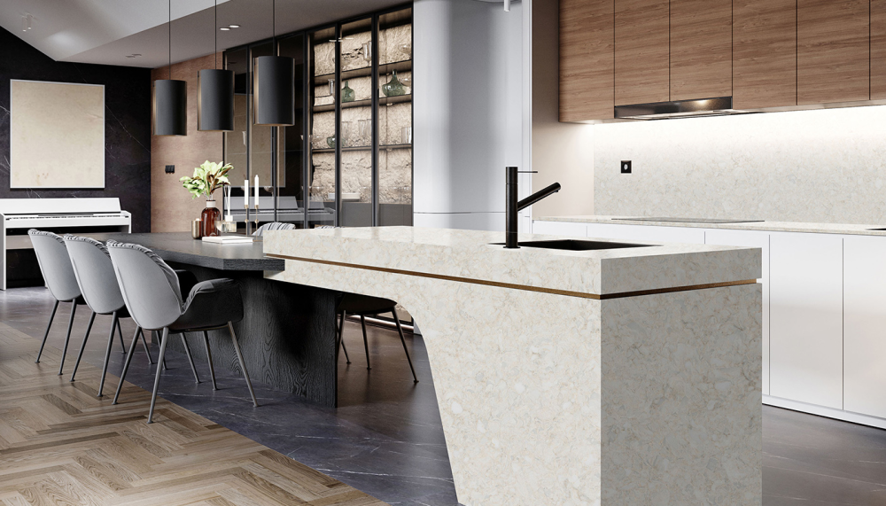
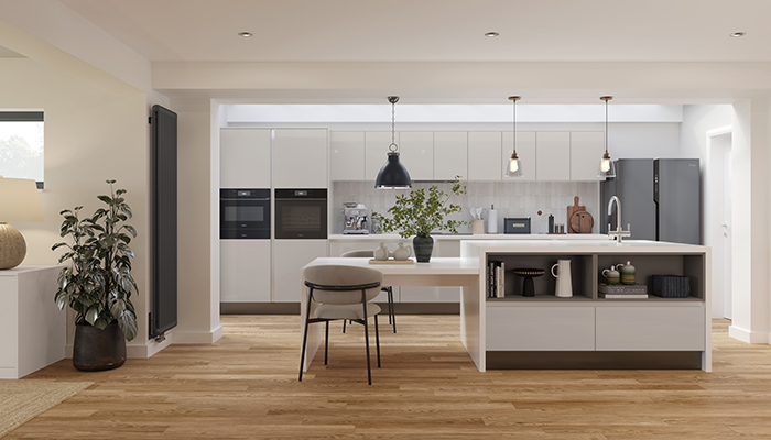
The latest pale, off-white kitchens on the market offer much warmer tones and complex palettes opening up a wealth of options for kitchen designers to offer customers a contemporary take on the white kitchen.
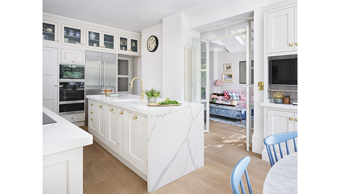
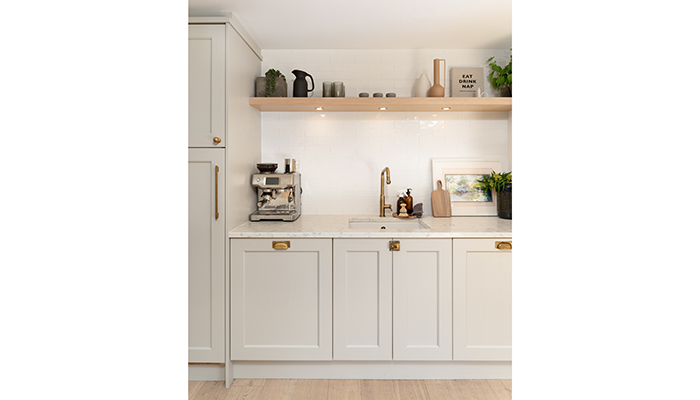
"The beauty of kitchen furniture painted in off-white is that it allows the interior scheme to shine. Its recessive, neutral palette allows designers free rein with fabrics and furnishings. Within the kitchen itself a mix of glamorous and natural materials, such as satin brass handles and taps, dramatically veined quartz worktops, natural timber floors and ribbed glass, elevate the design," says Richard Moore, creative director at Martin Moore.
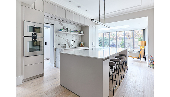
Graeme Smith, head of retail & commercial design at PWS, has seen how a paler off-white kitchen can appeal to a wider range of customers. "A white kitchen creates a perfect backdrop for colour and trend-driven styles to be added and layered in when required without driving the full scheme - flexing between both contemporary and traditional styles, even rustic and heritage designs," he says.
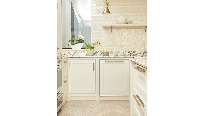
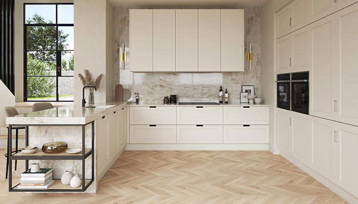
Warm whites tend to feel cosier and more inviting, while cool white suits a more contemporary design, but both have a timeless look. "White comes in an abundance of shades, with both warm and cool undertones," says Al Bruce, founder of Olive & Bar. "In recent years, there has been a noticeable shift from grey to warm white as homeowners look for a fresh take on a ‘new neutral'. A warm white kitchen offers creative freedom for designers to experiment with intricate worktops, accent colours and various hardware finishes, resulting in beautifully layered and considered design."
Homeowners are definitely looking to invest in their kitchens but with sustainability and longevity in mind. "This move toward understated elegance reflects a broader desire for something that looks good now and will still feel relevant years down the line. And unlike the stark whites of previous years, off-whites now create a more grounded and inviting atmosphere, which aligns with how people are using their kitchens today," says Charles Elwell, design director for Kitchens by Holloways.

Sophie Devonald, designer at Crown Imperial, agrees. "An off-white kitchen scheme suits smaller spaces particularly well, helping to create a brighter, more open feel. Consider introducing contrasting elements, such as handleless profiles, statement appliances, or distinctive storage features as focal points, whilst allowing the cabinetry to stand out to achieve a harmonious design.”
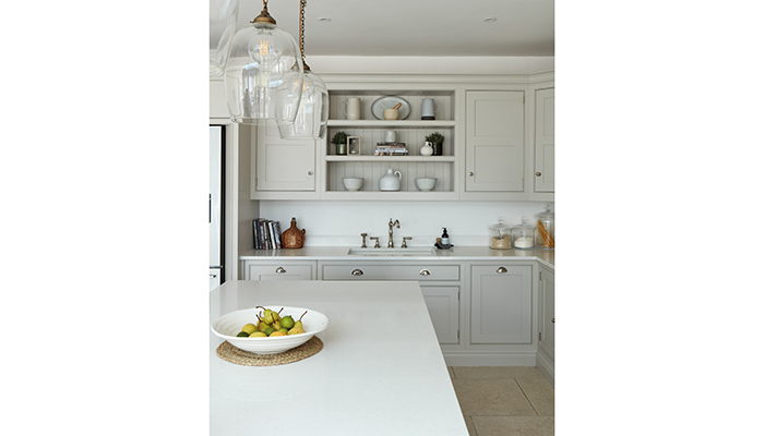
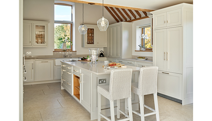
"Off-whites can be incredibly versatile, but without contrast and variation, the space risks feeling flat," explains Tom Howley, creative design director. "Mixing matte and gloss finishes, incorporating natural materials like wood or stone, and using strategic lighting ensures the kitchen feels warm, spacious, and full of character – rather than cold or clinical," he adds.
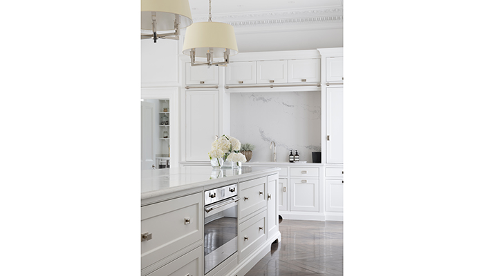
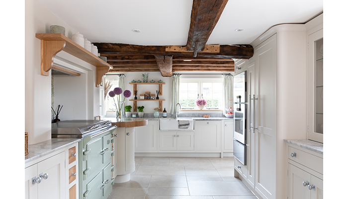
The appeal of more colourful kitchen designs can be short lived and on the whole people want to retreat to a calm oasis. Louisa Eggleston, creative director at Humphrey Munson, says: "The trick with a pale, off-white colour scheme is balance – you need some yin to the yang so that it’s complementary but there is an opposing tone or colour. A dark, rich wooden floor can work wonders for grounding a room and ensuring it doesn’t just blur into a mass of white."
"Warm neutrals work beautifully across both modern handleless and classic Shaker designs, making them perfect for achieving a soft contemporary look that suits a wide variety of homes. These schemes age incredibly well, making them a smart long-term investment for customers and an easy-to-sell option for designers and retailers," says Cassie Jones, brand manager at Masterclass Kitchens.
In addition, pale off-white kitchens work well with more traditional properties offering an opportunity to update a space without overwhelming the original features.
Tags: kitchens, features, pale kitchens, off-white kitchens, martin moore, pws, second nature, humphrey munson, crown imperial, olive & barr, masterclass kitchens, searle & taylor, simon taylor furniture, tom howley