How Simply Bathrooms turned a tiny space into a luxe design
How Simply Bathrooms turned a tiny space into a luxe design
In six weeks, Simply Bathrooms director Neil Harrold and his team managed to work around space constraints to create a sophisticated bathroom scheme – and one that incorporated all the eye-catching statement products you'd expect to see in a far larger room.
Q: What was the brief from your client?
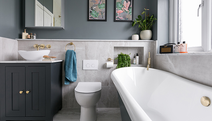
A: Our customer wanted change their old-fashioned shower over a bath bathroom and transform it with a larger more comfortable bath and walk-in shower. Throughout our design consultations the customer wanted a design that was a mix of both classic and modern design. We completely reworked the bathroom layout and combined traditional product shapes like the boat bath and the floorstanding vanity unit with contemporary colours to strike the perfect balance.
Q: What materials did you use? Did you use anything different or unusual?
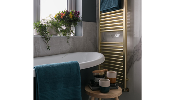
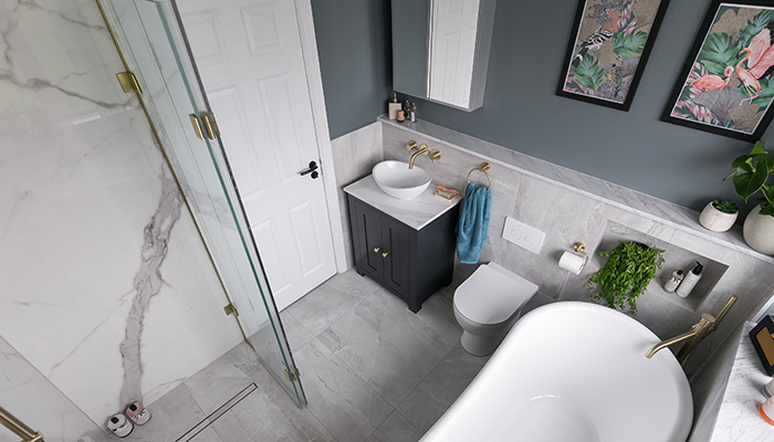
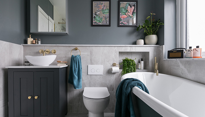
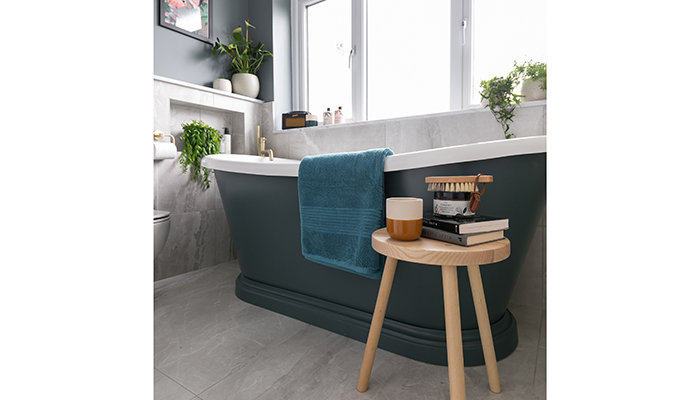
A: We used super practical but very beautiful, porcelain marble tiles from Ca' Pietra on the floors and walls. The book-matched Carrara marble makes a real statement in the shower area. We then used a softer grey marble effect on all other surrounding tiled areas. Colour-wise the room has a lot of natural light so we opted for contemporary darker, tonal accent colours to add depth and prevent the marble from looking too traditional – using Farrow & Ball paints De Nimes on the walls, Inchyra Blue on the freestanding BC Designs bath and Railings on the cabinet.
Q: How did you go about meeting the brief?
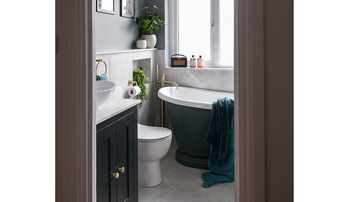
A: Our customer was desperate to have a contemporary walk-in shower area and a full-sized freestanding bath. However, she had struggled to find a solution for the layout in such a small room. We suggested moving the position of the door to better utilise the space along the sides of the room allowing us to position a bespoke slimline vanity and walk-in shower to either side of the door, creating space for the large feature Boat Bath underneath the window.
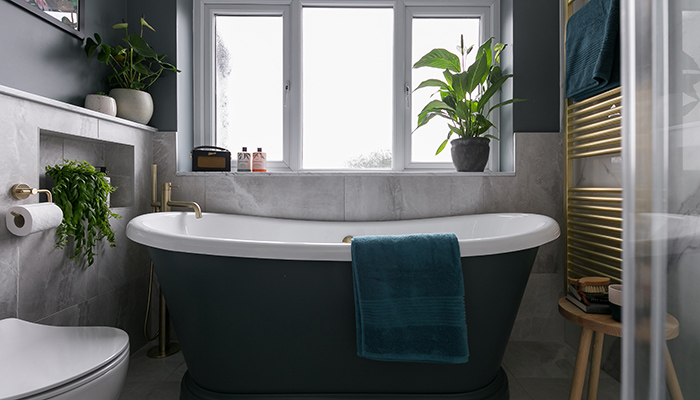
We also installed a fully tiled wetroom with a flexible bi-fold screen, as opposed to a conventional shower tray and bulky enclosure. This afforded us the space for a freestanding bath as well.
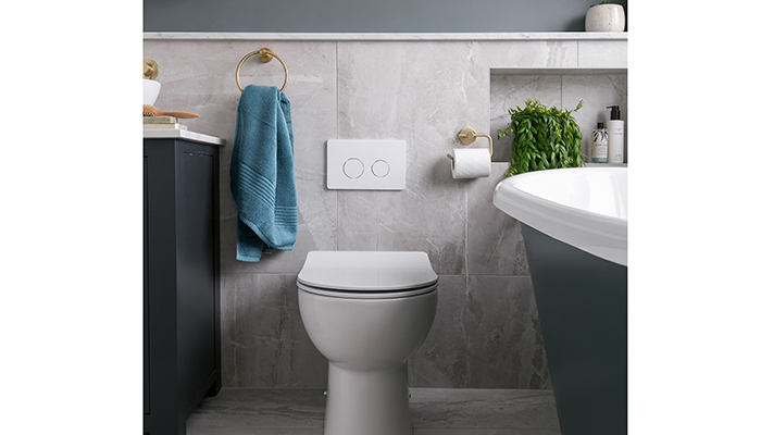
When we redesigned the layout we added in slimline boxing down the left-hand side of the room to conceal pipework, allowing for an ultra-slim WC cistern and contemporary wall hung sanitaryware. This clever boxing also allowed for some finer design details to be added in, like the bottle storage within alongside the bath, as well as creating perfect recessed shelving around the vanity area.
Q: Tell us about some of the products that make up the design.
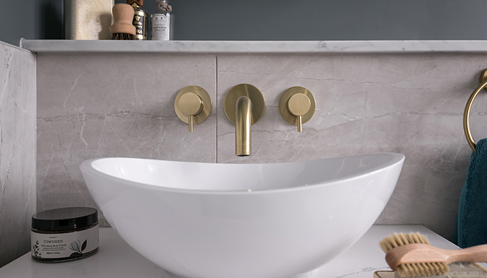
A: As well as the bespoke Simply Bathrooms vanity unit, there is a Lusso Stone basin with Just Taps Plus Brushed Brass VOS brassware, a Qubic mirrored cabinet from HiB, a linear dec wetroom tray from Impey, and a bespoke wetroom bi-fold screen from The Shower Lab. The W1760 Boat Bath from BC Designs is painted in Inchyra Blue – if a client is keen to purchase a show-stopping freestanding bath then we always try and plan this under a window to allow it to take centre stage.
Q: What is your favourite design feature and why?
A: The shower… We designed a bespoke, clever, space-saving bi-fold shower screen, which folds back when out of use. We coupled this with stunning book-matched marble to create a shower with real wow-factor. We always recommend considering the benefit of a tiled wetroom over a shower enclosure and tray, as they tend to be more space saving. We also love how the new layout allows the beautiful blue Boat Bath to take centre stage, and the unique colour scheme of this bathroom. We deliberately selected colours that were not perfectly matched but worked together tonally, for a more stylish look – the characterful design was further enhanced by the artwork which was commissioned to add the perfect touch to the room, tying in the darker colours and adding tropical feels into the space.
Tags: bathrooms, features, simply bathrooms, bc designs, lusso stone, just taps plus, hib, impey, the shower lab, neil harrold


