Millie Cupit of Krantz Designs reveals the reasons behind her design choices for a project that drew on modern and traditional influences to create an elevated style.
Q: When starting a new project, what’s the first thing you focus on?
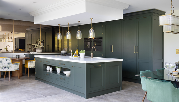
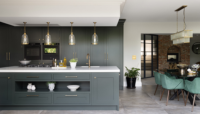
A: My first consideration is the client’s individual circumstances. A lot of designers begin by assessing the space available and thinking about how they could make the most of it. That’s an important step, but 'making the most' of a space means different things to different people. I look at the client first. Do they have a family? Do they like to entertain? What types of dishes do they enjoy cooking? The next step is to establish the core aesthetic. I always start by selecting a door style, and the rest of the design is built up from there. For this project, the door style we selected was plain Shaker and this influenced other choices I made with regards to lighting, flooring, and detailing.
Q: Do you prefer traditional or contemporary designs?
A: My preferred design style is called 'modern classicism', which is all about striking the balance between old and new. Modern classicism combines classical architectural elements with modern design principles. This means you get the elegance, symmetry, and ornate details of traditional, classic designs, but you also retain the clean lines, functional layout, and technical innovation of a more modern kitchen. The best of both worlds!
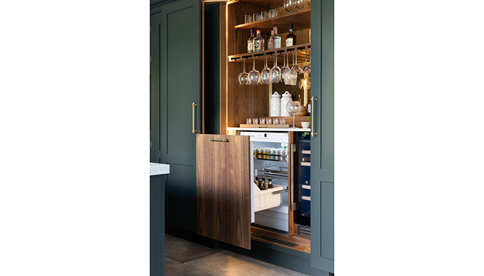
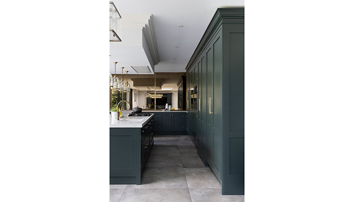
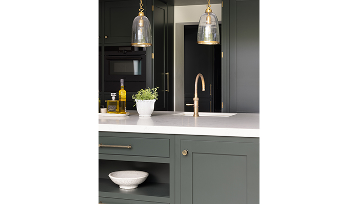
This project was a perfect example of this. The aesthetic was traditional, with a large, antique mirror forming a focal point of the design. However, behind the traditional facade, smooth cornices, and classic gold fixtures, bespoke wing doors concealed a fully stocked bar with built-in accent lighting and several other bespoke innovations.
Q: How do you stay up to date with the latest design trends?
A: I lean towards traditional aesthetics, but exploring designs outside of my area of expertise and staying on top of the latest innovations is vital to ensure my designs are constantly improving. I follow a lot of designers on Instagram, and I end up down rabbit holes looking up new ideas online. I take a lot of inspiration from the Krantz team, as we all share designs we like with each other.
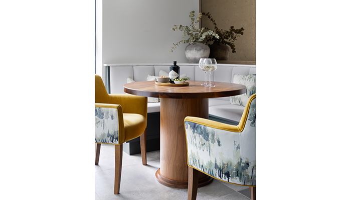
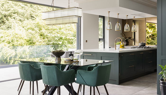
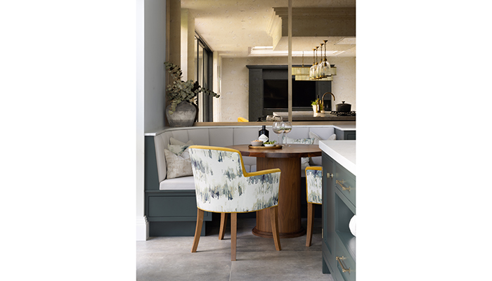
Online research is great, but I also like to take it back to basics – I often head down to Chelsea Harbour to see samples up close and look at designs that I might not actively search for. This was how we selected the seat coverings for this project. I stumbled upon the perfect material while browsing, and I immediately sent samples to the client. They loved the fabric as much as I did, and we created a gorgeous banquette seating area with it. It’s also important to remember that researching trends isn’t helpful in the long run. Trends and fads are constantly changing. What’s more important is researching what sticks around.
Q: How closely do you work with your clients?
A: A bespoke kitchen will never be truly bespoke unless the designer fully understands the needs and preferences of their client. I’m fortunate to have worked closely with many wonderful clients who I now consider very good friends. These friendships lay the real foundations for an excellent kitchen design. Forging close relationships allows me to come up with designs that are better suited to each individual client, but it also allows clients to feel comfortable coming to me with any ideas they might have. A lot of key features stem from friendly chats over coffee that spark opportunities for creativity.
Q: What was your biggest challenge when creating this design?
A: The antique mirror is one of my favourite features, but getting the spacing perfect was a difficult task. Brass dividers needed to look neat and seamless, so we opted for double mitre fittings. The measurements needed to be meticulous, but the hard work paid off and the mirror looks incredible in situ.
Q: What is your favourite element of this design?
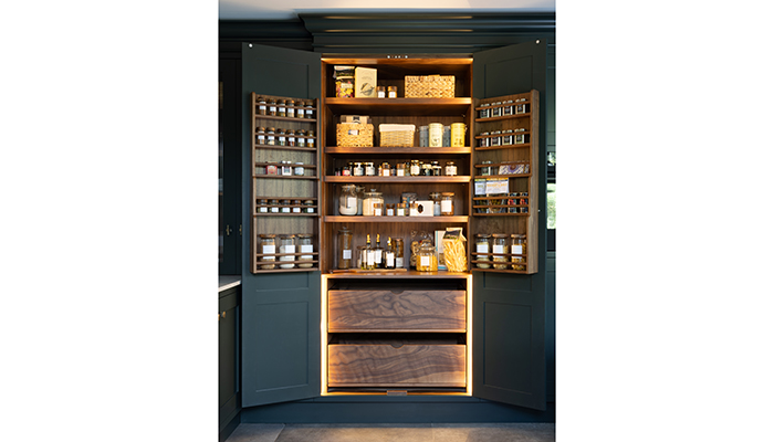
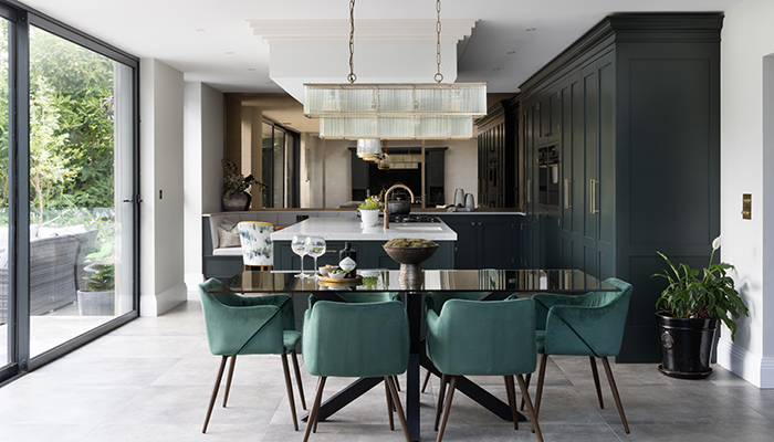
A: I love the secret doorway – one of the cupboards holds a concealed door into the pantry. Magnets were integrated into the doors to ensure that they would remain open when pushed into place. When closed, the doors look like just another cabinet!
Q: How has your approach to design changed since you began working for Krantz?
A: My project management skills have come on leaps and bounds since I started working at Krantz. With every project, I’m becoming more bold and ambitious with my designs. There’s a real culture of excellence that pushes me to constantly strive to improve.
