Sophie Temple of Rugby-based kitchen, bathroom and bedroom specialist Eat Soak Sleep reveals how she and the team went about creating a soothing retreat complete with bold Ca' Pietra tiles to add colour and individuality.
Q: What type of property was it in and who was the project for?
A: The property is a stunning Georgian townhouse, characterised by its elegant architecture and classic features. The project was tailored for a client who has a deep passion for interior design and a keen eye for aesthetics. Balancing a busy lifestyle, she wanted to transform her master suite into a space that not only reflected her personal style but also offered functionality and comfort. The design focused on creating a harmonious blend of modern elements with the property's historical charm.
Q: What was the brief from the client for this project?
A: The brief included the design of walk-in wardrobes and an en suite bathroom. With full creative freedom over the entire space, she wanted to maximise the large bedroom, and brought in vibrant fabric samples featuring oranges and reds for curtains, and wanted to nod to this beautiful fabric. The goal was to create a fun yet sophisticated atmosphere that also offers a relaxing retreat for her to unwind in after a hectic day. Key requirements included ample storage, a spacious shower, a freestanding bath, and beautiful tiles that would enhance the aesthetic while maintaining functionality.
Q: How did you go about meeting the brief?
A: Our first step was to assess the entire room layout, which involved moving existing walls and repositioning plumbing and electrical fixtures to create a more functional flow. We increased the size by reallocating some space from the original built-in wardrobes, and the new rectangular layout comfortably accommodated a large shower, freestanding bath, and vanity unit.
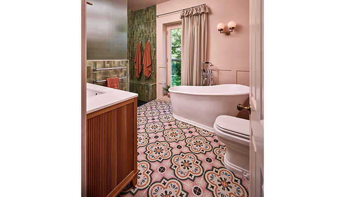
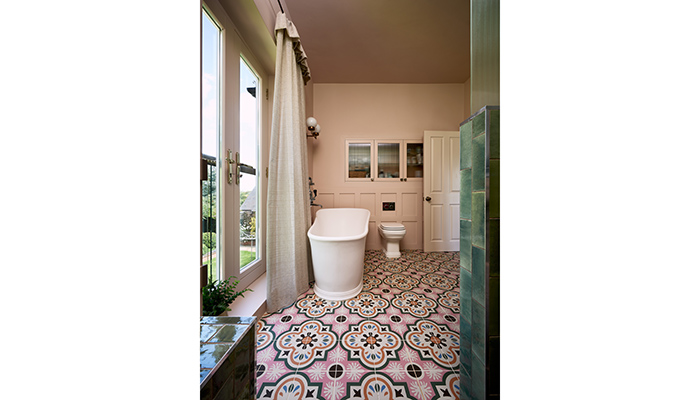
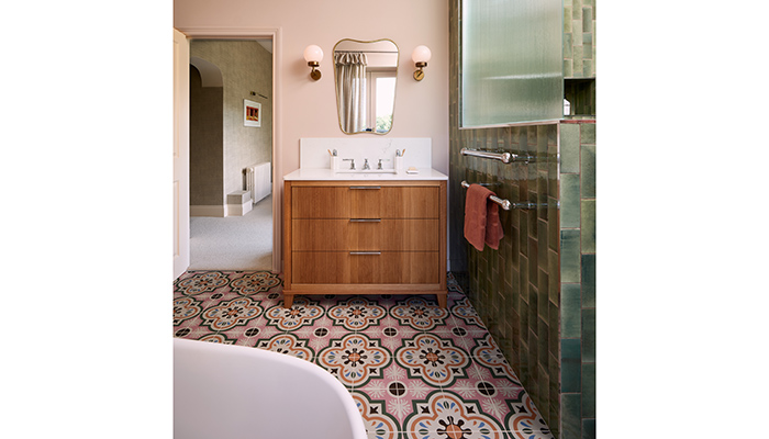
The client expressed a desire for playful tiles, so we began our tile search with the green brick tiles she had admired in our showroom. We strategically placed the freestanding bath near the Juliet doors to take advantage of the lovely views, creating a serene bathing experience.
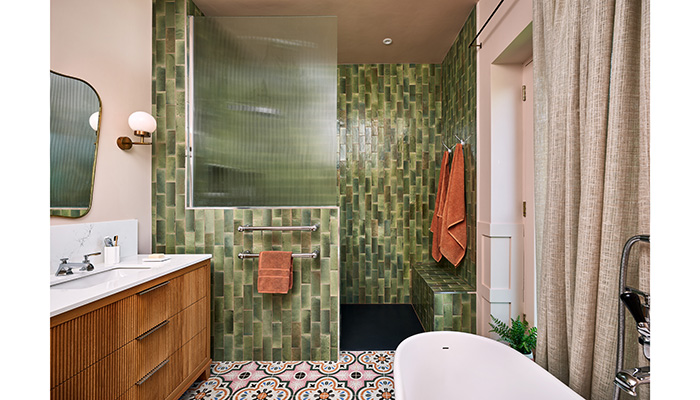
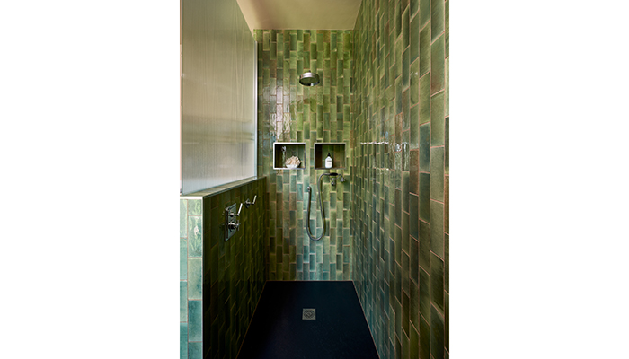
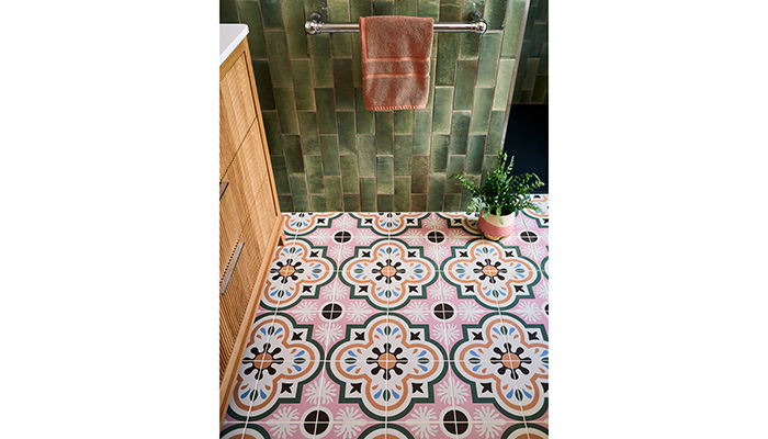
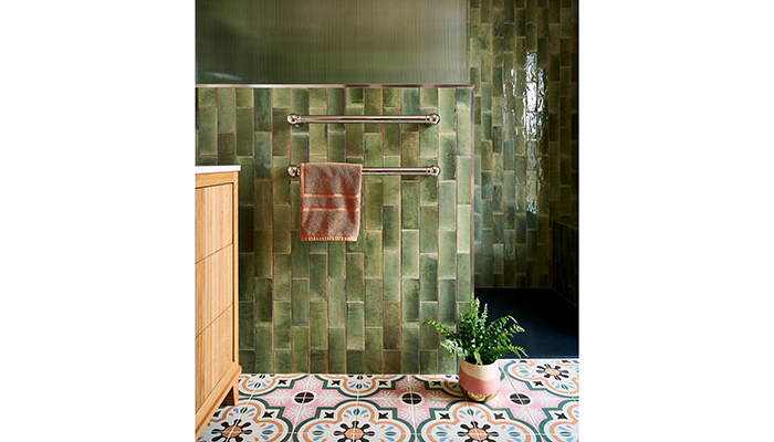
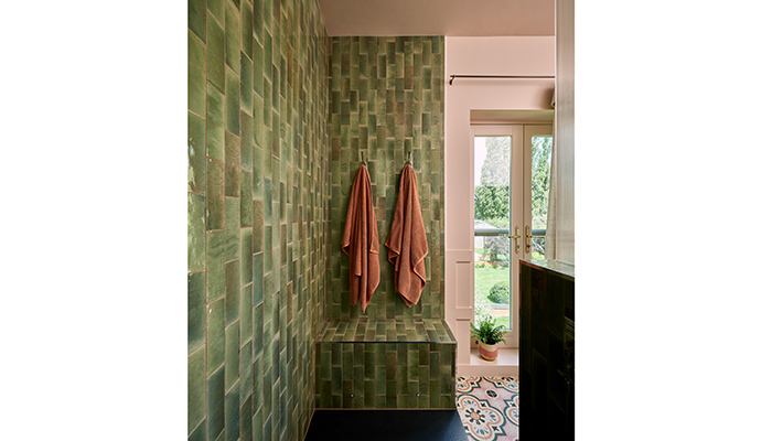
As we developed the mood board, incorporating various textures and colours like reeded glass, wood finishes, and paint hues, we realised something was still missing. Then, we discovered the Cabana New Orleans tile, which felt like the perfect addition. Once this was introduced into the design, everything clicked into place, allowing us to finalise the Pottery Kale brick tile for the shower area.
Q: What were the particular challenges that you faced during this project?
A: During this project, we faced several challenges, particularly with the spatial constraints of the original layout. We had to creatively reconfigure the space, repositioning walls and reimagining the layout not only for the en suite but for the entire master suite. Given the extensive building work required to realise our design vision, communication became crucial throughout this project.
To ensure a smooth process, we engaged in in-depth discussions with both the installers and the client. We conducted multiple site surveys and visits throughout the project, which helped us identify potential issues early and keep everyone aligned on expectations. We also collaborated with local businesses to enhance wall finishes, coving, and skirting boards, while also upgrading the lighting, sockets, and radiators to ensure the full design vision aligned.
Q: What materials did you use?
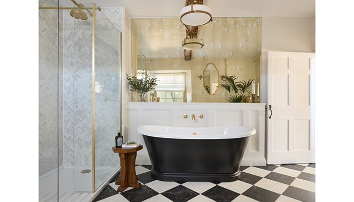
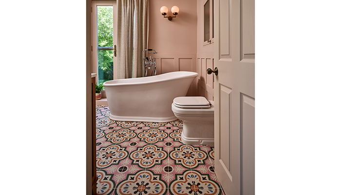
A: In terms of finishes, in the en suite we aimed for statement pieces, including fluted glass, reeded wood, patterned flooring, and a striking green tile for the shower. Our goal was to achieve a harmonious look without any single element feeling overpowering. To balance the bolder finishes, we selected softer materials, such as natural wood, subtle marble worktops, and painted panelling. These choices helped to create a calming and sophisticated atmosphere, allowing the vibrant tiles and textures to shine without overwhelming the space. We also wanted all 3 areas of the master suite to tie in, and achieved this through small nods to the original curtain fabric sample and other smaller details in brassware and styles – the result is a beautifully cohesive master suite.
Q: What were the different products that you and the client chose, and what made them the perfect choice?
A: For this project, we carefully selected a range of products that not only suited the aesthetic of the Georgian home but also reflected our client’s personal style and functional needs. We chose Lefroy Brooks brassware for its exceptional quality and timeless style, perfectly complementing the Georgian architecture. Our client said this brassware made her feel like she was in a luxurious hotel, enhancing the overall experience.
The Ca' Pietra tiles were a perfect match for our client’s vibrant personality, adding character and flair to the space while harmonising beautifully with the other finishes. The Bard & Blackwood Sussex Vanity was selected for its practical storage and elegant finish, which tied in seamlessly with the fluted glass accents throughout the room.
Our client fell in love with the Imperial freestanding bath, and it was a fantastic choice, as it complemented the curves and ornate details of the Riviera toilet, creating a cohesive and stylish look. Finally, the bespoke Fluted cabinet not only added visual interest but also cleverly concealed the contents within, co-ordinating beautifully with the shower screen and wooden elements.
Q: Are there any design elements that you’re particularly proud of?
A: My favourite part of the finished project is how beautifully everything ties together, creating a cohesive and inviting space. The relaxing atmosphere exudes elegance, making it a perfect retreat. I’m particularly proud of the bespoke recessed cabinet, which integrates seamlessly into the design, offering both functionality and a touch of sophistication. It’s gratifying to see how every element has its own place, contributing to an organised and harmonious environment. And I’m absolutely obsessed with the freestanding bath! Its elegant design enhances the overall aesthetic and serves as a stunning focal point in the room.
Q: What is the client's favourite part of the finished project?
A: The client loves that everything ties in beautifully, making the entire suite feel thoughtfully designed. In particular, she is thrilled with the Ca' Pietra tiles and how they add character to the space. Overall, she's delighted with how the design has transformed her master suite into a space that truly reflects her taste and lifestyle.
