Expert view: Read this now! Are your calls to action being ignored?
Thu 10th Mar 2022 by Katrina Bell

Expert view: Read this now! Are your calls to action being ignored?

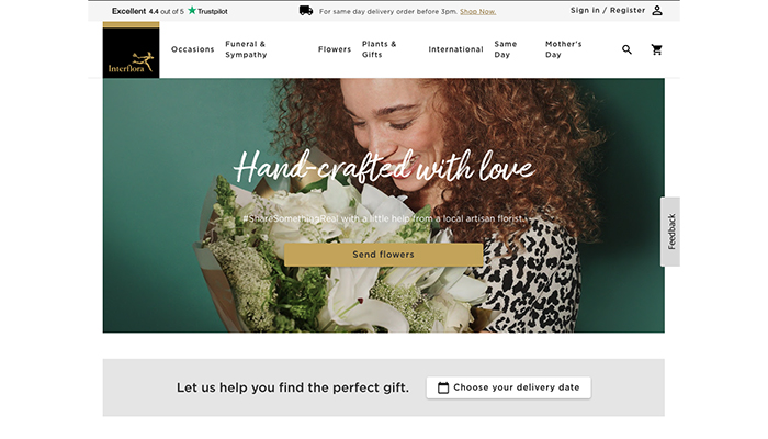
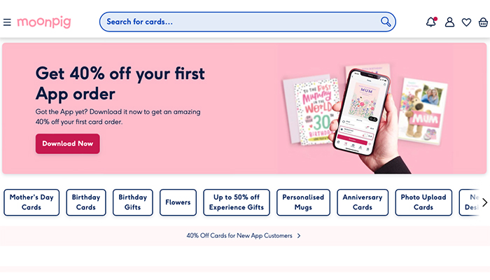
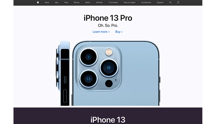
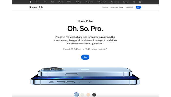
If those hot buying buttons on your website or socials are gathering dust, borrowing ideas from the likes of Apple or Moonpig will recharge your lead generation, says our web expert Katrina Bell.
Your latest content and products are uploaded, the blog is recently populated and snagging has been completed. You’ve newly minted your organic social media content and paid-for advertising. Then… tumbleweed.
While the symptoms of digital Siberia are easy enough to identify, one of the causes could be how you encourage your visitors to engage. In other words, your calls to action (CTA). Here are 6 ways to cure your malady plus some ‘inspo’ to get you started.
1. Keep it simple – so that means language that is urgent, inviting and risk-free. CTAs tend to be action words like build, start, win, save and get. Even better if you can explicitly tell visitors you will solve one of their problems. A customer who wants to plan their bathroom could be enticed by ‘I want to…’ for a multiple choice option or ‘See our design’. Both imply that configuring the layout is virtually finished already.
2. Most of all a CTA should emphasis that your offer is risk-free or there is an incentive for your customer to complete an action that will benefit your aims. If the hard sell doesn’t fit well with the brand, you can be casually persuasive with a CTA such as ‘Give it a try’.
3. Colorise your actions – if the brightest button on your screen is the CTA, that is where your visitor’s eyes will land while simultaneously encourage them to speed read the explanation. There’s no harm in repeating yourself either.
4. For an even subtler take, if an interaction requires them to sign up and log in, the easiest route is the best. Being offered the chance to log in with Google or LinkedIn, for instance, is a sly fox manoeuvre. If a consumer already trusts that platform with their data, they don’t need much of a nudge to allow you access to those same credentials. Even more cunning is that anyone not already signed up will just have to hit a couple of buttons to auto-sign.
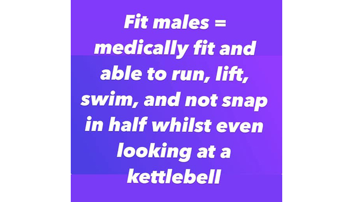
5. User shaming doesn’t work – we’ve all had those messages saying 'Sorry you don’t want to get a discount'. It’s overly confrontational and frankly counterproductive. My current favourite has to be this Facebook ad for a local personal trainer who not only neglects to establish any kind of branding recognition, but body shames all but the most self-confident. I didn’t stay for the comments from proud Dad-bods and those aspiring to better fitness levels.

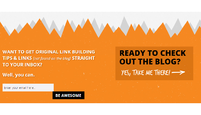
6. You need to be realistic and use those CTAs on content that works best for the visitor not for you. The prime example is newsletters. SEO experts Point Blank’s (https://www.pointblankdigital.co.uk) CTA shows that it understands that newsletters need to offer more than boilerplate content and uses a tongue-in-cheek, matey three-step process – outlines the USP, offers the chance to sign up directly from the box, or to visit the blog immediately. Not for them ‘Sign Up’ or ‘Submit’. They go with ‘Be Awesome’.
Tags: insight, features, digital marketing, calls to action, kitchens, bathrooms

In Other News