How Brandt Design gave classic style a twist to create a bold scheme
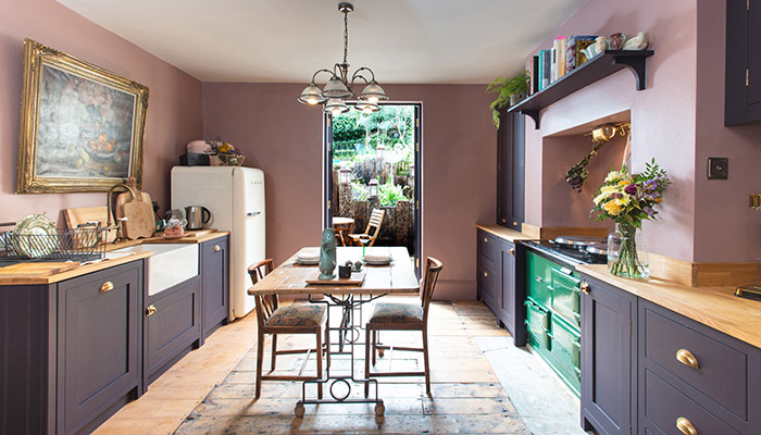
How Brandt Design gave classic style a twist to create a bold scheme
To create a boho kitchen scheme packed with personality, Brandt Design opted for classic cabinetry and changed it up with splashes of bold colour – we talk to commercial director Julia Steadman to find out more.
Designing for clients who love to spend time in their kitchen is always a bonus, so creating a scheme for the artist owner of a coastal period property in Broadstairs, East Kent, who likes nothing better than to be rustling up some traditional French cuisine meant the Brandt Design team could play to their strengths.
"Discovering what our clients love to cook and how regularly they entertain at home is a key part of our design process, as we often take this time to suggest added extras like a dedicated coffee station, walk-in pantry or breakfast cupboard to help streamline daily life," says Julia Steadman.
While the space wasn't huge, the owner needed plenty of clever storage so precise space planning was key. "Needing to be sensitive to existing architectural features, we recommended using a portion of redundant space behind the kitchen wall and turn it into a practical L-shaped food store complete with three custom shelves and enough space for a toaster.”
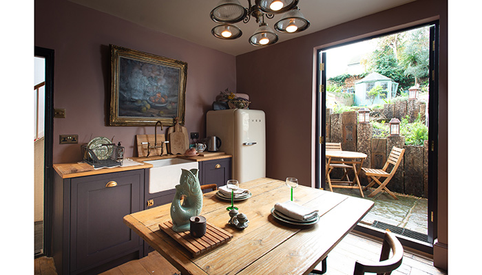
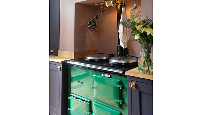
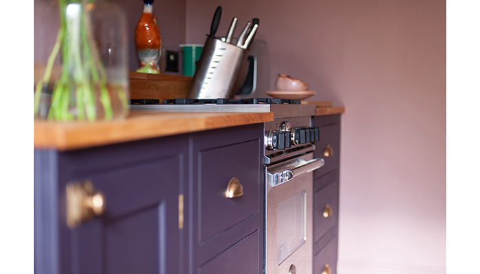
The owner was after a blend of contemporary and traditional so Shaker-style cabinetry, in the form of Brandt Design's Heritage Furniture, presented the perfect fusion, and painting it in Pelt by Farrow & Ball – a deep purple that looks almost black in some lights – gave the scheme an edgy look. An AGA was high on the owner's wish list, and opting for vibrant green created a dramatic focal point and added a characterful flourish.
"The project presented us with a unique challenge, as we needed to work within the parameters of the period property that has existing architectural features, an inflexible blueprint and limited natural light," says Julia. Even though the kitchen opens up onto a small patio, the room itself is relatively dark so saturating it in colour prevented it from feeling gloomy.
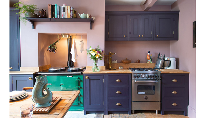
Brandt Design's Heritage Furniture with its in-frame cabinetry, and traditional-style toe-kicks that feature a recessed plinth at the base, work to complement the freestanding elements as they look like independent pieces of furniture.
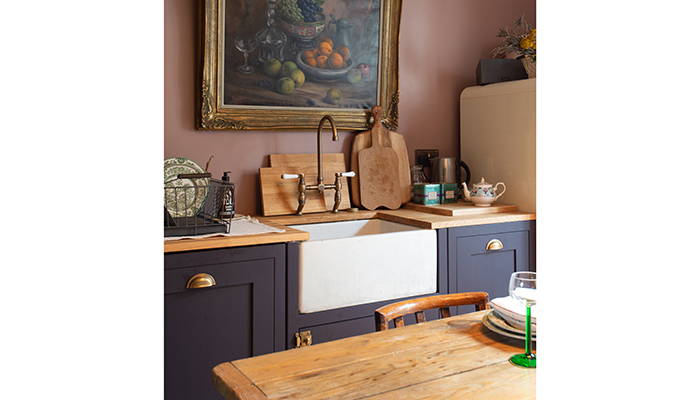
The large single-bowl Provincial sink in White Ceramic paired with Ludlow Bridge taps in Antique Bronze, both from Abode, add another classic touch, while to the left of the sink and hidden from view is a fully integrated Siemens dishwasher. Solid Oak worktops and matching plinths introduce another material into the mix while keeping the tones warm.

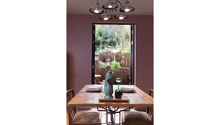
The owner is thrilled with the finished project, which exudes her love of all things creative as well as being a functional and practical space designed for her to enjoy preparing meals in. “We pride ourselves on being original by design and we were instantly inspired by this artistic brief for a hardworking kitchen dining space that has dual access and entry to the garden," says Julia.
Tags: kitchens, features, brandt design, shaker style, julia steadman


