Tiles are getting more creative by the second out there, but it’s what you do with them that counts – Ca' Pietra's marketing director Grazziella Wilson reveals her 5 top tips for using tiles to create stunning bathroom showroom displays.
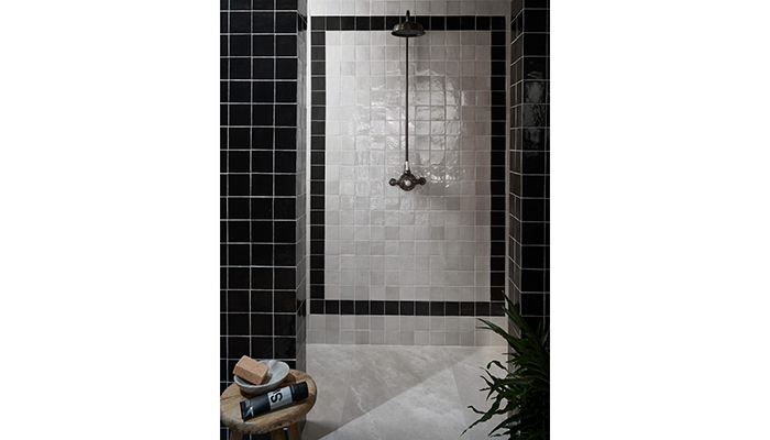
1. Tile Framing with Maroc
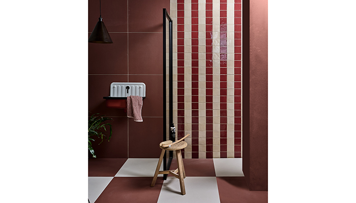
You frame a piece of art, but who’s to say what the art is? Step aside canvas and oil and enter a showroom shower masterpiece, framed in all its rightful glory with a tiled border like we’ve done here with our square Zellige-style Maroc tiles. The monochrome colour palette adds to the impact, but what really builds the drama are the tiled pillars that act as a second broader frame to this shower room. Think of the pillars as the main frame, the single layer of inner tiles as your mount and then the piece de résistance lies within. And who is to say you have to limit this technique to a shower area to make a statement in a showroom? Short on space? Is there a desk area that you could perhaps clad in a tile frame, or an entryway pillar into a showroom?
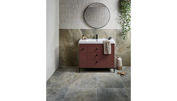
2. Going Up with Himalaya & Petite
This is a trend that started with the iconic metro tile being laid vertically instead of its classic horizontal brick effect. However, 2024’s vertical tiled walls use micro tiles like our Petite porcelain tile. In this dinky en suite, we butted them extra close together to give them a look that feels perfectly imperfect and adds to their artisanal aesthetic. What I love most about this design is that when you’re chatting to customers you can discuss a couple of design tricks as well as design trends too. It allows you to talk about how laying tiles vertically draws the eye up, how customers can recreate the zellige look with porcelain tiles and how mixing sizes and shades helps to enhance a room.
3. Chequerboard Version 2.0 with Stucco
Chequerboard floors will never fall out of favour, but what they will do is keep evolving, because as much as we love a chessboard vibe, there’s more to life than board games. 2024 sees chequerboard floors getting a makeover by firstly going XL on the tiles for big impact and remembering the tiles don’t have to be square to pull this off as our 60 x 60cm Stucco tiles show. In this shower room we’ve upped the ante but placing Stucco from wall to floor. It makes the floor come to life and also makes any space feel larger as floors and walls meld seamlessly into one. If customers love plaster effect walls but need something more practical, then this is the perfect tile to introduce them to. Grab their attention with the bolder shades but make sure to have swatch samples of the rest of the collection on hand too.
4. Chequerboard Version 3.0 With Stucco and Maroc
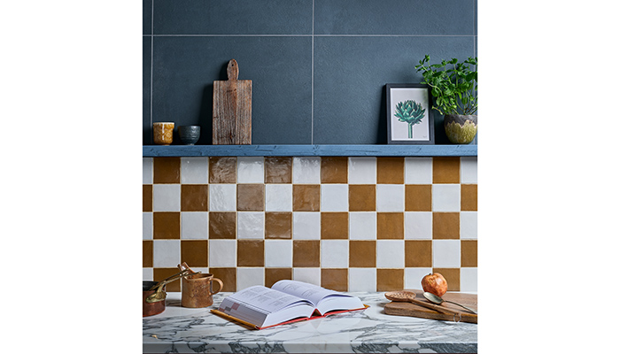
Chequerboard isn’t done with you just yet. From the macro to the micro, we’re loving this half-height chequerboard look that reminds you this is a layout not just for floors. We’ve used mini Maroc tiles in Khaki and Bianco to tile this trend-led kitchen’s walls and then have gone back to a larger format above the fold with Stucco in Blue. It’s a great way to showcase multiple tiles when space is limited in a showroom.
5. Stripes on Stripes with Carter and Deck Chair
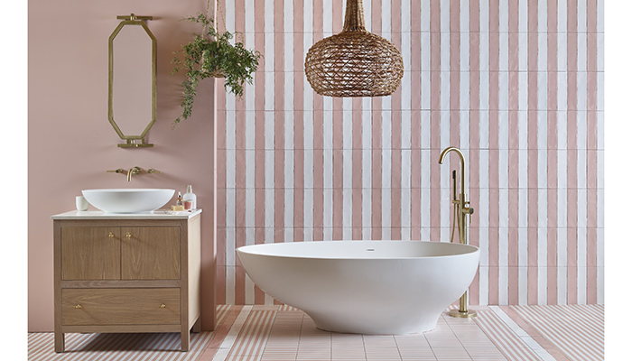
There’s lots to unpack with this seriously stripy style statement. First, running with trend number two of stacking tiles vertically, we’ve taken our Carter ceramic wall tiles and laid them to create this candy pinstripe wall – a drumstick lollipop palette if you please. But why end it there when you can combine a second sort of stripe, like Deck Chair, also in a pastel pink colourway? Stripes on stripes on stripes – and we’re here for it.
