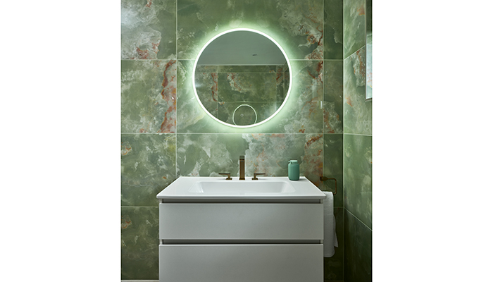
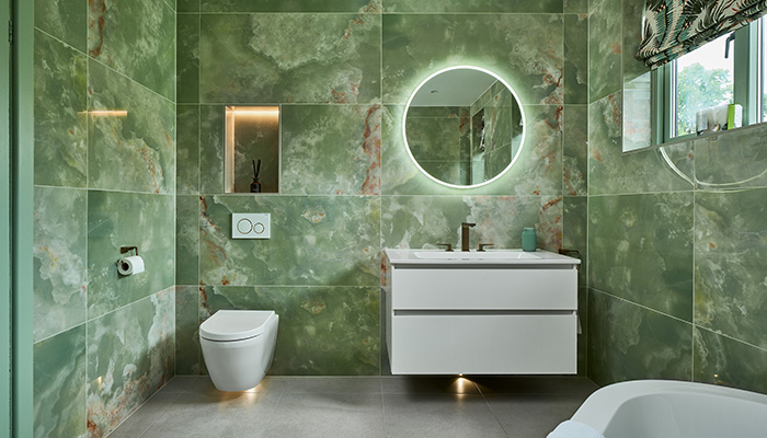
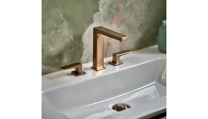
When Dane Chapman, showroom owner at Ripples Towcester, was tasked with creating a playful en suite bathroom that could double as a soothing retreat, he chose vibrant onyx tiles to set the tone.
Q: What type of property was it in and who was the project for?
A: The project was in a townhouse in Bedfordshire for a professional couple and their teenage children.
Q: What was the brief from the client for this project?
A: This bathroom project was part of an entire home renovation and the owner wanted to create a dedicated ‘hers’ en suite to complement her husband’s 'his' en suite which was also redesigned by us simultaneously. The brief was to create a space for relaxation and retreat but which also reflected the client's personality. Fun, colourful tiles and a luxurious bath were are the top of the list.
Q: How did you go about meeting the brief?
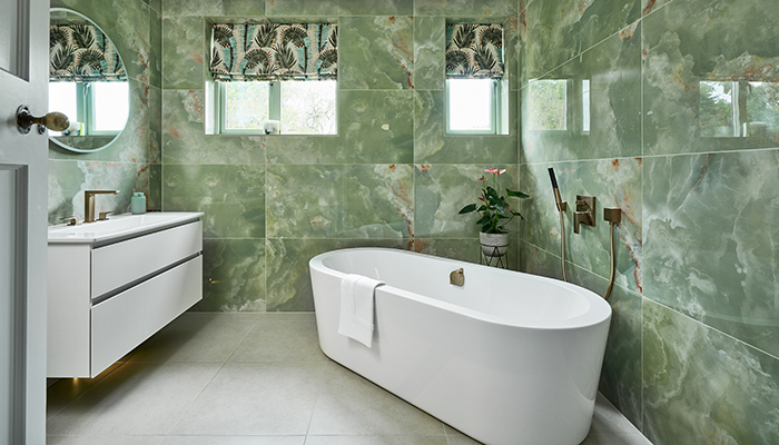
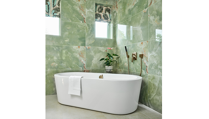
A: As the space was to be completely renovated, we were able to start with a blank sheet of paper with the design of this room. With the bath being an important feature within the design, I positioned it in the corner of the room, creating an impact as soon as you walk in. This position also stops the room from feeling too cavernous in the centre.
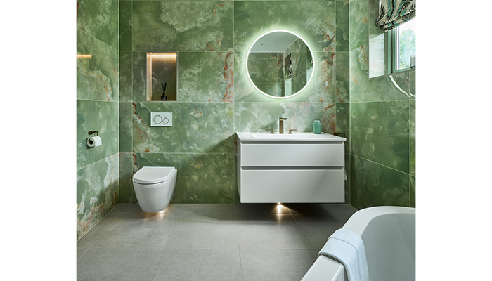
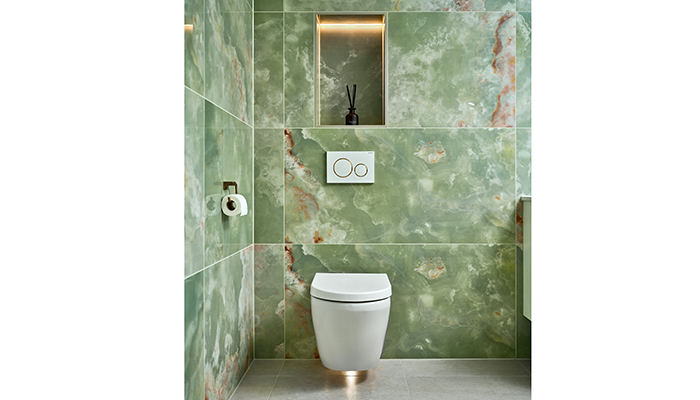
The wall-hung vanity unit and WC were then positioned flush to the adjacent wall, creating a sense of balance within the scheme and hiding the WC out of sight when the door is open.
Q: What materials did you use? Did you use anything different or unusual?
A: The tiles have a very high-gloss finish, which we don't tend to see a lot of these days, with clients now looking for something a little more matte and natural-looking. The high-gloss works so well in this space because they're the key statement feature within the scheme so they don't have to compete with anything else. There also a great way to add interest in a standard-sized square room.
Q: What were the different products that you and the client chose, and what made them the perfect choice?
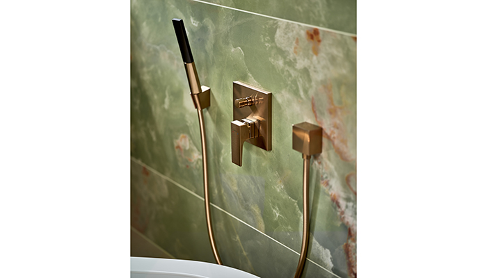
A: The wall-hung WC and furniture were a good choice because they open up space on the floor making the room look bigger than it actually is. It also keeps the room easy to clean as you can fully clean.
Q: Are there any design elements that you’re particularly proud of?
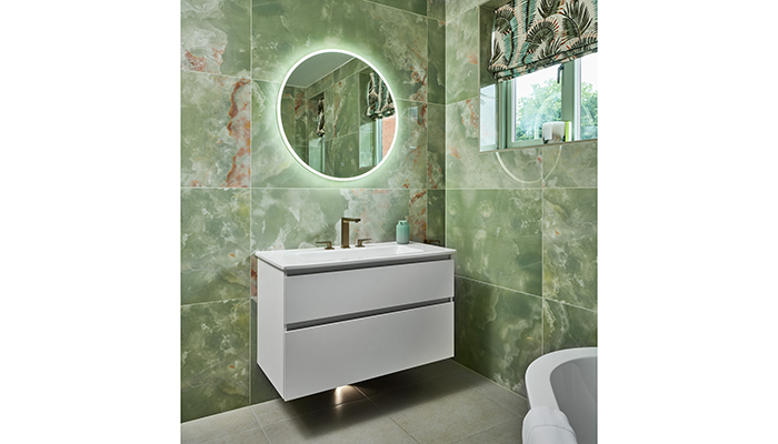
A: I particularly love the lighting as it's both practical and interesting to look at. It bounces off the high-gloss tiles, ensuring the room feels bright and airy even on grey days. Lighting is such a great way to add interest in a standard sized square room.
Q: What is the client's favourite part of the finished project?
A: The tiles! The homeowner loved the bold pattern and fresh colourway so these were an instant hit. She chose to make a real statement by running them floor-to-ceiling on each of the walls.
