CDA revamps website to give consumers information and inspiration
CDA revamps website to give consumers information and inspiration
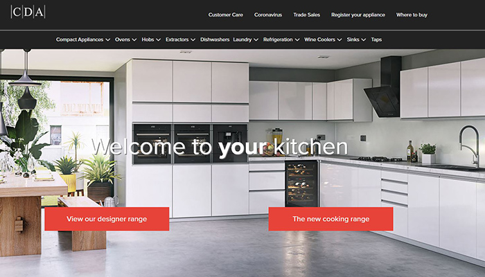
CDA has redesigned its website so that it now benefits from improved navigation, and according to the company, offers users both information and inspiration. In order to create a sense of warmth and friendliness, users are greeted with the message 'Welcome to your kitchen' when they land on the homepage, and the company says they are then presented with all the details they need to make a buying decision 'without information overload'.
Via the website, they are able to find, compare and locate products from the company's collection, with all products pictured and captioned with full information on features, sizes, and energy-saving attributes.
“A website should answer the questions people ask before buying without bogging them down with unnecessary information,” says marketing manager Steve Corbett. “What does it look like? How does it work? How will it help me? These are key to making the right buying decision. Our products are designed to help everyone from young families to retirees, with features such as roast probes and recipe presets that will give new, inexperienced cooks confidence.”
Tags: news, kitchens, cda, steve corbett


