How Ripples' Lisa Kyme added vibrant colour to a minimalist scheme
How Ripples' Lisa Kyme added vibrant colour to a minimalist scheme
When Lisa Kyme from Ripples London set about re-energising a tired bathroom that hadn't been touched for more than 20 years, she combined a pared-back style with vivid tones to create a revitalising but soothing space.
Q: What type of property was it in and who was the project for?
A: A two-bedroom apartment in Tufnell Park. The homeowner is a music producer and drummer and has lived in the property for 25 years.
Q: What was the brief from the client for this project?
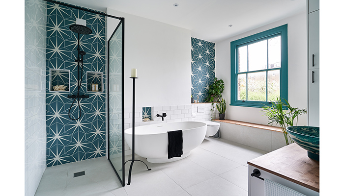
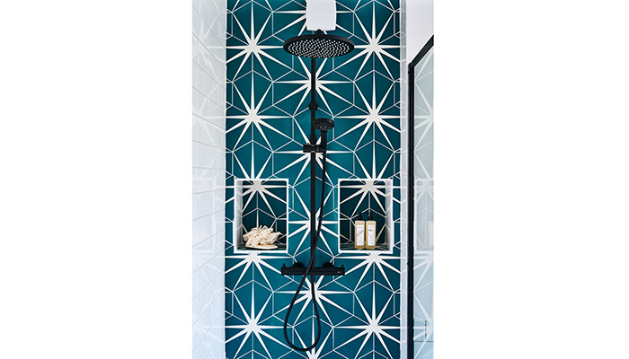
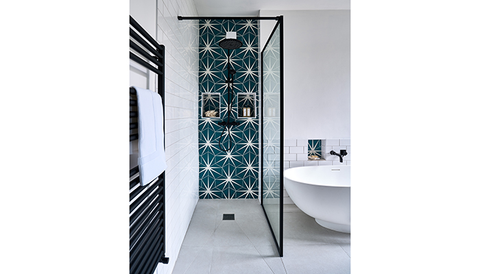
A: The room is large but had not been updated for over 20 years so was in a complete state of disrepair with several leaks and with electrical items that would not pass current regulations. So the main brief was to bring the room up to date whilst also making sure the scheme made an impact. Originally the client was looking at a Moroccan theme but once we started reviewing the layout and looking at different products, he fell in love with the Lilypad tile... then the whole room took on a new style based around this tile design. The homeowner wanted to have a large walk-in shower but also retain a bath... Oh, and the brassware had to be matt black!
Q: How did you go about meeting the brief?
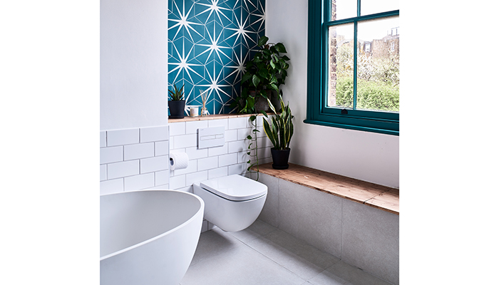
A: The layout of the room was quite easy to create because it has such a large footprint. I wanted to create a space that was functional as well as a room where you could go to chill out so taking both of these things into consideration helped to develop the design idea. For example, the boxed seating under the window can be used as lounge seating but also doubles up as a concealed storage area.
Q: What were the particular challenges that you faced during this project, and what were your solutions to overcome them?
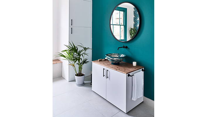
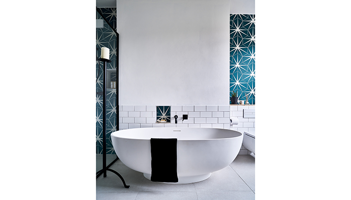
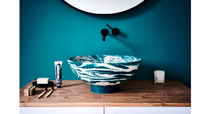
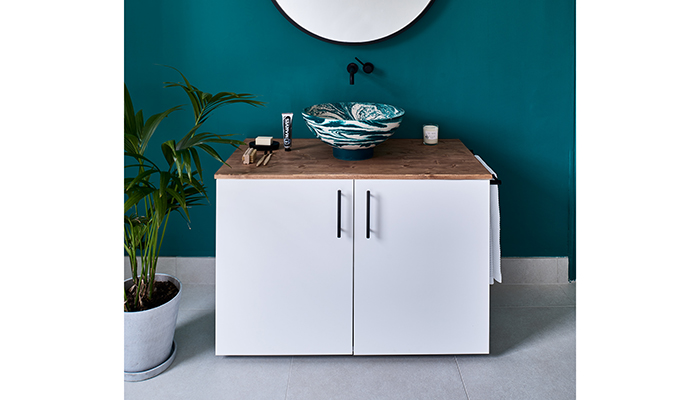
A: The tiles and the concrete basin were the must haves for the homeowner so the rest of the room was based around these items in colour, style and texture – hence the strong coloured walls! It was important then to keep everything else fairly minimal in style so that we didn’t overwhelm the room with too much colour and pattern. The freestanding bath took quite a while to choose as the homeowner was very keen that it was a certain shape but also a natural material – he didn’t want an acrylic bath.
Q: What materials did you use? Did you use anything different or unusual?
A: We used lots of natural materials, including the concrete basin and natural stone bath.
Q: What were the different products that you and the client chose, and what made them the perfect choice?
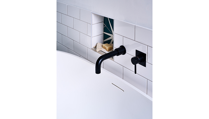
A: We used a Drench shower screen – it partitions the room to create a separate shower area without blocking out too much light. The Sam Lander concrete basin adds a sense of fun to the room and celebrates handmade/artisanal work. The Ca’ Pietra tiles and Grespania floor tiles create an interesting contrast between bright and bold and natural and minimalistic.
Q: What would your advice be to a designer who is just setting out on a similar project?
A: Don’t be afraid to use colour. Be open to looking at different styles as you work through the bathroom design and allow your ideas to change. The bespoke designs that we create as part of our design service really help clients to visualise how the room is going to look and to make any changes along the way.
Q: What is your favourite part of the finished project? Are there any design elements that you’re particularly proud of?
A: I particularly like the colour; the homeowner was braver than some clients with using such a strong colour but the room is so large and bright that I feel it works really well without being over the top. I also like the fact that it has somewhere you can just sit and relax, proving bathrooms don’t have to just be functional spaces but a place for relaxation and retreat.
Q: What is the client's favourite part of the finished project?
A: He loves it all – especially the tiles, basin and matt black brassware.

Tags: bathrooms, features, ripples, lisa kyme, ca' pietra, grespania, sam lander, drench


