How Martin Moore set about designing a bold 'colour drench' kitchen
How Martin Moore set about designing a bold 'colour drench' kitchen
Richard Moore, design director of Martin Moore, reveals how he and the team created a striking 'colour drench' kitchen in an Arts & Crafts style new build property.
When planning and designing this Arts & Crafts style new build, the owners knew that they wanted the kitchen to be at the heart of the home. The family had decided to completely demolish the old property, making way for a brand-new space, built entirely around their vision.
"We had designed the kitchen in the family’s previous home, so we already knew how they liked to live. The brief was to create a practical – but decorative – working kitchen that centred around the family’s love of cooking and entertaining on a large scale," says Moore.
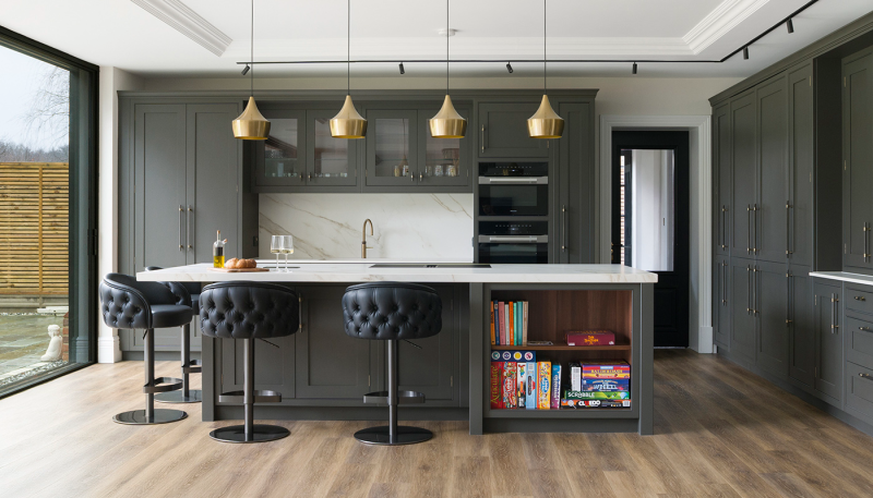
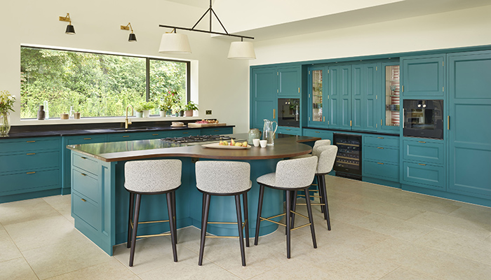
The room is zoned into three distinct areas – cooking, eating, and living. The kitchen acts as the axis of the space, facilitating an easy flow between the three. The island forms the soul of the kitchen; offering a generous amount of prepping space, it is inspired by the concept of counter style dining and features a bowed wooden table which directly faces the cooking zone, allowing the hosts to easily interact with friends and family.
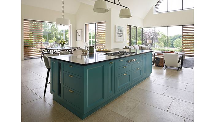
The rich teal colour scheme was created using a bespoke colour from Farrow & Ball, and is bold and lavish, which Moore says very much reflects the owner’s strong personality and sense of style.
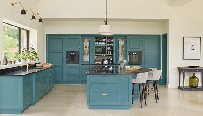
"She wanted the colour scheme to reflect her Persian roots and felt very strongly about injecting bold colours into the kitchen," says Moore. "It is often a good idea to use smaller features such as cupboard interiors, kitchen islands and seating to introduce bold colours into a kitchen. On the other hand, ‘colour drench’ kitchens are becoming increasingly popular – where the entire kitchen is painted in one strong colour. This is often balanced out with lighter worktops and less dominant metal finishes.”
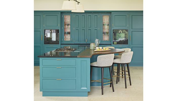
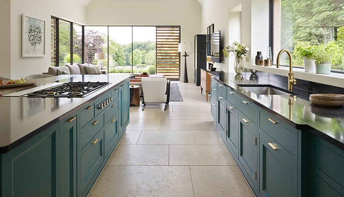
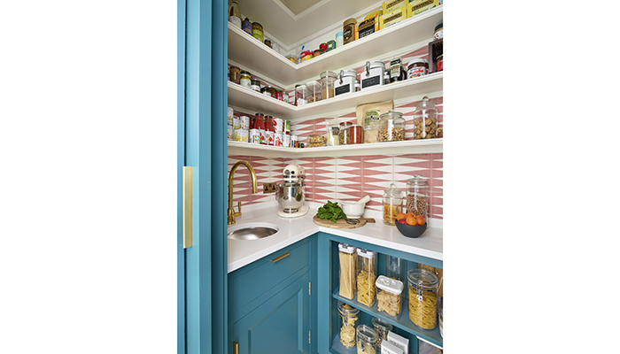
Cabinetry from Martin Moore’s New Deco collection was the perfect choice; with a contemporary, architectural edge, the design incorporates a wide variety of feature materials, including veneers, metallics, marbles and porcelains, ideal when creating a decorative statement kitchen. Geometric, patterned cream and coral tiles form the backdrop of cupboard interiors, bringing decorative flair to the design while also counteracting the intensity of the bold teal. Sleek brass handles and kitchen fittings add warmth and provide a striking contrast to the handpainted cabinetry.
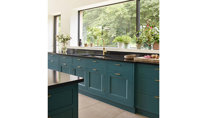
Surrounded by sliding glass doors and large framed floor-to-ceiling style windows, the space is bathed in light and offers 360-degree views of the garden and surrounding countryside. Due to the room’s very high ceilings, decorative pendant lights were chosen to direct the eye downward towards the kitchen/dining area.
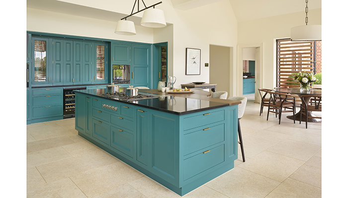
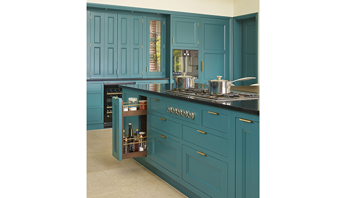
"Masses of storage space was essential for a family that loves to cook – deep drawers were incorporated into the island design, as well as pull-out spice racks," says Moore. A long run of cabinets is sited by the large panoramic style window, providing under counter storage for large ceramic dishes and serving plates. A capacious appliance cupboard acts as an informal breakfast station, storing tea, coffee, mugs as well as a coffee machine and microwave.
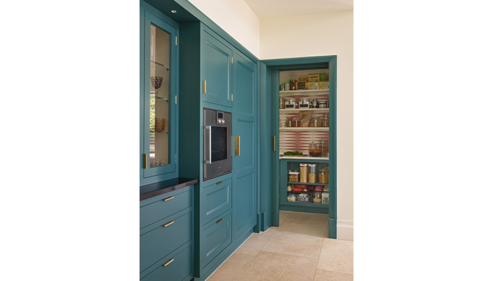
A well-designed walk-in pantry in the same bespoke cabinetry and teal blue colour scheme for the pantry helped to maintain visual cohesion between the two spaces, and achieve the same ‘wow factor’ feel. A sliding door gives the family quick, easy access to ingredients when preparing a meal for guests but allows everything to be hidden from sight when not in use. The same cream and coral encaustic tiles used in the main kitchen form the dramatic backdrop to the pantry’s sleek white shelves.
So now that the project is finished, what is his favourite part? "I like how bold this kitchen is – it incorporates rich colours and decorative materials – it’s certainly a statement kitchen. Also, there’s a fantastic flow between the three zones in the space which really does allow the family to live and entertain in the way they want to," he says.
Tags: kitchens, features, martin moore, richard moore, bespoke


