How ROAR Architects created a playful, stylish two-tone kitchen space
How ROAR Architects created a playful, stylish two-tone kitchen space
Craig Rosenblatt, director at ROAR Architects, reveals how a restricted colour palette and rich mix of materials were essential to creating a dynamic kitchen design that emanates warmth.
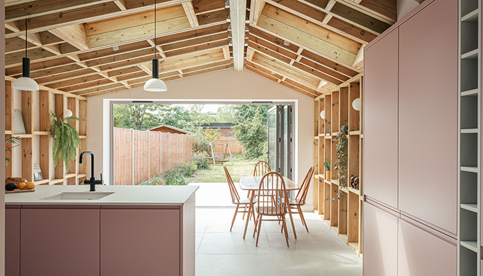
When the owner of this terraced house in Walthamstow, east London, approached ROAR Architects, her brief was simple: designing a light-filled and stylish rear extension that would work as a multifunctional space for a young professional. Housing a contemporary kitchen, the extension had to materially match the existing house externally, while providing a modern addition that exposes its timber structure internally to reduce material use and provide a warm and natural backdrop.
Q: What materials did you use? Did you use anything different or unusual?
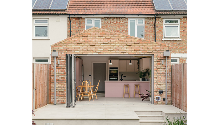
A: The extension is clad in red-toned bricks that match the existing house, and a sense of playfulness is demonstrated through the way the bricks project outwards and catch the eye. The protruding bricks are organised in a randomised order through the rigid stretcher bond.
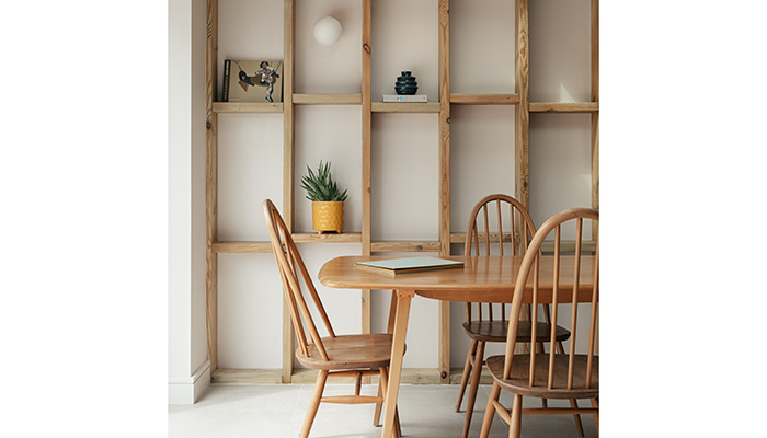
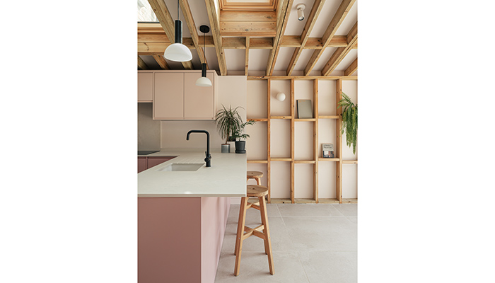
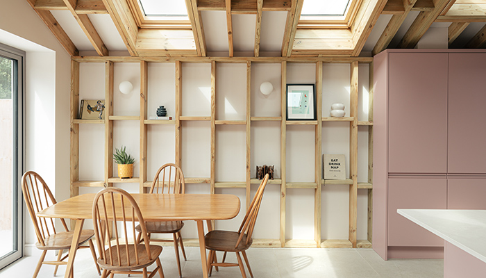
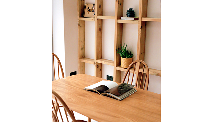
The element of playfulness in the architectural expression is continued internally where we used an exposed timber construction to create texturally interesting interior walls. By keeping the timber on show we were able to minimise the use of materials and to provide a purposeful, dynamic, and playful space. We created niches formed of vertical and horizontal studs that are both structural and decorative. These niches have provided the owner with a bold backdrop to display objects in such way that it has become an adaptable gallery for her everyday life.
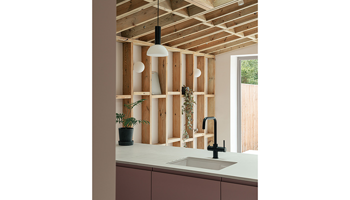
Q: Why did you choose Caesarstone 4011 Cloudburst Concrete for the worktop?
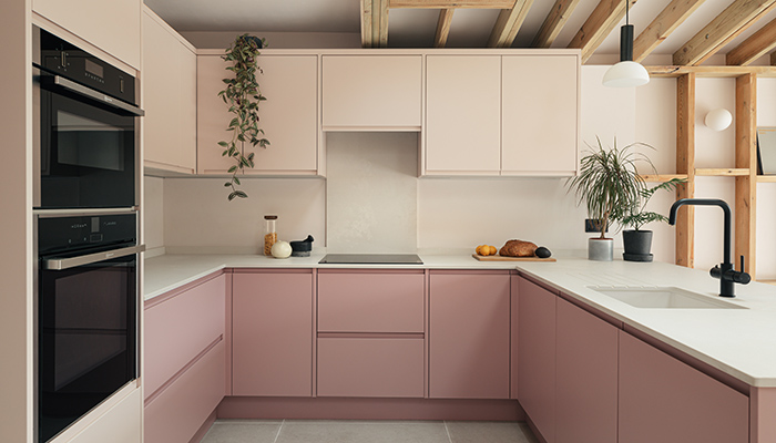
A: We chose 4011 Cloudburst Concrete for its pared-back and minimal feel, particularly against the 2-tone pink kitchen and exposed timber construction. Caesarstone offers an excellent and robust product with a good range of finishes at a decent price point too. We’ve specified Caesarstone on the majority of our projects and will continue to do so.
Q: What were the particular challenges that you faced when working on this project?
A: The project involved a reconfiguration of the internal spatial layout, creating a sociable kitchen for entertaining with doors that open up directly onto the patio and garden. To bring plenty of natural light into the space and maximise the ceiling height, the form of the extension is a simple pitched roof, reaching 3 metres internally from floor to ceiling at its highest point.
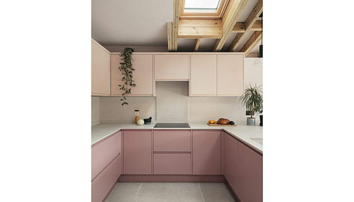
Demonstrating both structural detail and decorative touches, the design of this extension brings a lot of potential to what is a modest space. Intentional architectural interventions make all the difference, including the different sized roof lights. These were purposely offset on plan when designing the space to provide the means of framing natural light on key activities that take place in the space over the course of a day.
Q: Are there any design elements that you’re particularly proud of?
The view from the living through to the kitchen as the top of the sloped roof aligns with the centre of the doorway leading your eye into the timber framed extension and garden beyond. This was a key part of the design from early on so it's great seeing to it come to life.
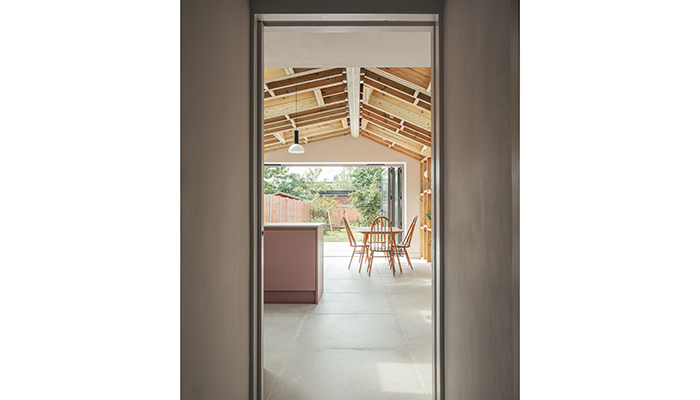
Working with timber frame construction from a sustainable and speed viewpoint was also a favourite part. Especially exposing the construction, which forms part of the shelving and decoration.
Q: What is the client's favourite part of the finished project?
A: The pink kitchen! We weren't convinced by this decision and did everything we could to steer the client in a different direction. But I have to say it looks fantastic so the client was absolutely right!
Tags: kitchens, features, roar architects, craig rosenblatt, caesarstone, surfaces, worktops, materials, pink kitchen


