10 playful kitchen designs with a fresh and uplifting feel
Mon 3rd Jul 2023 by Angelica Hedges

10 playful kitchen designs with a fresh and uplifting feel
The latest trend for using colour and shape in quirky and unexpected ways is perfect for clients after a truly personalised look. Angelica Hedges rounds up 10 playful designs for homeowners who want their kitchen to be their happy place.
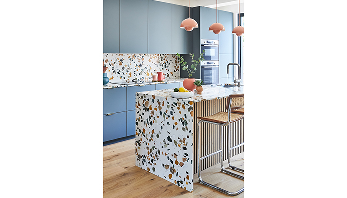
1. From the interior designer and stylist Nicki Bamford-Bowes of & Then They Went Wild, designed for her client Sylwia Newman who sells vintage posters, the design of the kitchen below mirrors Newman’s passion for bright colours and contrasting shapes. The quirky terrazzo surface from Diespeker, which features varying pops of colour across the surface, is the perfect foil for the blue kitchen cabinets, that were inspired by the blue shapes within the terrazzo. Grohe’s Minta kitchen tap with its bold outline works beautifully in the scheme, and the addition of the wood veneer panelling on the island hides storage areas and adds another layer of texture to the design.
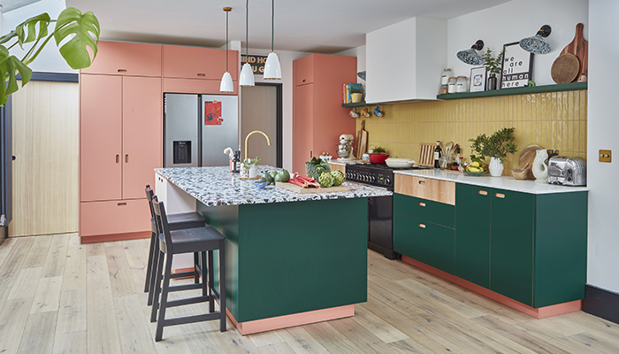
2. From Pluck Kitchens and designed for author and social entrepreneur Hollie de Cruz, the style of this kitchen has taken its inspiration from the aesthetic favoured by filmmaker Wes Anderson, who has a unique and charming visual style. The island attracts the eye thanks to the hectic terrazzo work surface from Diespeker with its colourful chunky design, which connects the pink, green and yellow colour themes in the rest of the kitchen.
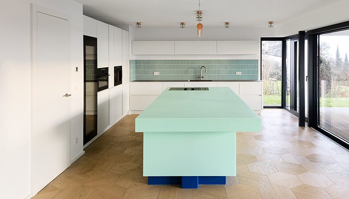
3. This kitchen designed by interior architect Stephanie Thatenhorst is intended to mirror the eclectic nature of her client’s style and features a custom monolithic kitchen island. The island is in HIMACS Emerald, from their Lucent Collection, which has been paired with a contrasting dark blue base. The island is finished off with built-in lighting, which makes it translucent when switched on in the evenings. While the Lucent collection features a palette of sugary pastel colours, the material itself has full antibacterial properties making it ideal for kitchen use.
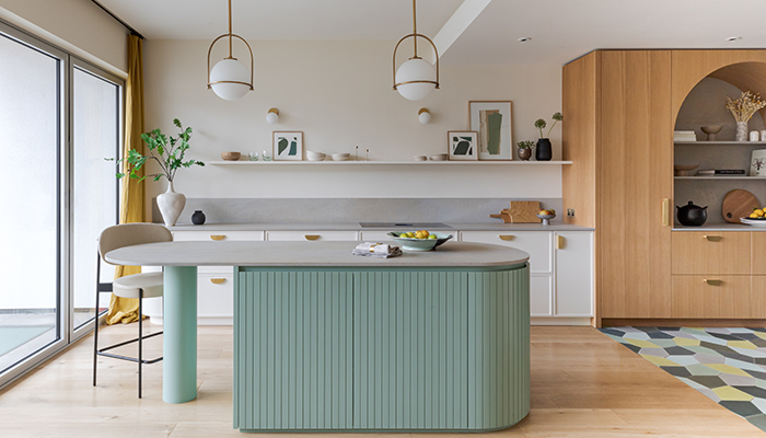
4. Designed by Kate Feather Kitchens, this kitchen features Caesarstone’s 4023 Topus Concrete both on the countertops and the island worktop, and the unique texture of the material makes it the island the visual centrepiece of the kitchen. The floor tiles add an uplifting pop of colour to the working zone of the kitchen on the right, beneath the fridge and freezer, which are concealed within an arched oak unit. The repetition of the rounded shapes in the kitchen creates a free-flowing and open atmosphere.
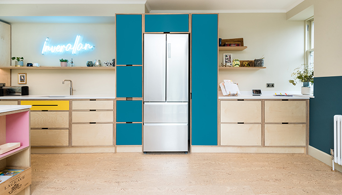
5. Based in Perthshire, Scotland, cabinet makers Birkwood form their plywood kitchens using natural wooden veneers, and then pair them with various colours in Formica laminate. Pictured here are cabinets with flashes of bright yellow and bubble-gum pink tones, and striking blue at the centre to pull this simple yet highly effective design together. The addition of the neon sign provides a fun, retro element reminiscent of a classic American diner.
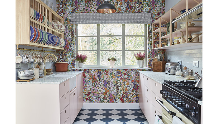
6. According to Pluck Kitchens, this galley-style design was created for a client with eclectic taste. The wallpaper from House of Hackney showcases a multicolour floral aesthetic and is pictured here balanced with a simple checkerboard flooring. The house is surrounded by Epping Forest, so the floral wallpaper has the effect of bringing the outside world in, and is teamed with baby pink cabinetry, and a pale terrazzo worktop. To make the most of the available space, an ash plate rack and Spoke shelving help keep the kitchen clutter free.
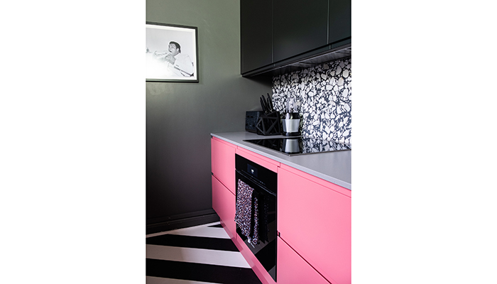
7. The bespoke Pure kitchen by John Lewis of Hungerford features a handleless design to ensure a continuous flow between each component. The minimalist style of the kitchen allows homeowners to mould their surroundings to their own personal style – in this case this kitchen was made for influencer Sarah Akwisombe, who is known for her love of colour. Hot pink cabinetry contrasts with the black and white two-tone flooring, with the differing shapes in the terrazzo splashback adding a sense of fun.
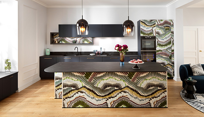
8. The Prete-Moi Ta Plume pattern by Christian Lacroix Maison is showcased here on the panels and door fronts of this Schmidt kitchen. The pattern features curving waves of multi-coloured feathers, and is teamed with ultra-matt Soft Navy melamine doors and co-ordinating gold handles. A Nano Black Marmor laminate worktop acts as a grounding element to the design, with the island featuring rounded corners for an organic, free-flowing feel.
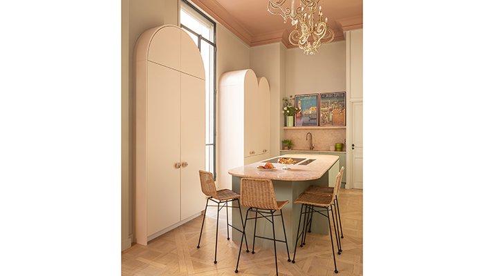
9. This collection was designed for John Lewis of Hungerford by 2LG Studio, and showcases the range's unique cabinetry with its distinctive arched shape. The freestanding larder unit is the highlight of this bespoke range, and can showcase glassware when made with the optional fluted glass doors, and customisable interiors. The painted ceilings and vintage chandeliers within this kitchen in a Parisian apartment add elements of quirky chic.
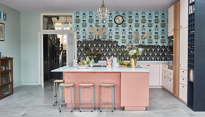
10. This open-plan space designed by Pluck Kitchens is full of delightful and unexpected contrasts when it comes to pattern and colour. The central island with its pink base features a Bora hob, so the cooking and entertaining zones are connected for a social and open environment. The base cabinetry is in pale pink and London Plane wood veneer, which – when paired with the wallpaper by Emma Shipley and monochrome tiles from Ca’ Pietra – creates a lively space that's packed with style and personality.
Tags: kitchens, features, 10 playful kitchen designs, pluck, caesarstone, & then they went wild, john lewis of hungerford, himacs, schmidt


