David Fisher on designing the new additions to Rangemaster's portfolio

David Fisher on designing the new additions to Rangemaster's portfolio
As Rangemaster prepares to launch 2 new range cooker families for the first time in 5 years, chief creative advisor David Fisher reveals the inspiration behind the designs.
Q: Rangemaster previewed the new Estel Deluxe and Edge Deluxe range cookers at KBB Birmingham – tell us what prompted the latest designs?
A: I’m incredibly fortunate in my role at Rangemaster to respond and reflect on the question, ‘What should we do next?’. When we look at what we can do, I think the best outcomes stem from honest conversations – challenging preconceived perspectives but respecting established viewpoints. It quickly became a deeper look at the new and evolving customer needs and what we could best describe as ‘traditional values meeting progressive attitudes’. The Edge Deluxe and Estel Deluxe families signal a step forward in meeting the next generation of customer needs.
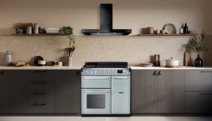
Q: What inspired the design of the Estel Deluxe?
A: I’m pretty certain that deep down most of us are incredibly sentimental but equally forward-thinking. Estel’s style is timeless, modern, and retro. In the same way that we love the new Mini or Fiat 500, Estel is built on familiar classic design values; there’s fun there in terms of new pastel colours, but also practicality and common sense. So yes, it was about familiarity, which is the ultimate goal of design – I love the notion that customers will feel like they already know it, but at the same time, it feels new and exciting.
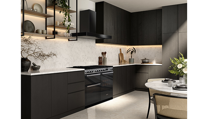
Q: Edge Deluxe is a departure from the usual style – is it in response to any particular trends?
A: Edge started as a simple proposition – to be ‘edgy’ and contemporary. The idea was to create a range cooker aesthetic consistent with built-in appliances. A ubiquitous language of edgeless glass doors that seamlessly integrates with any modern kitchen – as simple as possible and defined by the materials. I generally think less about trends and more about the self-fulfilling prophecy of ‘good design just makes like better’.
Q: Rangemaster also unveiled a new logo. How do you approach making one of the biggest design changes in decades at an established manufacturer?
A: It was simply time to re-evaluate who we were as a business and what the company stood for moving forward. Rangemaster is constantly adapting and changing for the better, and we need to communicate that. We have long established ourselves as a brand through ‘unrivalled performance’. But honestly, that statement felt a little too comfortable and self-reverential. So, we challenged ourselves to take a broader stance regarding forward-thinking and our customers; it’s obvious that we’ve always had a progressive attitude – we’ve always put the consumer first – but most critically, we’ve always considered innovation to be inspired by everyday life.

So, a new identity made sense based on those principles. It also coincided with the business embarking on a transformative process to reimagine the entire production process – all with the modern customer in mind. No one had to be persuaded that we needed a cleaner, more straightforward identity with simple typography to reflect a timeless vision. What was most important – and I say this as a product designer first and foremost – was that the new badge had to look great on our new range cookers!

Tags: insight, features, rangemaster, david fisher, range cookers, appliances, kitchens


