How Simply Bathrooms created a stunning design in a tricky loft space
How Simply Bathrooms created a stunning design in a tricky loft space
Sophie Harrold, director of Surrey-based Simply Bathrooms, reveals how she went about reconfiguring the layout of a difficult space to create a light, spacious and elegant bathroom that will stand the test of time.
Q: What type of property was it in and who was the project for?
A: The Onslow family – Stephanie and Adam, both busy professionals with 2 young children – wanted a timeless yet elegant bathroom design that would blend seamlessly into their newly refurbished London townhouse.
Q: What was the brief from the client for this project?
A: I was tasked with creating a family-friendly, easy-to-maintain space that would serve as a stylish guest bathroom for the next 5-10 years, but with the 'wow' factor needed to transition into a master en suite once Stephanie and Adam move upstairs. As the children get older their plan was to move their bedroom to the top floor and have the loft bathroom as their en suite, so they had more privacy. Given that I was designing 5 bathrooms for them, budget considerations were crucial, and I needed to deliver maximum impact within cost-effective parameters.
Q: How did you go about meeting the brief?
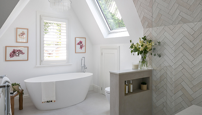
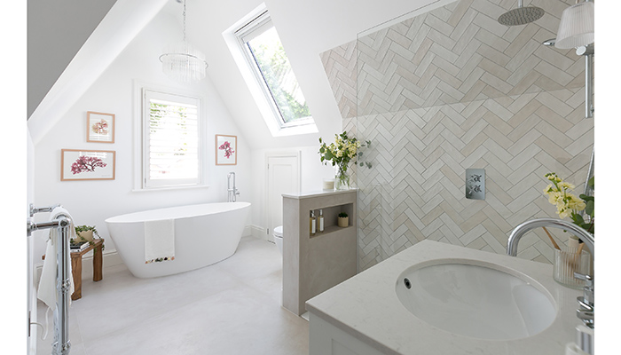
A: Designing a warm and inviting neutral bathroom can be a challenge, I wanted to avoid a cold, clinical feel aiming to create a space that felt characterful and inviting. Despite the all-white palette and chrome fixtures, I achieved warmth and personality through thoughtful layering, design details and clever planning. I chose the Oasis tile range from Ca’ Pietra for its warmer neutral tones and wide tonal variation, laying it in a decorative herringbone pattern to add texture and disguise areas with reduced head height. The result is a crisp, elegant, and cohesive space that feels homely and timeless, perfectly complementing the architecture of the new-build London townhouse.
Q: What were the particular challenges that you faced during this project?
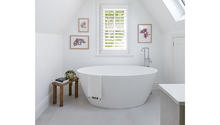
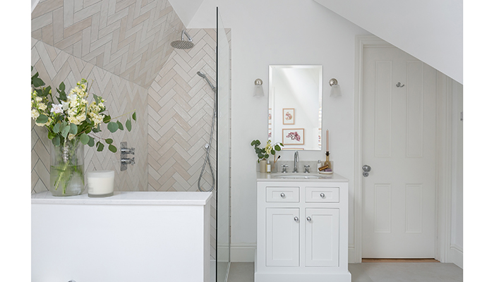
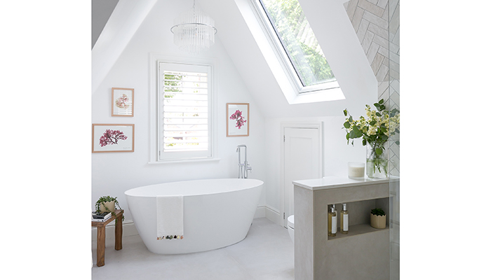
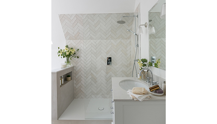
A: The loft bathroom presented significant challenges, such as reduced head height and an awkwardly placed loft hatch. The initial architectural layout was less functional, so I had to think creatively to maximise the space. I adjusted the loft hatch position to make room for a larger full-sized bath but also ensure the family had access to usable storage. I moved the vanity to a more practical spot and repositioned the shower, creating a spacious walk-in area. At the foot of the shower, I added a pony wall with an integrated alcove and a Silestone top for bottle storage. This clever design provided functionality and created a visual break, while also offering privacy for the WC.
Q: What materials did you use?
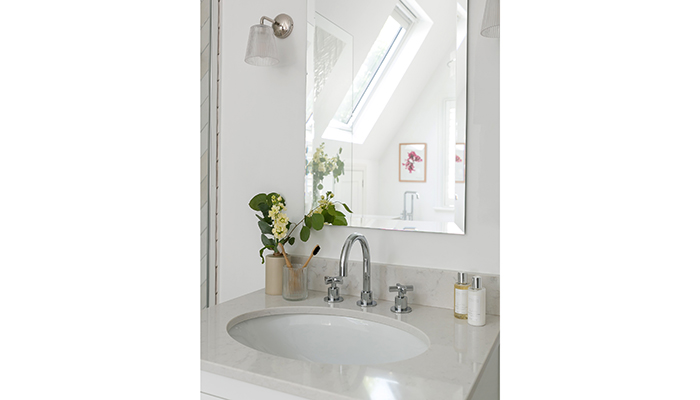
A: The neutral tones of the Oasis range from Ca’ Pietra provided warmth and texture, adding interest without overwhelming the space. The herringbone layout offered a sense of elegance while addressing head height challenges. Most importantly however, I ensured we selected porcelain tiles for practicality of upkeep alongside a seamless but practical choice of grout colour for the longevity of the design. Chrome taps were chosen for their affordability, but the traditional crosshead design added character and complemented the modern elements.
Q: What were the different products that you and the client chose?
A: The vanity unit was designed by me and bench-made in the UK, balancing modern and traditional elements. It features a floorstanding design with an elegant undermount basin, while the Shaker-style doors have a simplified, contemporary look.
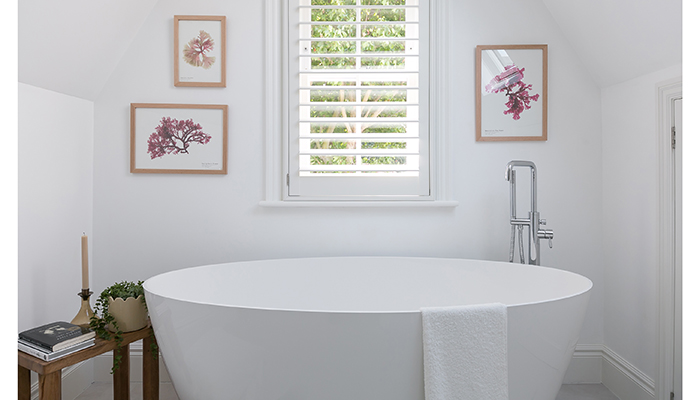
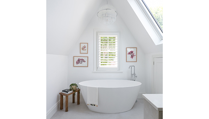
A key product choice was the Bette floor tray. The family’s agreed labour cost with their builders did not extend to fully tiled wetrooms. And the Adamsez York bath was chosen as the material and shape elevated the design, having a more contemporary feel that worked perfectly with he windows and feature pendant light
Q: Are there any design elements that you’re particularly proud of?
A: This project demonstrates that a neutral bathroom can be warm, inviting, and full of character, all while adhering to budget constraints. It's a testament to how thoughtful design and strategic planning can create a space that is both timeless and elegant. I am confident that this loft bathroom design will look as good now as it will in years to come when the couple move upstairs and make it their principal master en suite.
Tags: bathrooms, features, simply bathrooms, sophie harrold, loft bathroom


