A Victorian property with a tired interior proved a unique challenge with its unusual layout and double-height proportions – Stephen Kavanagh of Stephen Kavanagh Architects reveals how he and his team created a stunning space with a welcoming feel.
Q: What type of property was it in and who was the project for?
A: The property was a converted Victorian schoolhouse. The homeowners, Clare and Shona, tasked us with a full refurbishment of the dated and inefficient 1990’s interior. The challenge was to provide an ambitious design on a moderate budget.
Q: How did you go about meeting the brief?
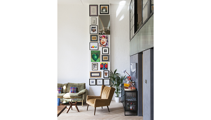
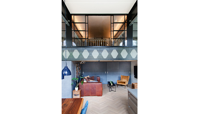
A: The incredible Victorian structure containing the apartment gave us the lead we needed. The only successful part of the original flat was the double-height space that ran the length of the apartment, lined with three dramatic double height arches, with a mezzanine tucked into the back of the space. We started by stripping back the entire space with the extension of the main castellated beam supporting the original mezzanine. As the one retained piece from the original space, we were determined to make a feature of it.
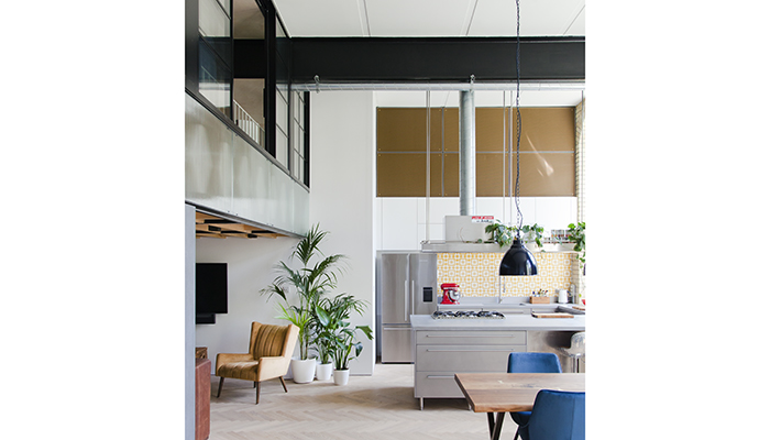
Beneath the bedroom mezzanine, we created a cosy nook for watching TV and relaxing – a counterpoint to the large open-plan living space, which could be separated off with a curtain.
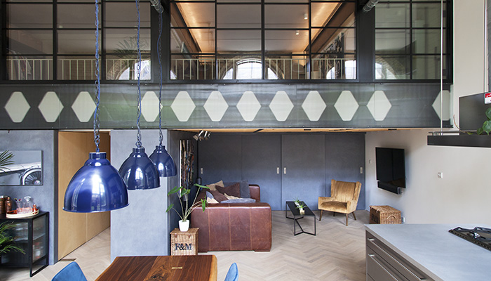
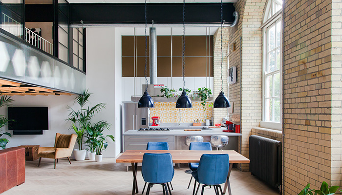
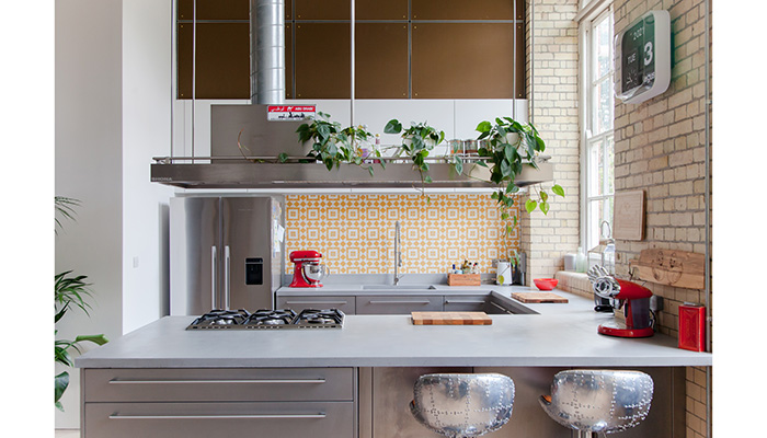
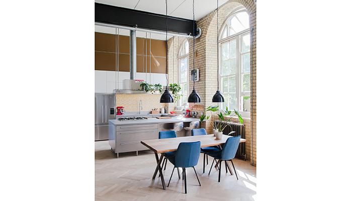
For the kitchen, we decided to keep the same location as the previous layout. There was a lot of sense in doing so – lighting levels, its location at the end of the living space, its position relative to main building services, etc. At the same time, we made a number of significant improvements. We omitted the raised platform that the kitchen sat on, which made the kitchen feel part of the space and much less formal. Crucially, we moved the oven and hob to the peninsula facing into the living room, turning cooking into a social activity.
Q: What type of cabinetry did you choose and what made it the perfect choice?
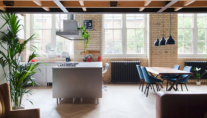
A: The unusual nature of the space meant that an ordinary high-street kitchen wouldn’t be appropriate. The pseudo-industrial aesthetic we developed with the clients precluded anything too traditional, but also anything too minimalist and sterile. We drew inspiration from the developing nature of Bermondsey itself, and how many buildings around Bermondsey Street had been transformed from functional warehouses into refined restaurants and cafés.
We engaged a company called Cavendish Equipment, who specialise in stainless steel kitchens. As a company that originally served the catering industry, their kitchens had an admirable sense of purpose. With a few custom touches, such as the long horizontal handles, we sought to turn this affordable, well-built kitchen into an integral part of the design.
Q: What materials did you use? Did you use anything different or unusual?
A: We settled on stainless steel for the units. This was the most cost-effective version of the catering kitchens available, but was also more subdued than alternatives such as brass. It was the same reason the clients chose to go with a concrete worktop.
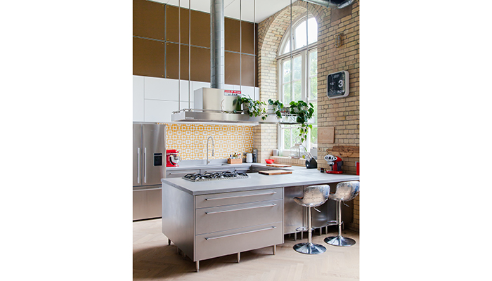
The key feature of the space was the sense of space itself, and the composition of all of the various elements within it, rather than a single element. It didn’t feel right for the kitchen to have materials that would dominate, and the neutral kitchen helped make the space feel bigger. Above the kitchen, we employed a subtle brass mesh to hide an acoustic screen, removing a dominant echo that had previously existed. Behind the kitchen, a small colourful splashback was added using encaustic cement tiles.
Q: What were the reasons behind the choices for the appliances?
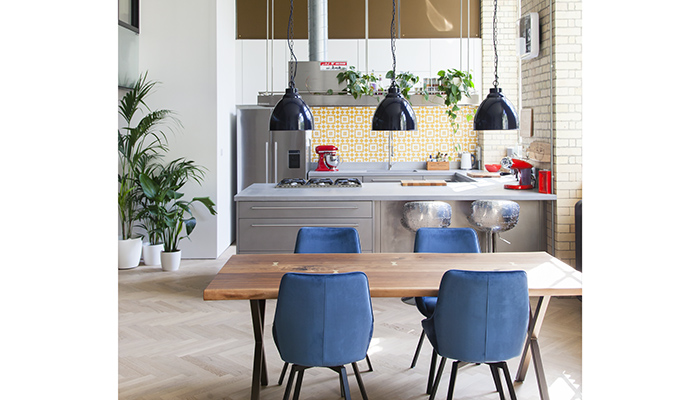
A: The Fisher & Paykel fridge-freezer was chosen as it matched the overall look of the Cavendish kitchen, while being big enough to suit a home of this size. The Smeg oven and hob were chosen for similar reasons, suiting the playful industrial look.
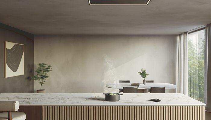
The big choice was how to procure the unique, suspended extractor hood, which helped to define the kitchen as a 'space within a space'. The tall ceiling meant that there were no viable off-the-shelf solutions, so we turned to Westin for a bespoke design. They proved to be the right choice, providing both a functional appliance and an architectural frame for the kitchen.
Q: What were the particular challenges that you faced and what were your solutions to overcome them?
A: One interesting challenge was how to successfully serve an apartment that is bigger than most terraced homes in London with only a single external wall. As with much of the project, we turned this unique challenge into an opportunity and hung visible galvanised ducts along the underside of the steel beams. Similarly, for electrics, there was no way to hide cables within the exposed concrete ceilings so we carefully employed galvanised conduit to distribute power.
In a broader sense, the budget was the biggest challenge. Meeting the targets meant making careful choices for all aspects of the specification, without compromising the impact of the finished space.
Q: What is your favourite part of the finished project?
A: The cosy, inviting nature of the home is one of its greatest successes, transforming what was a cold, echoey void. This was achieved by taking the large social space and carefully breaking it down into a series of smaller sub-spaces. The bespoke Westin extractor defined the kitchen. The tall, dramatic pendants centred the dining table. The living space was tucked into a quiet corner. It really feels like a space you want to spend time in.
Q: What is the client's favourite part of the finished project?
A: I think they enjoy the pops of colour and eccentricity. We were keen to give them a neutral canvas that they could make their own, albeit a canvas with some soul. And they’ve very much made the space their own.
