How Rhian Williams from Harvey Jones created a family friendly design
How Rhian Williams from Harvey Jones created a family friendly design
The kitchen is the heart of the home where all the family can congregate together, but what are the essential ingredients that make it practical for children – and pleasant for adults – to be in? Harvey Jones senior designer Rhian Williams talks us through a recent project, and reveals her top tips – as well as the main pitfalls to avoid.
Q: What are your top design strategies for creating a family friendly kitchen space?
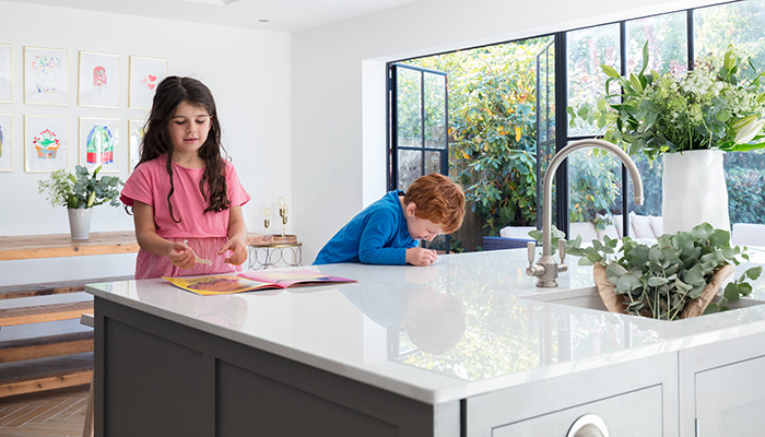
A: A family friendly kitchen must have two key elements in my opinion – versatile functionality and low-maintenance beauty. It needs to keep up with the ever-changing demands of typical family life and grow with it. Consider zoning the space to maintain a practical working side to the kitchen that is safely – but not noticably separate – apart from the sociable areas. The space needs to be able to accommodate a family altogether, while catering for individual needs too. We need the perfect balance of 'versatile functionality meets beautiful backdrop for the family photo album'!
Q: What are the key things to avoid?
A: Avoid elements in the design layout that could conflict or create congestion in a busy space. For example, keep an accessible route between the hob and the sink and avoid combining that route with the main walkthrough to the garden, or adjacent room. Also, do your research on materials and finishes – a family friendly space is one the client doesn't have to worry about, so opt for hardwearing surfaces that are super practical for busy lifestyles, and can withstand being used and abused by all ages.
Q: What are the elements in this design that you created with a young family in mind?
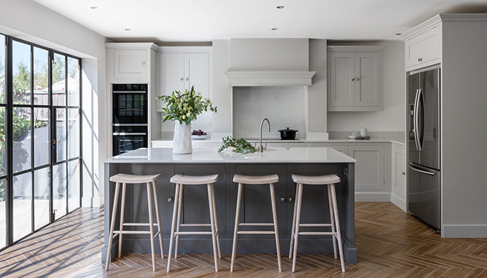
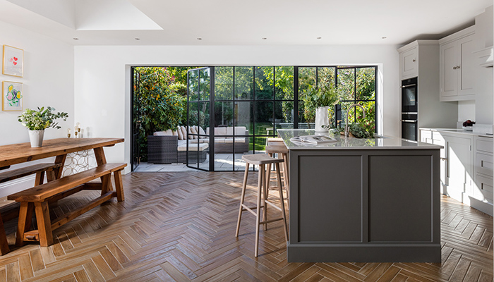
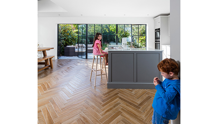
A: Clever zoning and positioning of the central island in this kitchen has made for an incredibly versatile and practical family space. One side of the island provides the designated 'working area' with easy flow between the sink, hob, ovens, fridge-freezer and preparation/serving countertop space, while the other side of the island is multifunctional – it offers sociable seating areas for after school catch-ups, after work catch-ups, breakfast, homework, family dinners, parties, and endless family fun! The fridge-freezer being positioned centrally between the two zones works brilliantly – the kids can help themselves to a drink or a snack while dinner is being prepared without any risk of dangerous collisions with a hot pan or tray! The ovens are set back at eye level in the far corner of the room, which not only contributes to an incredibly safe working layout, but also balances the space perfectly. A very subtle design detail to note are the softly rounded worktop corners – always a consideration to minimise any painful head bumps to wobbly toddlers!
Q: What were the particular design challenges that you faced and what were your solutions to overcome them?
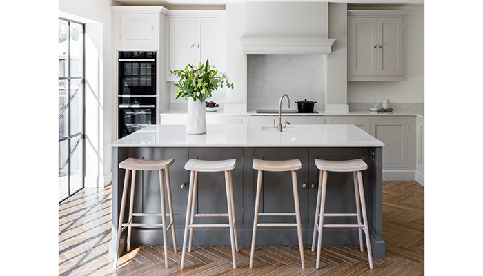
A: It can be difficult to maintain visual symmetry in an L-shaped design and, even more so, to introduce a chimney mantle and maintain the impactful focal point that it is intended to create. In this design, the double wall cabinet each side of the chimney achieves a perfect visual symmetry. We also enhanced the balance by using a deeper colour in a localised area to compliment the neutral backdrop – the island therefore works to draw your eye from perceiving a natural centre point in the space, while creating a tonal, sophisticated and timeless interior scheme.
Q: What is your favourite part of the finished project?
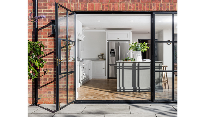
A: I absolutely love the Crittall-style doors with a panoramic view of the garden – they complement the design perfectly and really open up the space, bringing the outdoors in.
Tags: kitchens, features, harvey jones, rhian williams, family friendly


