How mixing finishes helped Freshwater Interiors create a unique space
How mixing finishes helped Freshwater Interiors create a unique space
Hannah Malley, designer for Freshwater Interiors, reveals the design process behind this Morocco-inspired bathroom scheme that's rich in tone and texture, and explains why her favourite part of the entire finished project – is the ceiling.
Q: What was the brief from the client for this project?
A: The project was in a detached coastal property, and the brief from the client was, above all, blue! But she also wanted something to remind her of her travels to Morocco and beyond on days when the weather was dreary in Wales.
Q: So how did you go about meeting the brief?
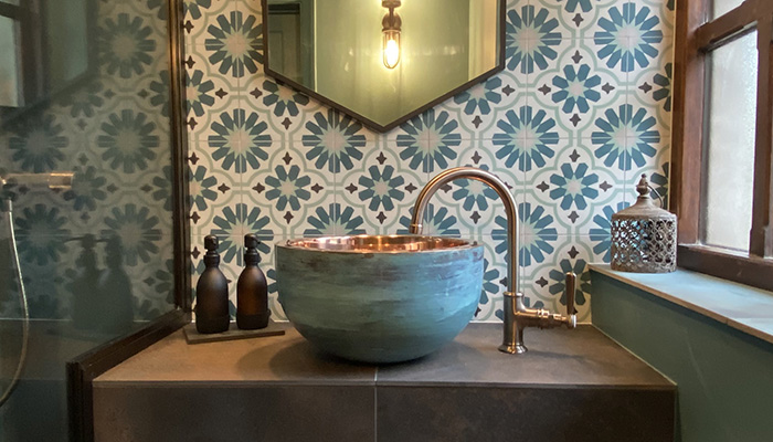
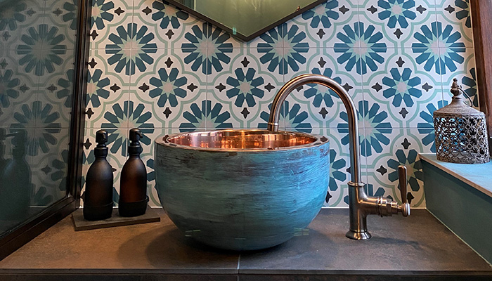
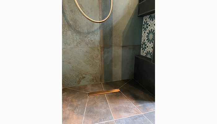
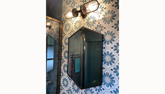
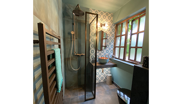
A: We knew she was interested in the idea of patterned tiles and a unique basin as features, so we built out from there using a mix of complementary finishes for an eclectic feel. Elsewhere, large-format, moody tiles in combination with the deeply coloured walls and ceiling really gave the sense of immersion that the client was after.
Q: What were the particular challenges that you faced during this project, and what were your solutions to overcome them?
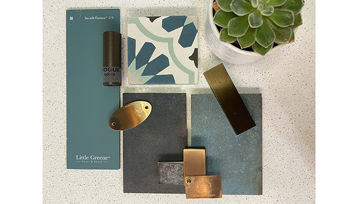
A: Our challenges included sourcing products from a range of suppliers, and offering different special finishes, while keeping a cohesive look at the same time. By using mottled-effect tiles that encompassed differing shades, a wider scope was available to us and the mix of finishes didn’t become chaotic.
Q: What materials did you use? Did you use anything different or unusual?
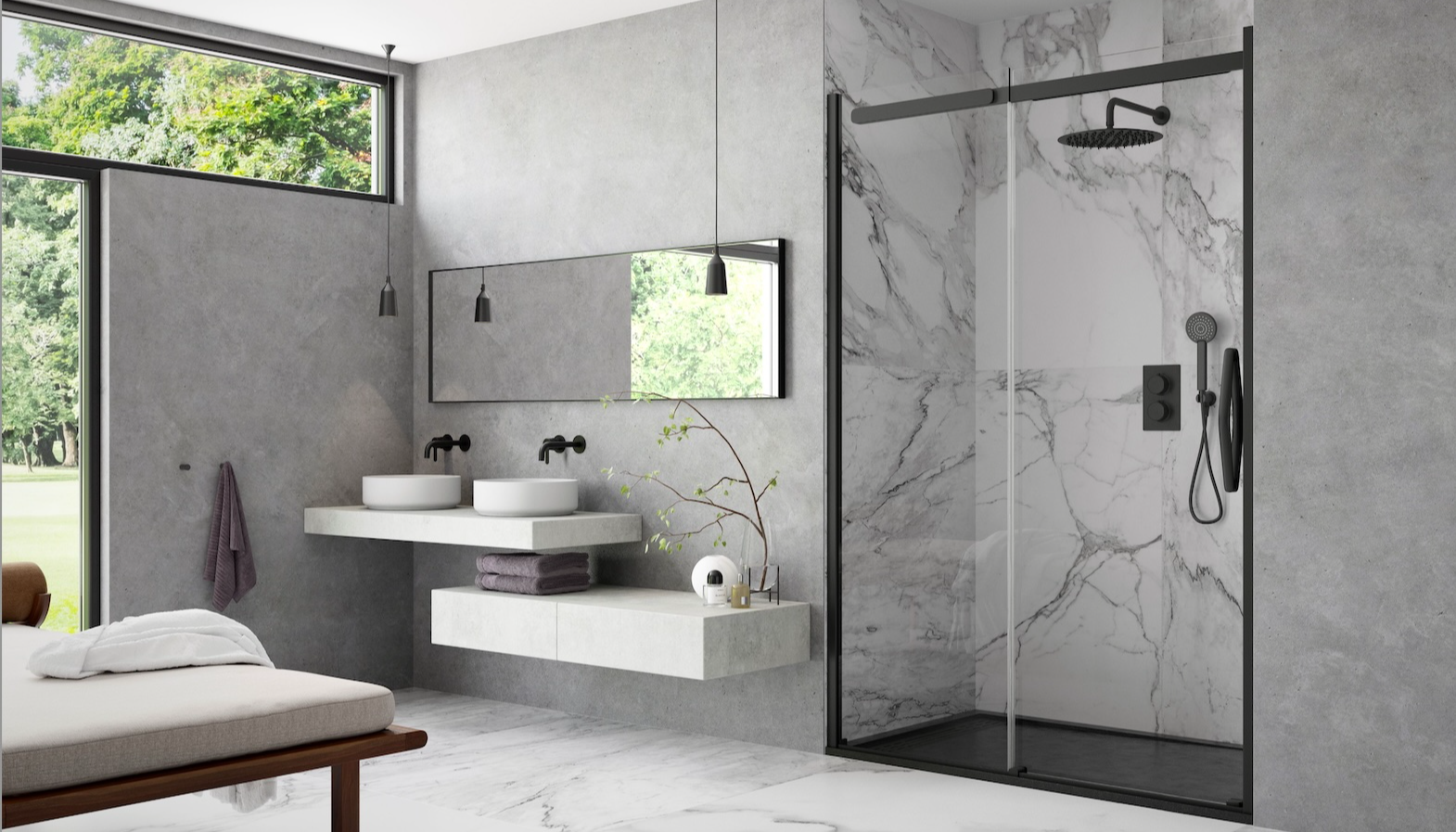
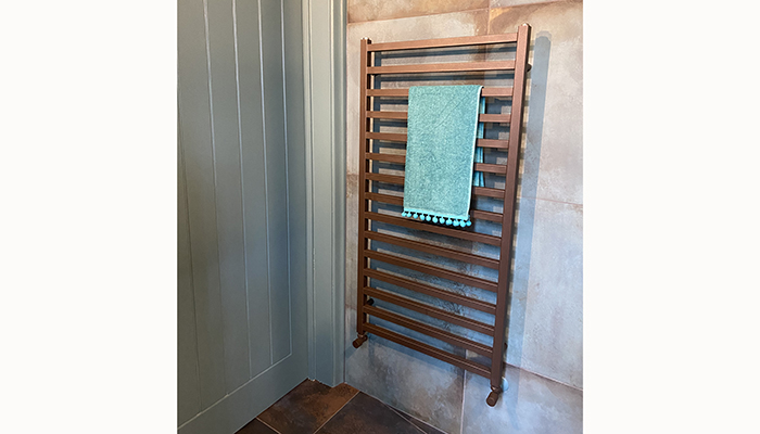
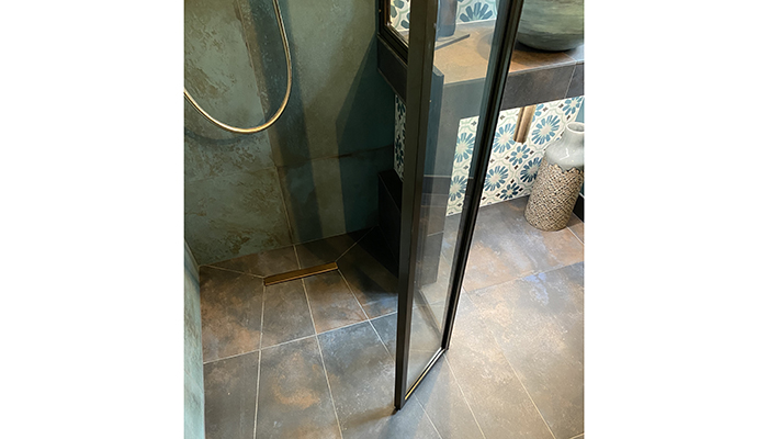
A: Porcelain and encaustic tiles, brass, copper. Encaustic tiles can be seen as an unusual choice but with some extra care taken with placement and during installation, they can offer up a great additional texture to a scheme. The shower screen was bespoke by Drench, and it allowed us to maximise usable space in this tight room with its moveable flipper panel.
Q: What were the different products that you and the client chose, and what made them the perfect choice?
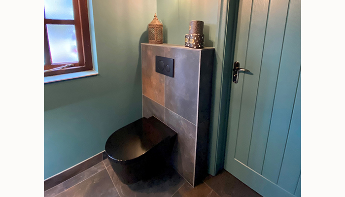
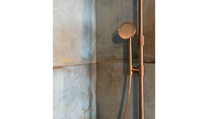
A: We steered clear of conventional white sanitaryware and chrome altogether, opting for a moodier palette with a Laufen black toilet and mixed metals. The standout product in this scheme has to be the Axor shower. It's a really showstopping piece of hardware with a distinctly different – almost steampunk – look, all without compromising on functionality. It was perfect for this project… just because!
Q: What would your advice be to a designer who is just setting out on a similar project?
A: Absolutely work to the brief, but always stand your ground on the things you think make the room. A little more money spent on specialist elements can really elevate the whole scheme.
Q: What is your favourite part of the finished project?
A: One of my favourite features is actually the painted ceiling, complete with… NO spotlights. We were so glad she was brave enough to go for it, using just ambient Original BTC wall lights, it really envelops you and makes this little room feel all the more special!
Q: What is the client's favourite part of the finished project?
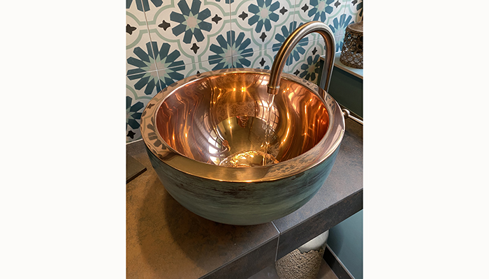
A: The William Holland washbasin is probably her favourite, and for good reason. The hand finished exterior contrasting with the bright copper interior makes for an amazing focal point as you enter the room.
Tags: bathrooms, features, freshwater interiors, hannah malley, laufen, william holland, axor, hansgrohe, drench, original btc


