10 two-tone kitchen schemes with a high-contrast approach to colour
Mon 20th Dec 2021 by Emma Hedges
10 two-tone kitchen schemes with a high-contrast approach to colour
Whether it's to subtly zone the space and separate the wall units from the island, or to create some high-contrast visual drama between upper and lower cabinetry, a two-tone kitchen is an on-trend way to create lasting and impactful style. By Emma Hedges.
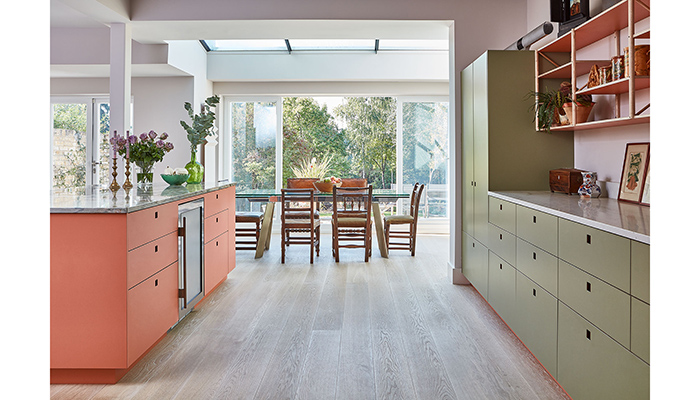
1. The Ritzy (coral, peachy pink) and Brockwell Moss (olive, khaki green) cabinets from Pluck, work together to create a kitchen scheme that's full of joy, and contrasts without clashing. The colours are all high-pressure laminate, and come in a range of warm, neutral and bold shades, while Pluck's doors all feature recessed handles to offer a streamlined look.
2. The Devine collection from Tom Howley is shown here in earthy green Serpentine on the base cabinets, while pale Sorrel gives the scheme a tonal lift on the upper section. The two-tone effect works to keep the block of units from feeling overbearing, and introduces a contemporary feel to an inherently traditional kitchen.
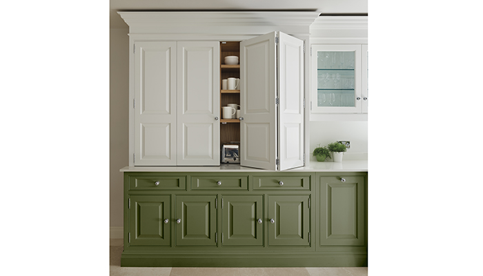
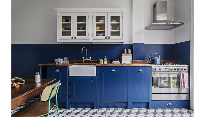
3. This design from British Standard features the brand's elegant Shaker style, and involves some serious colour blocking, placing resonant blue units in Little Greene's Smalt beneath a colour 'tide line' that extends up the wall, and bright Loft White wall units above it. The two-tone effect tricks the eye and enables the pale units to almost disappear from view.

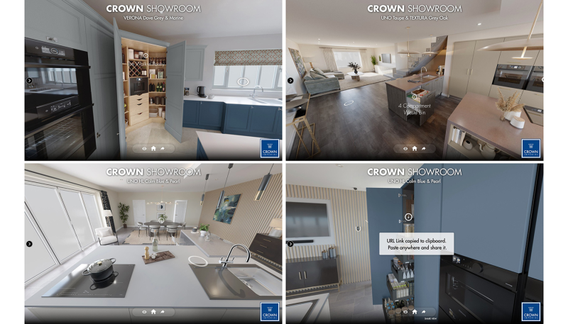
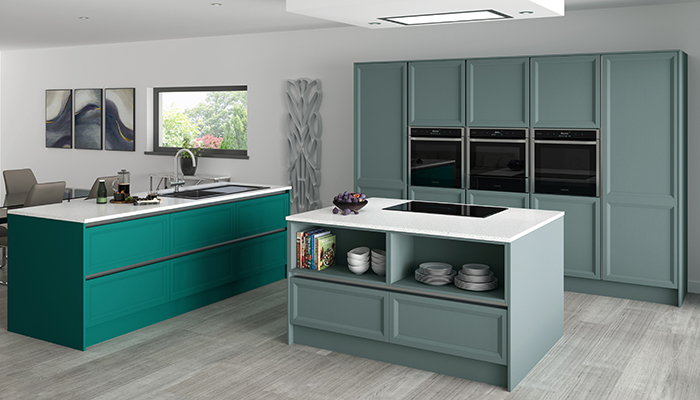
4. Crown Imperial has extended its range of colours to offer retailers design flexibility – this is the modern classic Rimano range, which works with or without handles. Here the kitchen area on the right is defined by soft, muted Sage, while the vibrant Mint island on the left signals the shift in the zones towards the living area.
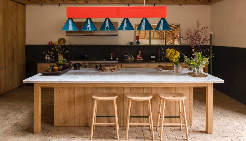
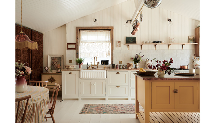
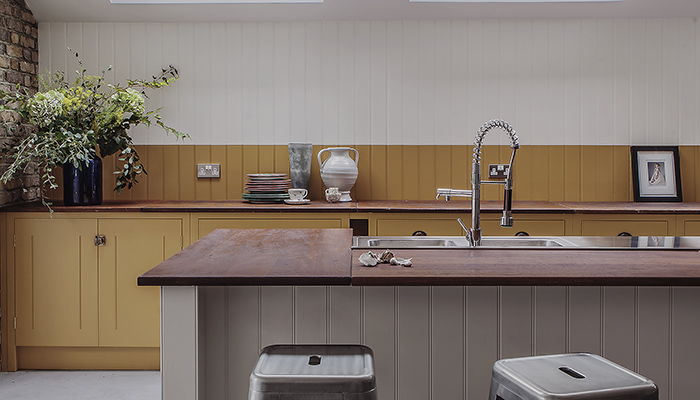
5. This design by DeVol is in Pearl Lowe's new holiday home by the sea, and features a long run of cupboards in pale Linen, along with a prep table in warm Scullery Yellow teamed with a copper worktop. The easy mix of the brand's modular Haberdasher's furniture works to give the open plan space a relaxed living room feel.
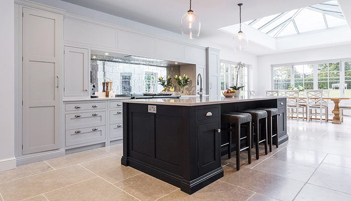
6. This epic kitchen by Burlanes Interiors shows Wellsdown cabinetry in Mylands' light grey Ludgate Circus along the walls, while the central island is in Bond Street – a deep blue verging on black. The sophisticated blend of the pale cabinetry, which makes the most of the abundance of natural light, and the dark island, anchors the space and packs it with personality.
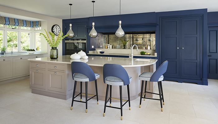
7. Here Martin Moore reverses the strategy, and places the emphasis on the main run of cabinets from the brand's New Classic collection by painting them Deep Cobalt. To soften the effect and create harmony, the curved island is painted in Lilac Grey, which is then extended into the living area of the open-plan space.
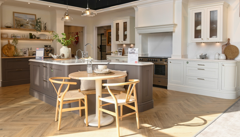
8. The combination of Farrow & Ball's India Yellow on the wall section of units, and Mole's Breath grey on the island in this design by British Standard places two very different but complementary earthy hues together in a warm scheme with a cool vibe. The design is topped with All White walls and ceiling to open the space up.
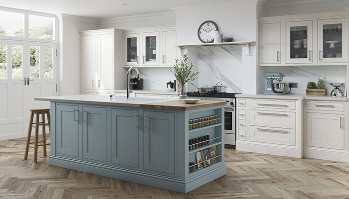
9. Mereway Kitchens' latest new colour addition Teal Mist is shown here teamed with Chalk White on the brand's English Revival Shaker collection. It's a fresh combination that adds an on-trend bold flourish to the essentially traditional-style scheme.
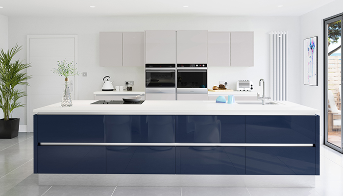
10. The high-contrast colour approach works beautifully with this two-tone gloss finish design, featuring Crown Imperial's handleless Furore range in Midnight Blue and Cashmere. Doors from this collection also come in Grey Silk, Coffee Light, Grey Light, Grey Pale, Grey Aqua, Graphite and Black.
Tags: kitchens, features, two-tone kitchens, colourful kitchens, crown imperial, martin moore, burlanes interiors, devol, british standard, pluck, tom howley, mereway kitchens


