Expert view: The hottest digital design trends to look out for in 2022
Tue 21st Dec 2021 by Katrina Bell
Expert view: The hottest digital design trends to look out for in 2022
Our web expert Katrina Bell rounds up the latest design trends to help you get in front of the next wave of digital innovations to stay ahead in the New Year.
Whatever changes we see in 2022, you can guarantee that the designers and developers of our digital footprints are hard at work making our sites and apps smarter and faster. Here’s what to look out for.
1. The thumb's the star
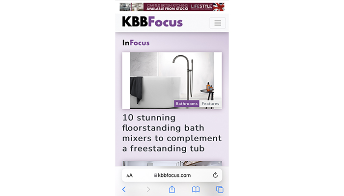
Over half of Internet traffic is mobile driven, so interactions on all devices will focus even more on the natural movement of the hand rather than a mouse. A December 2021 Apple iOS update moved the browser address bar from the top of the screen to the bottom – all the better to allow for a one-handed browsing.
2. The need for speed
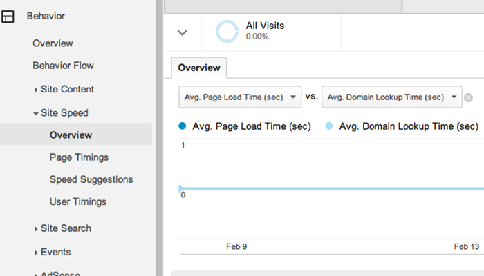
Since Google started conducting mobile-first indexing in 2019 the ranking algorithm is getting increasingly rigorous – if you don’t want to see your search results tank, details such as page-load time should be on your regular must-do task list. Using Google’s Page Speed Testing tool in Google Analytics will tell you at a glance how you are doing right now and where you need to aim. Or you can sign up for a service such as Pingdom (www.pingdom.com) that will highlight performance bottlenecks like slow loading pages or buggy coding. You can currently sign up for a 30-day free trial.
3. Hero worship will wane
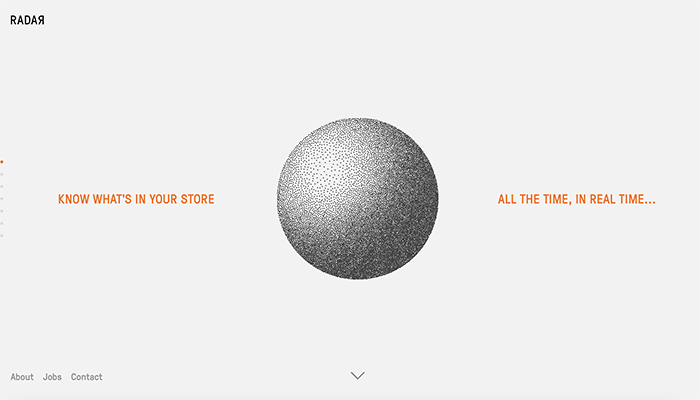
Image-laden hero images that use up the top of a site could make way for more activity driven content. So instead of using up all the real estate above the fold with a bandwidth-hogging image we might see animated menus, stylised design and short videos that do the same job of establishing identity and mood. RFID developer RAJAR’s site is pared down, characterful and packed with usable links from the get go.
4. Bias towards everyone
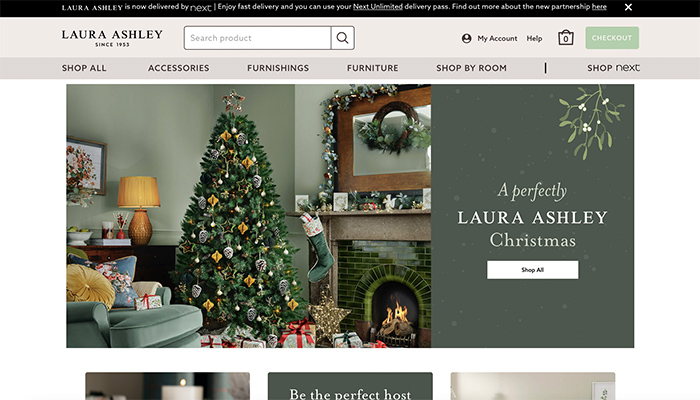
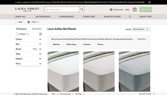
Gender-neutral interfaces will offer a more accessible approach – have you ever noticed how some sites have a profoundly gender-specific home screen? Laura Ashley is a great example as the entrance is consistently feminine in its use of fonts and colours, however once you get into the purchasing product screens, the flourishes have gone. Foregoing gender-stereotyped design makes perfect sense as your user experience is less likely to be off-putting to anyone, however they identify.
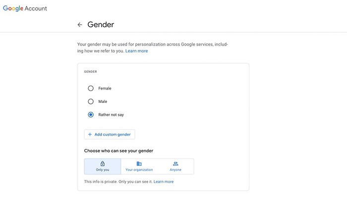
Inclusivity will also see the end of forms that require a binary response to gender or titles, so now would be a good time to audit yours. Google’s latest approach is to allow users to create a custom gender but the explanation of why it needs your gender at all is fuzzy.
5. Lose the lumber
Designers are already leaning heavily on lightweight real estate, so expect swathes of white space, fewer words and less intrusion from clutter. Rather than overloading a visitor with complex interactions, a calmer, mindful space will avoid information overload, which causes many of us to feel overwhelmed and bounce away without completing our tasks.
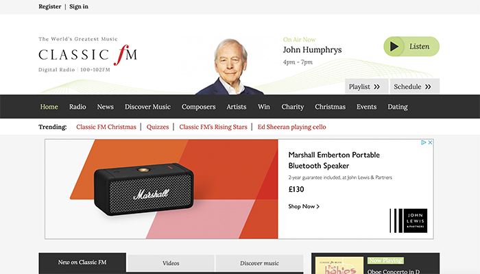
Jazz FM Romania’s (https://jazzfm.ro) beautifully chunky website by agency Anagrama has nailed the ‘Get to the Good Stuff Principle’ of layout – the large black triangle represents the play button to stream online, and is a fantastic expression of a layout that engages with immediacy and style. Compare this with the UK’s noisy Classic FM site and the juxtaposition is startling. There’s no prize for guessing which radio station’s online presence gets my vote.

6. 4K means four-times the density
As screens and even monitors transition from HD to 4K that offers four times the pixel density and mobiles to 5G, 2022 will see another chance for illustrators and designers to create environments that rely less on text and illustrative images. Enter increasing use of video, 3D animation and interactive imagery. That can only mean more originality and freedom to express even with the most mundane of subjects.
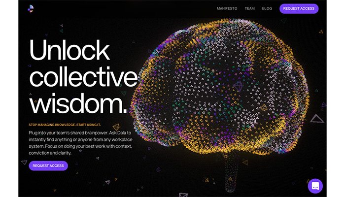
Take a look at Dala’s (https://dala.craftedbygc.com) cinematic home screen, which looks and feels more like the intro to a cutting-edge sci-fi movie than a dry as dust introduction to a business selling workplace solutions.
Tags: insight, features, digital design, digital trends, kitchens, bathrooms


