How Simply Bathrooms worked with light and dark tones in an open space
How Simply Bathrooms worked with light and dark tones in an open space
Sophie and Neil Harrold of Surrey-based Simply Bathrooms reveal how they set about drawing a spacious scheme together using a high-contrast palatte and some stand-out statement pieces.
Q: What was the brief? Was there anything unusual about it?
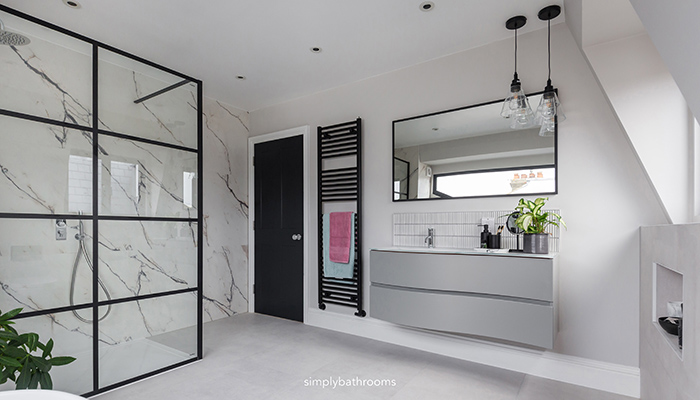
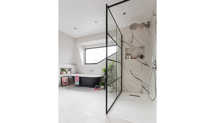
A: Our customer had a beautiful period property in Putney and was planning a modern extension which meant refurbishing three bathrooms within the house. This bathroom was ‘his bathroom’ within the new second-floor loft space. Within the bathroom the couple wanted a large walk-in shower, a full-sized bathtub, and a spacious vanity area. The couple wanted a light and airy space.
Q: How did you go about meeting the brief?
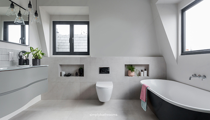
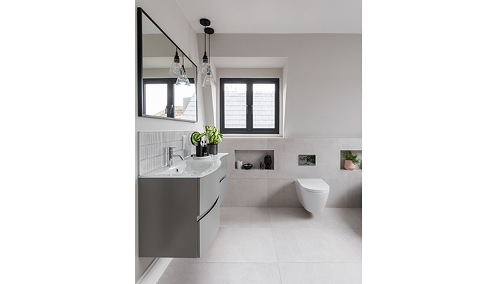
A: Our customer had a pitched roof to one side of the room and the original architects' plan had suggested a close-coupled WC on the left-hand wall to avoid this space. However we suggested a new plan, opening the space up by creating half-height boxing along one side of the room to allow for a hidden cistern. This design created shelving and alcoves to make good use of the space and it also allowed us to move the WC onto the wall with the boxing so we could free up more space on the left-hand wall for a larger vanity area and some feature lighting.
Q: What materials did you use? Did you use anything different or unusual?
A: Throughout our design consultations the customer requested subtle grey bathroom scheme with a contemporary feel. Due to the size of the room, we encouraged our customer to look at large-format tiling on the walls and floors for a much more modern feel. We also encouraged our customer to look at more than one tile type as she had originally requested. Instead, we kept the colour scheme neutral but added interest through introducing three different tile designs. For the largest square meterage we used Ca' Pietra’s Louvre Blanc porcelain soft grey tiles. Not only were these affordable for a large space, but they also provided the perfect backdrop for the feature splashback and shower wall tiles to do all the talking.
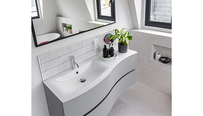
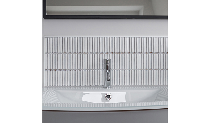
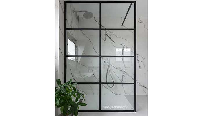
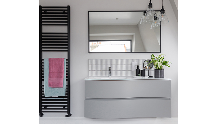
We added a statement feature wall around the shower area with large-format porcelain marble tiles, keeping the colour of the print monochromatic meant these remained neutral while still adding real wow factor! For the vanity area we wanted a simple yet modern mosaic and Ca' Pietra’s white bamboo were perfect for this space, pulling together the soft neutral colour scheme and contemporary style.
Q: Are there any design features you particularly like?
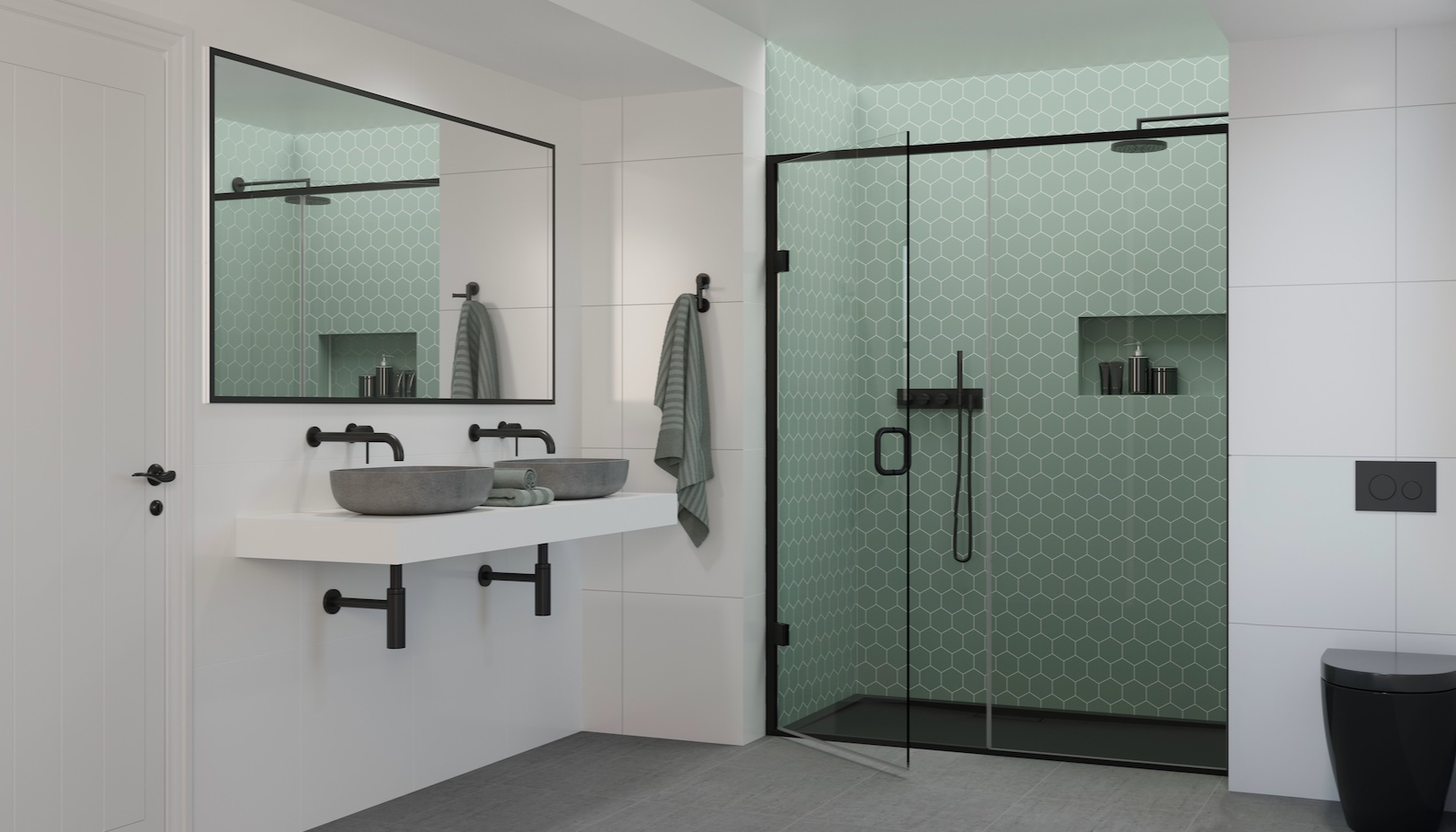
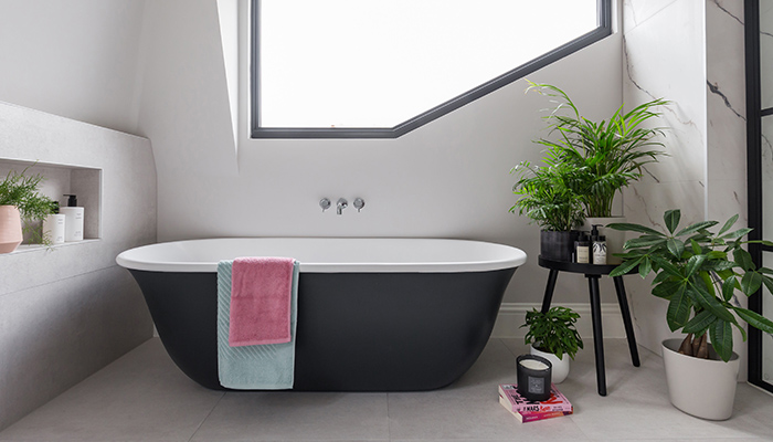
A: We loved the large walk-in shower with black grid screen and striking black Omnia bath under the modern black window frames. Colour-wise, as the room had a lot of natural light, we opted for a darker contemporary matt black on the bath, shower screen and some of the fittings to give the design a modern edge and prevent the chrome brassware from looking too traditional. We particularly like the balance of the black accent colours alongside the chrome brassware.
Q: What is your favourite product within the design and why?
A: The vanity unit and feature lighting… this was a big space to fill with a neutral scheme, but this understated wall-hung vanity is the unsung hero within the room. The curved design is clean and fresh, and the white glass worktop gives a sharp finish. The black mirror and statement lighting add just the right amount of drama and finish this design off perfectly.
Tags: bathrooms, features, simply bathrooms, bc designs, impey, crosswater, bathroom origins, ca pietra


