Mereway Kitchens unveils new-look branding to reflect luxury identity
Mereway Kitchens unveils new-look branding to reflect luxury identity
Mereway Kitchens has unveiled its new visual identity, which the company says embodies its brand values of beauty, craftsmanship and conscious design. The new look for Mereway Kitchens has been created to reflect the company’s deserved place in the luxury arena.
Founded on a passion for artistry and exceptional quality, Mereway Kitchens has been handcrafting kitchens in the UK since 1986.
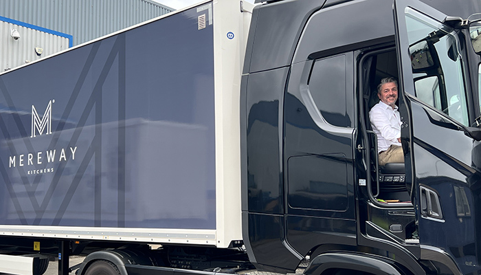
In a complete rebranding campaign – the first since its origin – Mereway has a new website with increased interactive functionalities and optimised retailer and Premuim Partner pages, a new range of POS materials, reskimmed liveries and a storytelling video – see below.
The collections have been curated into two new brochures – Mereway Kitchens and Mereway In-Frame, designed to make the selection process more experiential for consumers and showcasing designs more easily for retailers.
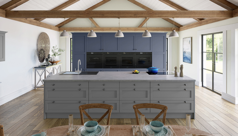
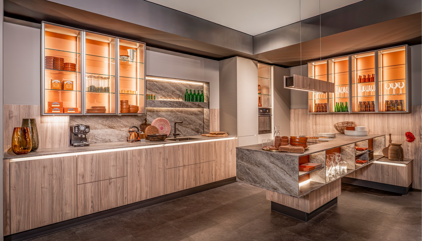
The namesake brochure combines contemporary and modern classics. The popular Q-Line collection sits alongside woodgrain Shakers, with plenty to inspire – including concepts that rip up the rule book, blending a handleless, super-contemporary kitchen with a skinny shaker door, pushing the boundaries of design.
In-Frame Kitchens highlights the brand’s premium range, which can be personalised with a carefully selected colour palette of hand painted finishes to create a timeless design.
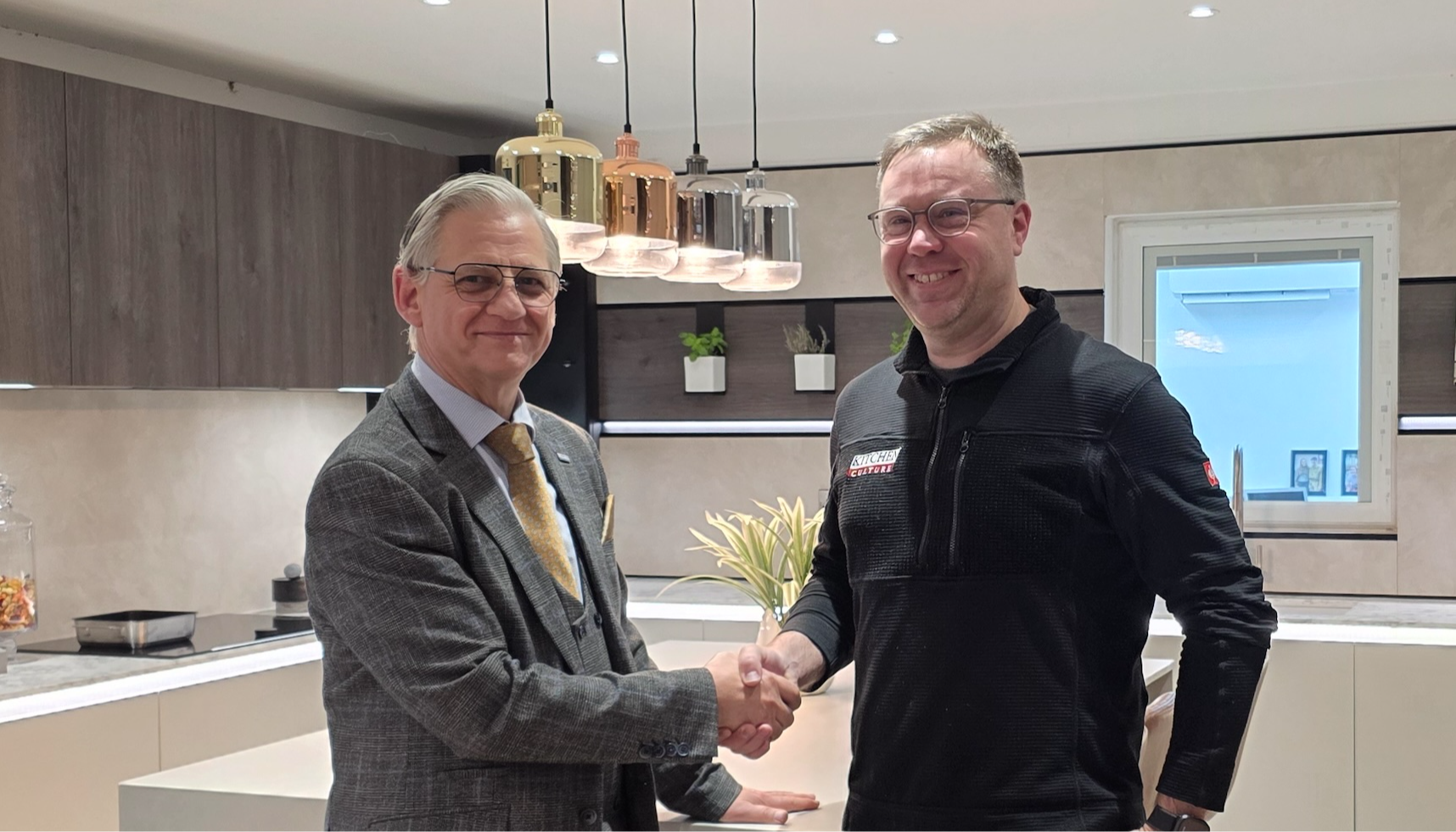
Mark Mills, MD of Mereway, pictured, said: “We’re excited that after years of brand development, we are able to present this complete refresh. It’s our privilege to work with so many great retailers who share our ethos of quality, care and creativity and are proud to endorse Mereway.”
Tags: kitchens, news, mereway kitchens, mark mills, mereway group
Sign up to our newsletter
Most Read
Designing with colour: The timeless appeal of painted kitchens
Sun 26th Apr 2026


