How Simon Taylor Furniture created a dream bedroom for stylish clients
How Simon Taylor Furniture created a dream bedroom for stylish clients
Tony Lister, senior designer for Simon Taylor Furniture, reveals how he created a perfect bedroom scheme with plenty of hardworking storage to keep the space clear, and a luxe finish that made it truly unique.
Q: What type of property was it in and who was the project for?
A: It's a large Victorian house in Buckinghamshire owned by a charming couple for whom we have already undertaken refurbishment work on their kitchen and en suite bathroom. This was their next big project for the master bedroom and we were delighted when they commissioned us again.
Q: What was the brief?
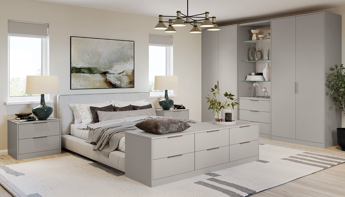
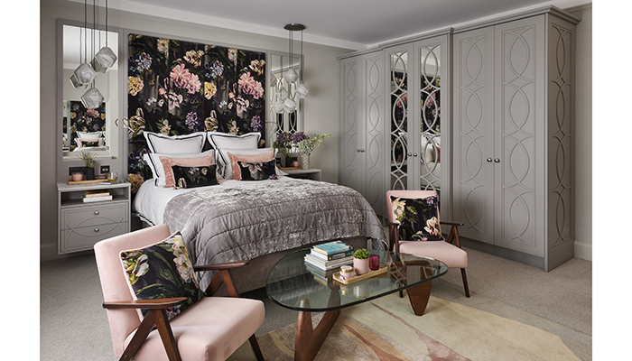
A: Our client’s brief was to design a soft luxurious bedroom with plenty of internal storage, a dressing table and a statement headboard. We worked in association with their interior designer, Karen Jackman of Karen Jackman Interiors, who sourced paint colours, textiles and fabrics for the scheme. The core colour for the room is grey with pink accents and walls and cabinetry are handpainted in Worsted by Farrow & Ball. Our clients have a love of mid-century modern furniture, so the look had to include 20th-century accents. We did a lot of research and found images that would fit the look our clients were seeking, and then we made our own recommendations, which they loved.
Q: What type of cabinetry did you choose and what made it the perfect choice?
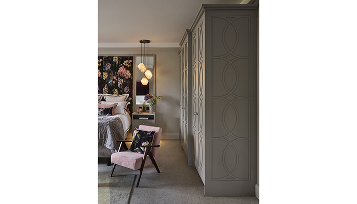
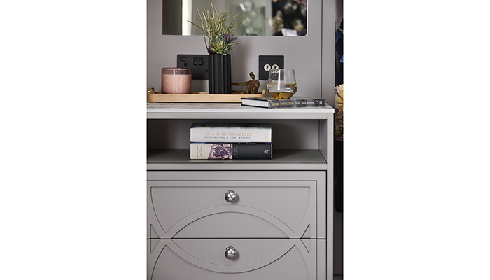
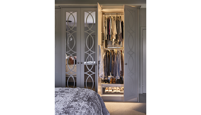
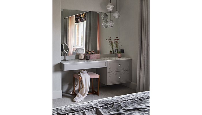
A: We presented a geometric pattern for the wardrobe cabinetry, yet with a circular design to soften the aesthetic. We also recommended floating bedside tables and a similar style floating dressing table, with design accents repeated for each. All the handcrafted tulipwood cabinetry was made bespoke at our Cabinet Workshop in Bierton.
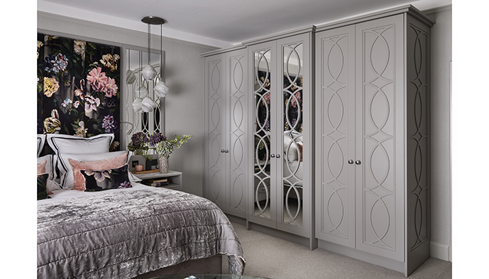
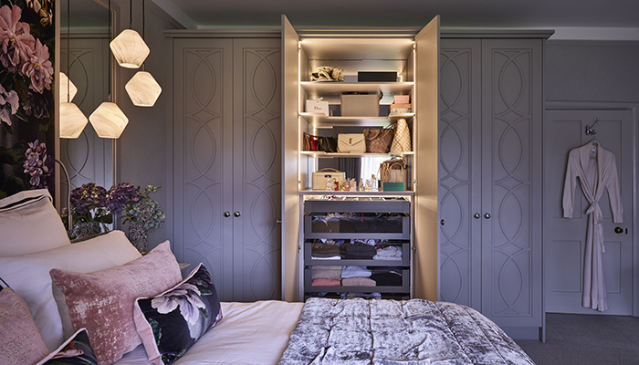
The wardrobe features two mirrored centre panel doors that were designed and handmade to perfectly fit the dimensions of the bedroom. Internal cabinetry on either side of the central section was designed on a ‘his and hers’ basis with pull-down and fixed hanging rails plus pull-out shoe storage, all lit using rebated LED lighting strips in natural white. The top half of the central wardrobe is used for accessories, with dedicated shelves for our client’s designer handbag collection. These feature a mirrored back panel and LED lighting that entirely showcases the internal area.
Q: Did you use anything different or unusual?
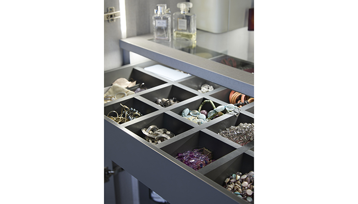
A: For the central section of the wardrobe, we used contemporary fittings for the internals, including Legrabox drawers. These comprise the lower half have clear glass window fronts for easy access to folded clothing and woolens. A slim top drawer has separate compartments and is dedicated to storing jewellery and watches.
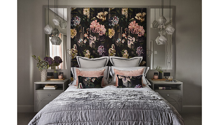
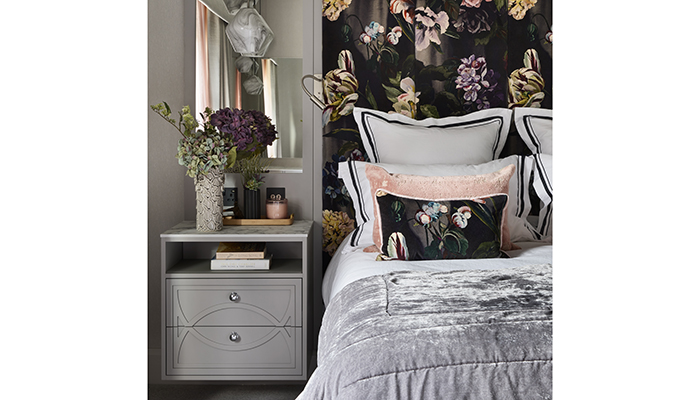
The most unusual aspect of the bedroom is the headboard, which is designed to look as if it is a single piece that includes floating bedside cabinets with mirrored panels above them on either side of a tall centrepiece. This is upholstered in Delft Velvet in Noir by Designers Guild. On either side of the bed and integrated within the headboard are LED reading lights, while in front of the bedside cabinets, and illuminating the dressing table area, are Ada pendant lights by John Lewis.
Q: How helpful was it that you had already worked on other rooms in the house when it came to doing the bedroom?
A: It was very helpful. Because we had worked on other rooms in the house, we definitely had an understanding of what the clients wanted right from the start. Because this was part of a master suite, we were able to make the style of the rooms flow perfectly.
Q: What are the key elements to consider when designing a bedroom, as opposed to other areas in the house?
A: Bedrooms and dressing rooms can be quite tricky to design as you often have to take into account the needs of two people, who each have different space requirements. We try to ask as many detailed questions as possible in order to present a truly personalised solution to fitted wardrobes and furniture for the bedroom. This is where it helps working with a bespoke furniture company, because every aspect of the room is tailor-made for that client.
Q: What is your favourite part of the finished project? Are there any design elements that you’re particularly proud of?
A: At Simon Taylor Furniture, one of our design signatures is space-efficient furniture pieces that look like they are floating, or on a cantilever. I particularly like the floating bedside cabinets that complement the floating dressing table. I also loved the pendant lighting that is featured in both of these areas, because it showcases the mid-century modern aesthetic.
Q: What is the client's favourite part of the finished project?
A: It is the geometric pattern that runs throughout the cabinetry from the wardrobes to dressing table to the bedside cabinets.
Tags: insight, features, simon taylor furniture, tony lister, bedroom design, kitchens, bathrooms


