Crown's Justyna Korczynska reveals on-trend ways to work with colour

Crown's Justyna Korczynska reveals on-trend ways to work with colour
Homeowners have woken up to the fact that injecting colours they love into spaces gives a boost of positive energy and improves the level of comfort – Justyna Korczynska, senior designer at Crown Paints, takes a look at some colour trends to get on board with.
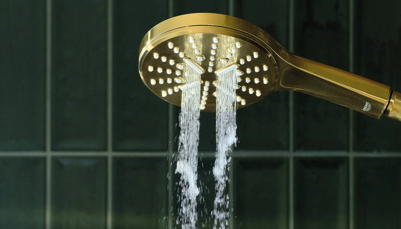
Colour drenching
Colour drenching is a simple and effective way to achieve a dramatic transformation of the bleakest of rooms in our homes. Rich, bold colours work best for colour drenching. If your client feels brave they can go for a really dark shade for a strong, dramatic effect, but it's better to avoid overly bright shades, as they could become overpowering, especially in smaller spaces. For this trend to work best, the harmony is very important, so avoid putting together two highly contrasting shades.
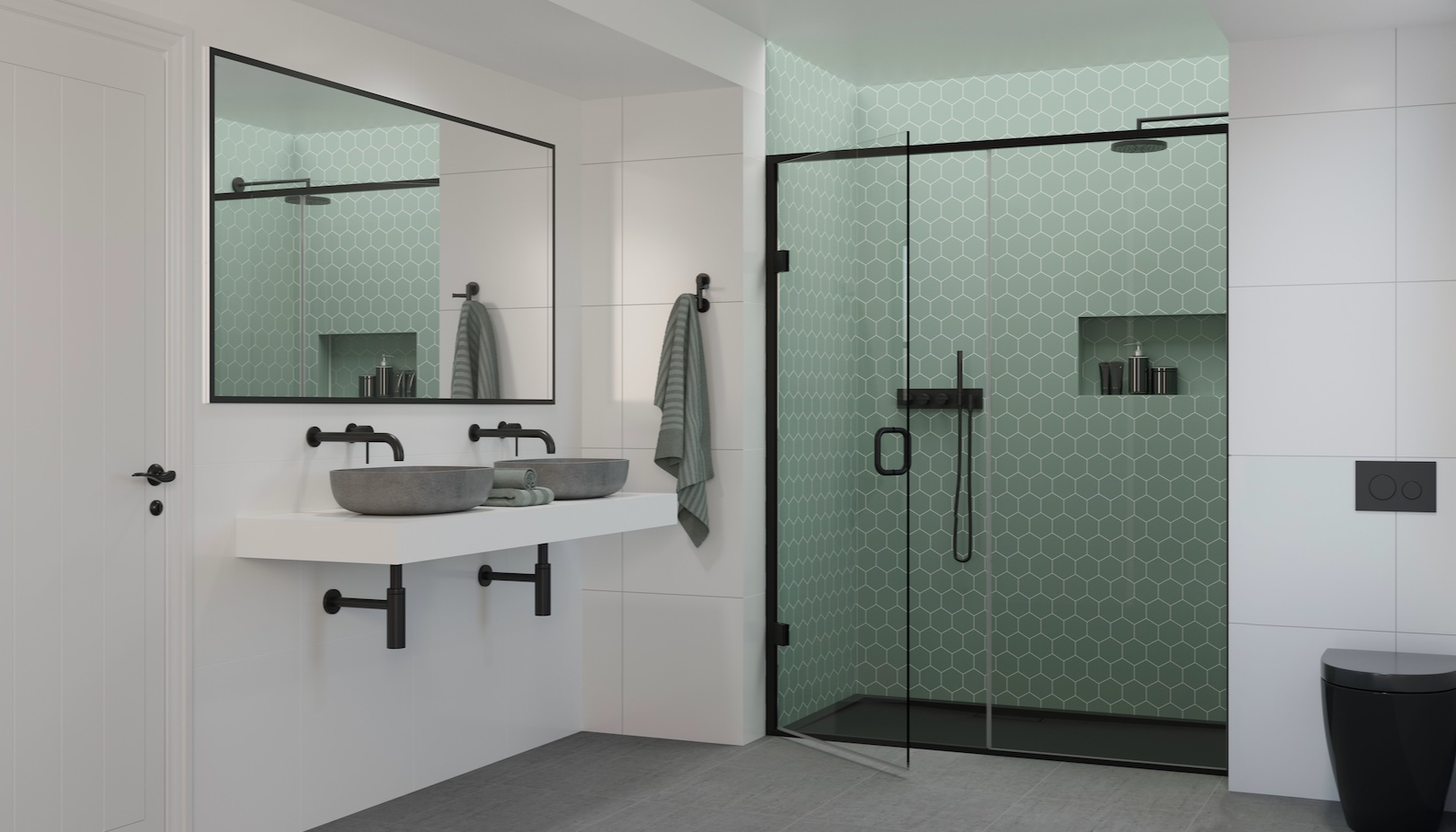
When choosing furniture and accessories for a colour-drenched room you can go two routes. You can use similarly strong shades and rich patterns to add another layer of colour to your room for a strong bold look. Or if your client prefers simplicity, make the colours on the walls the heroes and use minimal and neutral-coloured furniture and accessories. The colour of the walls will then become the main focus of the room. Colour drenching, especially when using darker brave colours, works best in small spaces like a hallway, a corridor or small bathroom. Bold saturated jewel greens and teals work very well for colour drenching. Dark greys to near black and deep navy shades are also good choices.
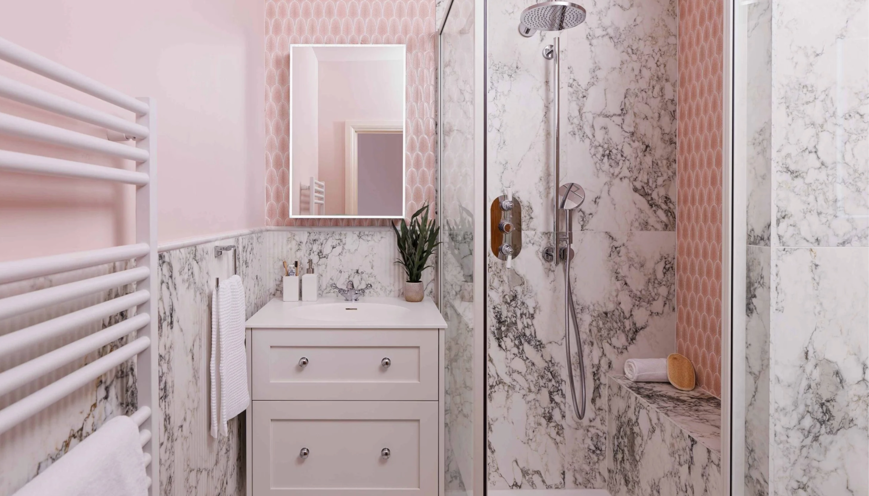
Neutrals
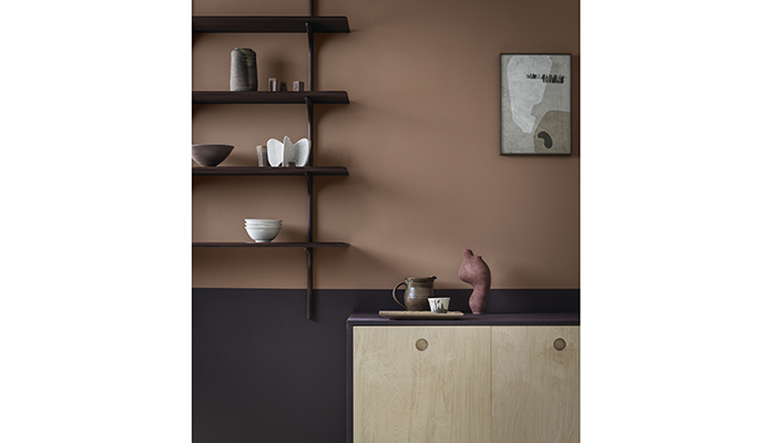
Neutrals are back, and one of my favourite neutrals is Saddle Stitch – a gorgeous, warm tan. It belongs to the neutral colour family, but it is a neutral with plenty of character and looks great in the kitchen. It's very bold and saturated with lots of caramel undertones, but without being too bright or overpowering and it could be a real fashion statement for walls.
It's perfect to be used on its own throughout the room such as behind the cabinets, creating a cosy cocooning space. When used with warm off-whites and gentle light neutrals it can become a real statement shade and bring warmth to the room. In this combination it would be perfect for sunny, south facing rooms. It also performs very well in darker spaces where it would look best paired with even deeper, darker shades from a neutral colour family, for example on the kitchen cabinets. It pairs beautifully with all natural materials like wood, stone, clay and natural fabrics like linen or jute. Saddle Stitch looks the best with soft warm lighting and is perfect for creating a relaxing ambient atmosphere in the home.
Bold tones
Working with bold, dark colours should be all about balance, so always make sure you incorporate neutral and pale features into the room as well, whether that’s through furniture, accessories or other paint colours, that will light up the space. If you’re painting the walls in a deep green shade, make sure you paint the ceiling in a crisp white and opt for light wooden flooring or carpet. Keep the majority of the furniture neutral and add a few brighter pops with soft furnishings or decorative accessories.
Feature walls
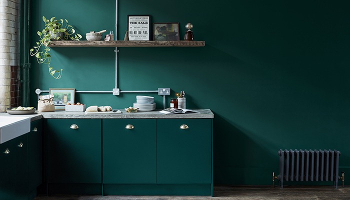
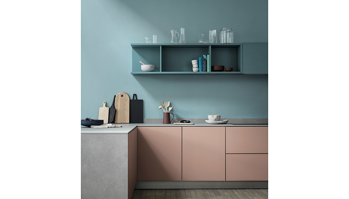
The traditional feature wall always works well, however there are ways of using colour other than on one feature wall in the home. Think about carrying the area of contrasting colour around corners and onto the ceiling, try masking out large shapes or creating zones in an open plan living area. Use one colour or tones of one colour in a room. If you paint walls, skirting, doors, cupboards, radiators – and even window frames – in the same colour it will look thoughtful and sophisticated. This works particularly well with soft greyed blues and greens as well as any neutral.
A final tip...
The best finish for family spaces is matt, because it can more often than not be wiped clean of any marks and stains and it's tougher than sheen surfaces. Where possible, opt for a paint that’s been classified as ‘wipeable’ – Crown’s easyclean range is incredibly durable and the most washable yet, and is ideally suited to the kitchen. It’s perfect for pen marks and sticky fingers and added to that, it’s been designed and tested for the best stain and scrub resistance.
Tags: insight, features, justyna korczynska, crown paints, colour trends

In Other News