How Victoria Covell created a luxury feel in a bijou shower room
How Victoria Covell created a luxury feel in a bijou shower room
When interior designer Victoria Covell set about reconfiguring a small narrow bathroom for her parents, she decided creating a shower room was the obvious solution – and a collaboration with Matki proved to be a winning formula.
Q: What type of property was it in and who was the project for?
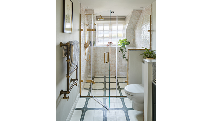
The project was for my parents, at their Lincolnshire Farmhouse, originally built in the 1860s. Their brief to me was to design a luxury bathroom with high-end fixtures and finishes, with an improved spatial layout, so it felt less narrow. They also wanted colours that felt fresh and in keeping with the rest of the property.
Q: How did you go about meeting the brief?
A: Initially, we spent a great deal of time, speaking about the brief, to really understand their requirements for the space in detail. Who would be using the bathroom? What storage did they need? Were there any styles or finishes they really didn’t want to see? We then spent time analysing the best use of space, creating an overall concept design before pulling finalising the fixtures and finishes and ironing out the technical details. I wanted to use a palette which complemented the view, so we went for a fairly neutral palette, with accents of dark green, and the softest pink in the tiles, for that fresh feeling.
Q: Were there any particular challenges that you faced during this project?
A: The main challenge for this bathroom was the narrow layout of the space.
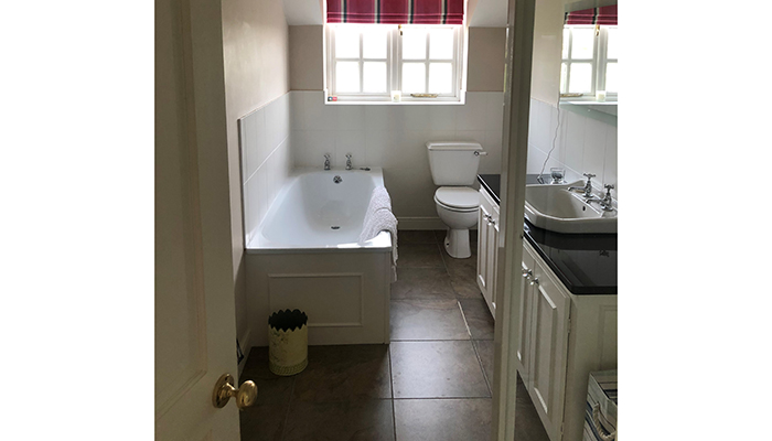
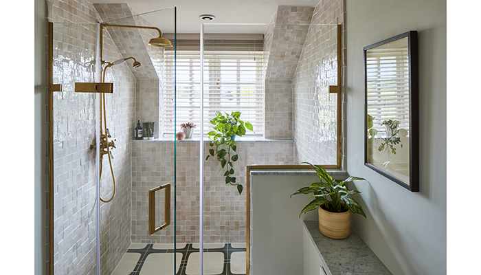
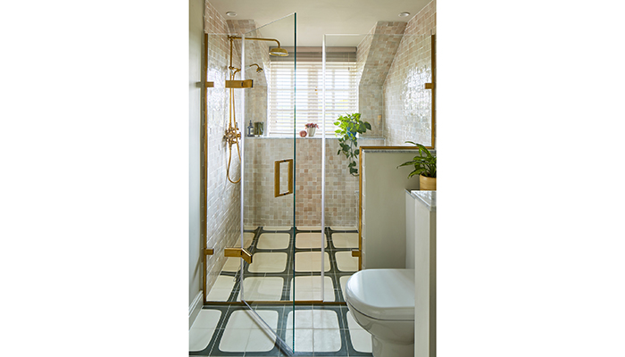
The solution was twofold, the first was to remove the bath (it wasn’t needed, there were two others already in the house) and the second was to move the shower into the window area. This created a focal point at the end of the room, drawing your eye straight towards the lovely countryside view. This effect was added to by the way the dormer window framed the shower. Having the glass shower partition across the end of the room split the room in half, and kind of foreshortened the space, making it feel less long and narrow. It created a lovely big shower with a great view!
Q: What materials did you use?
A: I used marble as the countertop on the bespoke vanity, WC & top the stud walls and window sills – this added a real feeling of luxury, and I love the variation in the natural stone. I also designed our own bespoke floor tile through Mosaic Factory, and we played with different tile layouts until we landed on this. There's something a little retro about the pattern that I love.
Q: What were the different products that you and the client chose, and what made them the perfect choice?
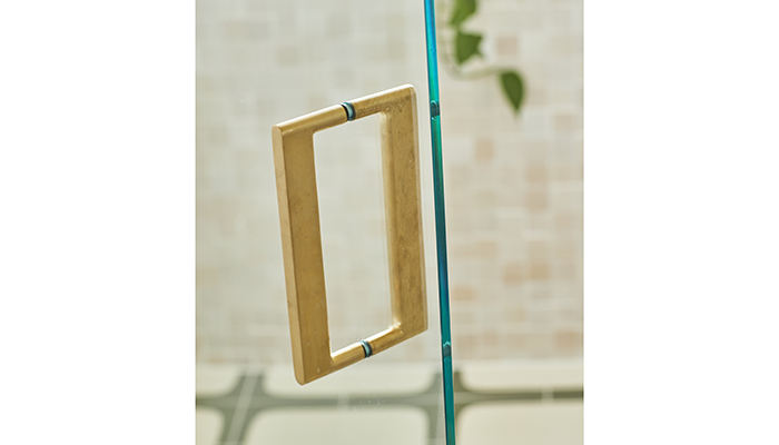
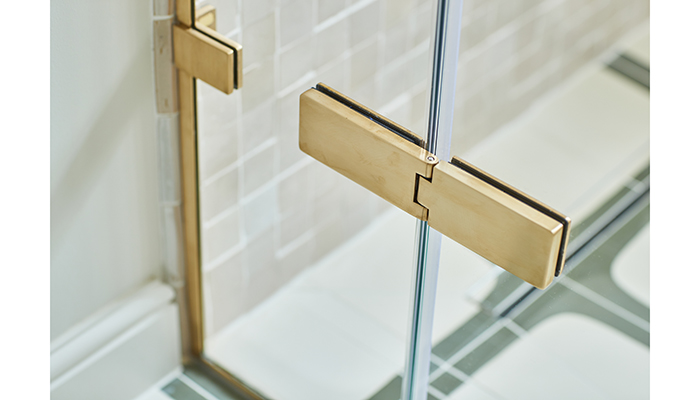
A: One of the key products I needed to source was the bespoke shower door. Liz at Utopia Interiors, who helped me source all the bathroom fixtures for this project (brassware, showerdoor, sink & WC), suggested using Matki for this element of the job. I knew we were looking for traditional brassware in a brass finish. It was the quality and colour of the brass that led us to Swadling Brassware. But it was fortuitous that Swadling happened to have just come under the umbrella of the Matki family, and it was now possible to have Matki's bespoke shower door in the same finishes as Swadling's brassware.
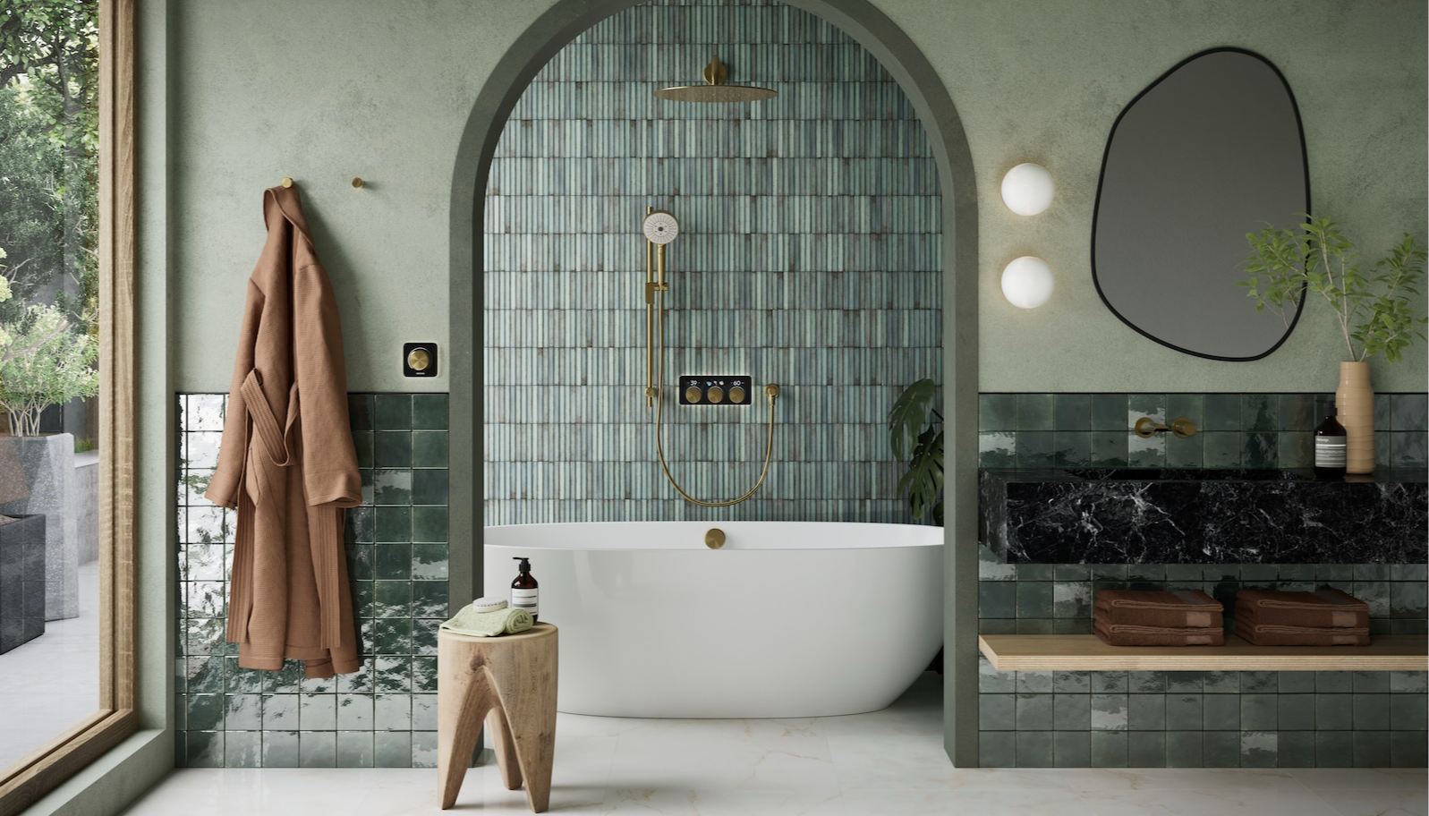
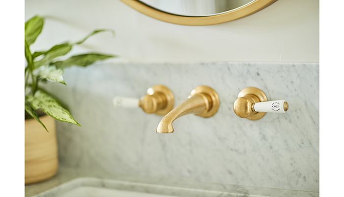
For the basin, we went for the Invincible wall-mounted mixer with lever handles, in brushed brass and white ceramic detailing. I didn't want the brass to be too shiny – I wanted to look natural next to the imperfections of the zellige tile.
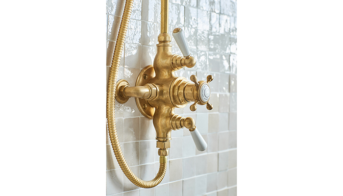
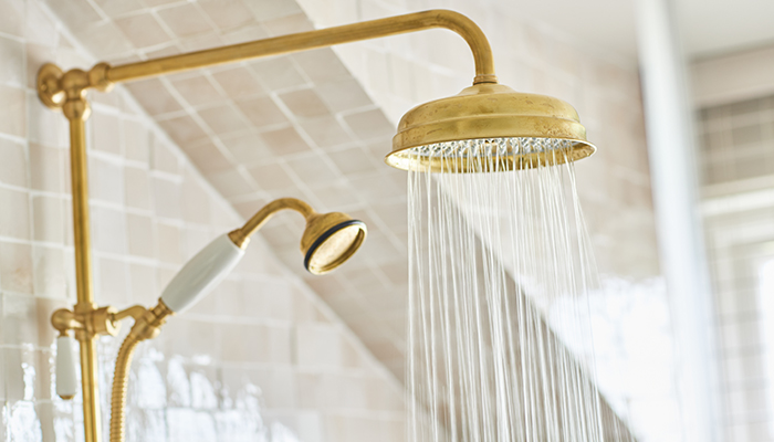
For the shower, I decided to go for the Swadling Invincible Double Exposed Shower Mixer with Rigid Riser, Deluge and Hand Shower, I wanted a real wow factor in the big shower, and it certainly provided that. The exposed shower also lent a more traditional feel to the space I was after.
I designed the bespoke reeded vanity to be wall-mounted with an undermount sink, and a large drawer for storage. I wanted it wall-mounted to give the illusion of space. Liz sourced a Loop & Friends Ceramic Plus undermount sink from Villeroy & Boch. It's simple, and the ceramic plus is for easy cleaning. The wall lights were Old School Electric Deco opal glass wall lights in antique brass. They were outside zones 1 & 2, so we could use standard wall lights, they didn't need to be IP Rated. The recessed downlights were from Astro, IP65 rated. I like that they're slightly recessed, which stops the glare from the light.
The wall and floor tiles were both from Mosaic Factory, the wall tiles were Zellige 50x50mm in colourway 1019. They have a very subtle pink to them which works so well with green – they're neutral but not boring. The floor tiles were from their cement tile range – we used their tile simulator to play around with the patterns, until we landed on one we liked with the colour combo that worked with the scheme.
Q: What would are your 'do's and don'ts' when it comes to designing a compact luxury space?
A: Do go for a wetroom-style shower, so that you can get the biggest shower possible that fits in the space, and think about designing bespoke shower doors/panels to block water from getting everywhere. And try to tuck the toilet out of view. Also, pick different complementary finishes and tiles for different areas of the bathroom – e.g floor tile, wall tile, vanity backsplash. I like to use marble as a vanity countertop.
Don’t be afraid to move plumbing – it’s always worth exploring the options. It can significantly improve the final design, and although it will absorb some budget, sometimes it’s more beneficial to the overall feel of the space than an expensive tile. And don’t tile the whole bathroom from floor to ceiling in one tile.
Q: What is your favourite part of the finished project?
A: My favourite part of the project is really nerdy, but I love the Brushed Brass trim that frames the whole shower door, it's a small detail, but it completely elevates the whole thing. I also love the seat in the shower – what says luxury more than a shower you can sit down in?!
Q: What do you parents like best?
A: The brass finish of the shower against the tiles, and being able to look out the window from the shower.
Tags: bathrooms, features, matki, victoria covell, swadling brassware


