How Humphrey Munson helped create the perfect pied à terre
Tue 1st Dec 2020 by Emma Hedges
How Humphrey Munson helped create the perfect pied à terre
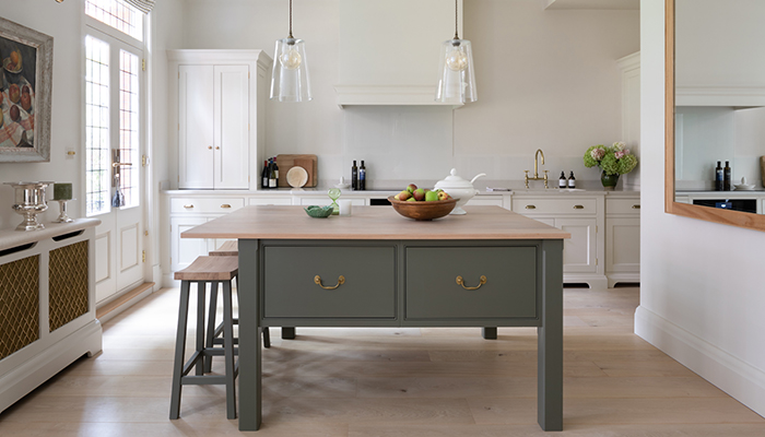
When Peter Humphrey, design director and founder of Humphrey Munson, was tasked with designing a kitchen for a weekday London pad for a couple, the clients stressed that they wanted a homely environment with a clean, simple aesthetic. “The overall brief was to create a warm and welcoming space for the kitchen that was not overloaded with cabinetry,” explains Peter. “The clients particularly liked the idea of an open, pared-back kitchen that felt light and airy.”

The homeowners wanted a timeless design with a traditional feel and chose Humphrey Munson’s Nickleby cabinetry, which Peter describes as a “refined take on the classic English Shaker-stye door”. The emphasis is on simplicity – the clean lines and pale H|M Linen shade of the perimeter cabinetry and walls accentuate a sense of openness in the room.
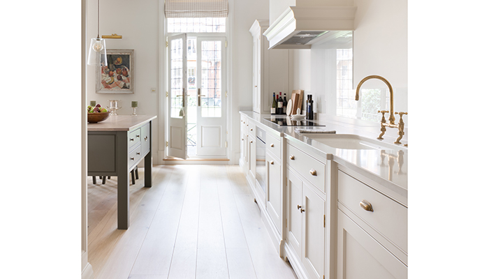
“We chose to keep the main run really pared back with a canopy housing for the extraction and then two simple countertop cupboards – one for breakfast and one for glassware,” says Peter. “The kitchen is in a pied à terre in Knightsbridge so we didn’t need to allow for massive amounts of perishable food storage, which was ultimately a win-win as the aesthetic is much improved for not having tall cabinetry overloading the run.”
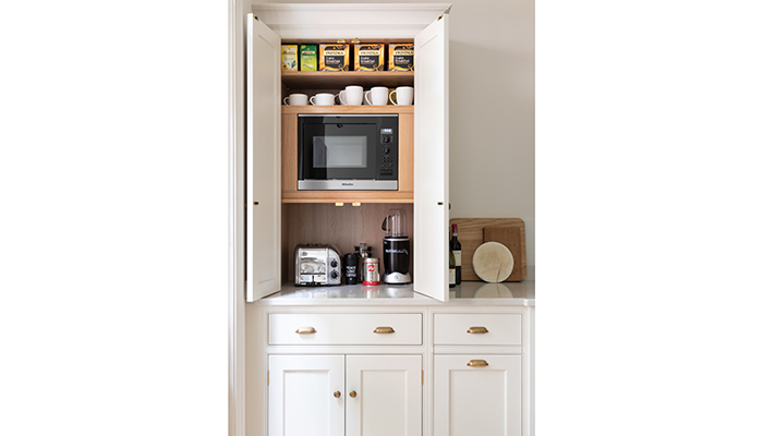
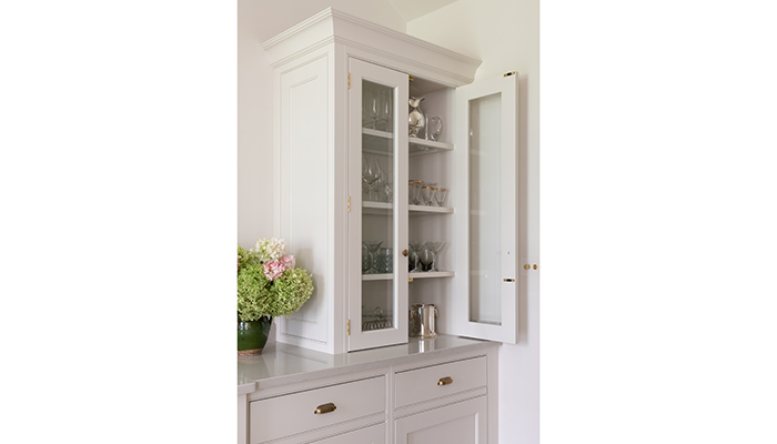
“To achieve this pared-back look you need to be quite strict,” explains Peter. “The real challenge was actually the cooling appliances. We discussed a tall column fridge and freezer or a 60/40 split, but ultimately the clients opted for under-counter models the achieve the desired look.”
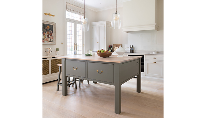
The bespoke Nickleby prep table is the centrepiece of the design, and also Peter’s favourite element of the layout. “The prep table is so beautiful and fits the scale and proportion of the room so well,” he says. “The colour is H|M Lock & Load, which we have mainly used in big country houses so it’s lovely to see it in a central London setting. It suits the space very well, particularly the aged brass bespoke hardware.” He also loves the fact that the walls and cabinetry are the same colour. “It just melts the cabinetry into the architecture of the room,” he says.
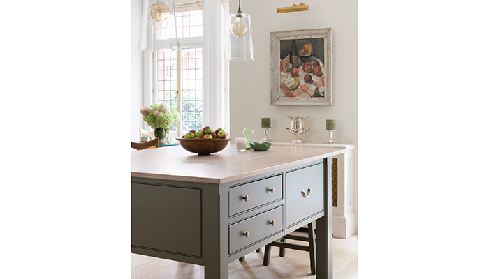
The clients are delighted with the end result, which offers them everything they’d hoped for. “This is a kitchen that is great for a quick light supper, and where the homeowners can entertain a few friends and enjoy the space for what it is – welcoming, relaxed and endlessly appealing,” concludes Peter.
Photos by Paul Craig
Tags: features, kitchens, humphrey munson, peter humphrey


