Farrow & Ball's Joa Studholme on kitchen and bathroom colours for 2021
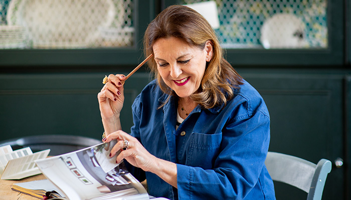
Farrow & Ball's Joa Studholme on kitchen and bathroom colours for 2021
Colour curator Joa Studholme has worked with Farrow & Ball for over 25 years, and in that time she's developed colour ranges for the brand's richly pigmented paints, and consulted on design projects all over the world. So what are the key colour trends when it comes to paint that retailers and designers should know about for 2021? We caught up with her to find out.
What colour trends do you see particularly coming through for kitchens?
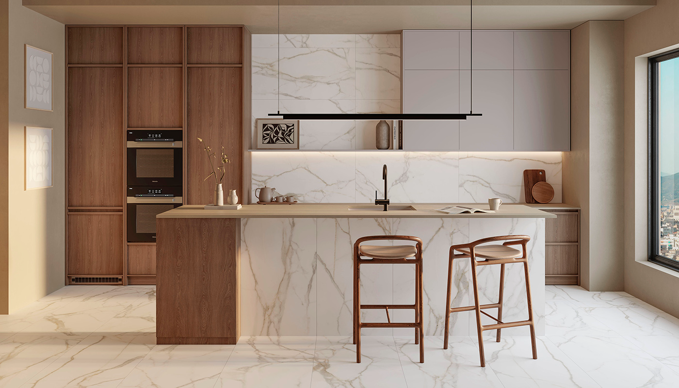
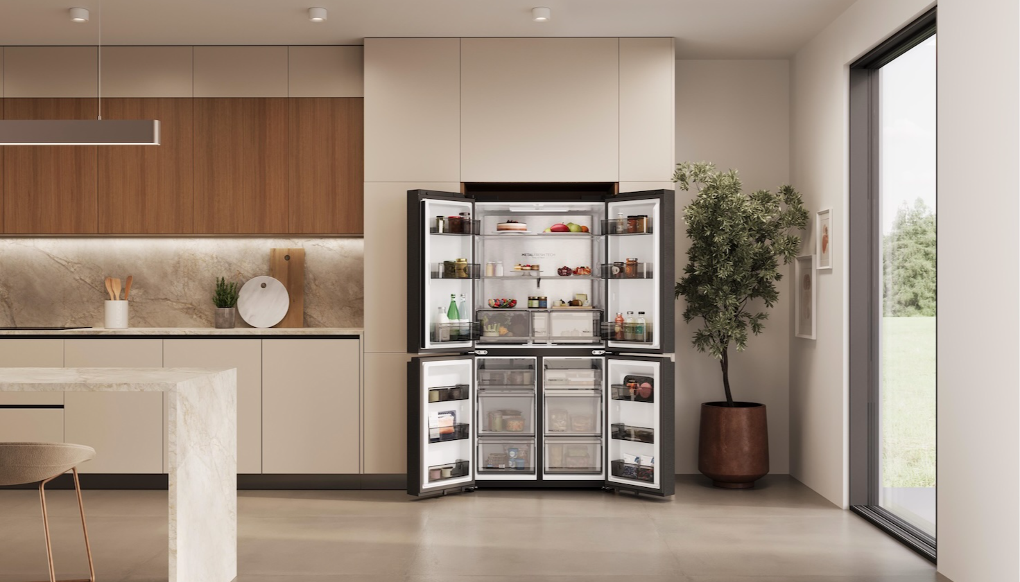
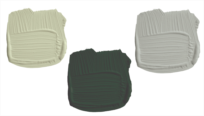
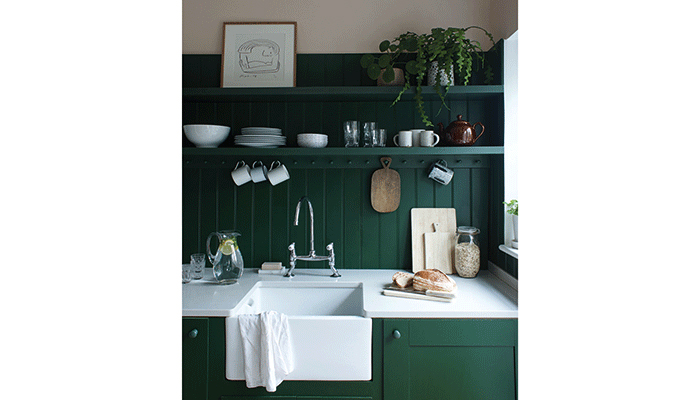
The palette of neutrals we are using in kitchens has expanded as we look to bring warmer, earthier tones into our homes, adding personality while still remaining comfortable. Soft understated Jitney and luminous Orange Coloured White are the perfect base colours to build upon, so are particularly suited to kitchens where we can layer blues and greens such as Light Blue and Vert de Terre on units and shelves to reconnect with the elements of verdant earth, clean air and natural light. In order to ground these schemes, introduce a strong colour like Studio Green on a central kitchen island which will make everything around it look bigger and lighter. Embrace these earthier timeless neutrals to add warmth to a kitchen scheme and stay right on trend.
How will the colour trends for painted kitchen cabinetry differ from the trends for the wider room scheme?
The preference for warm homely colours and natural green tones pertains mostly to schemes for whole rooms but can certainly translate to use on cabinetry – especially if you are wanting to create an informal atmosphere in your client's kitchen. Central islands or pantry cupboards are being painted in super strong tones like Preference Red or India Yellow while the surrounding units are kept neutral resulting in a nostalgic look much favoured at the moment.
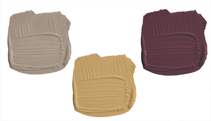
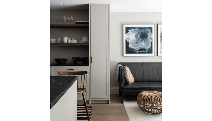
But for the ultimate in nostalgic kitchens use the same colour on both walls and cabinetry – a trend that has crept into the kitchen from living rooms and bedrooms. Soft understated Purbeck Stone or the more aged looking Dead Salmon are perfect for this.
What colours do you think will dominate in bathrooms?
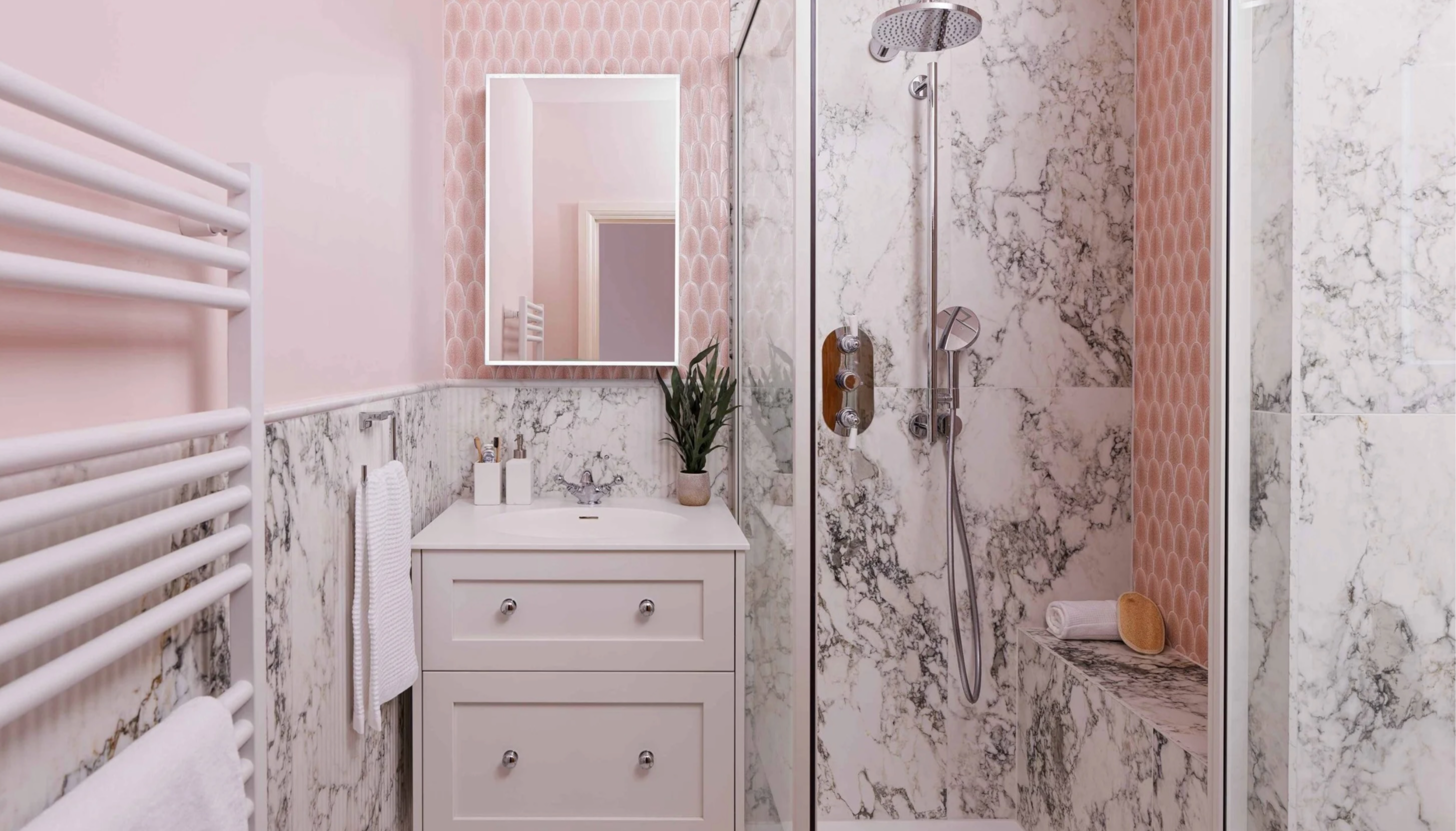
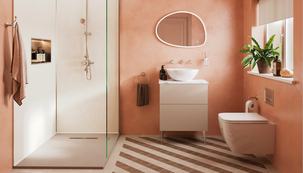
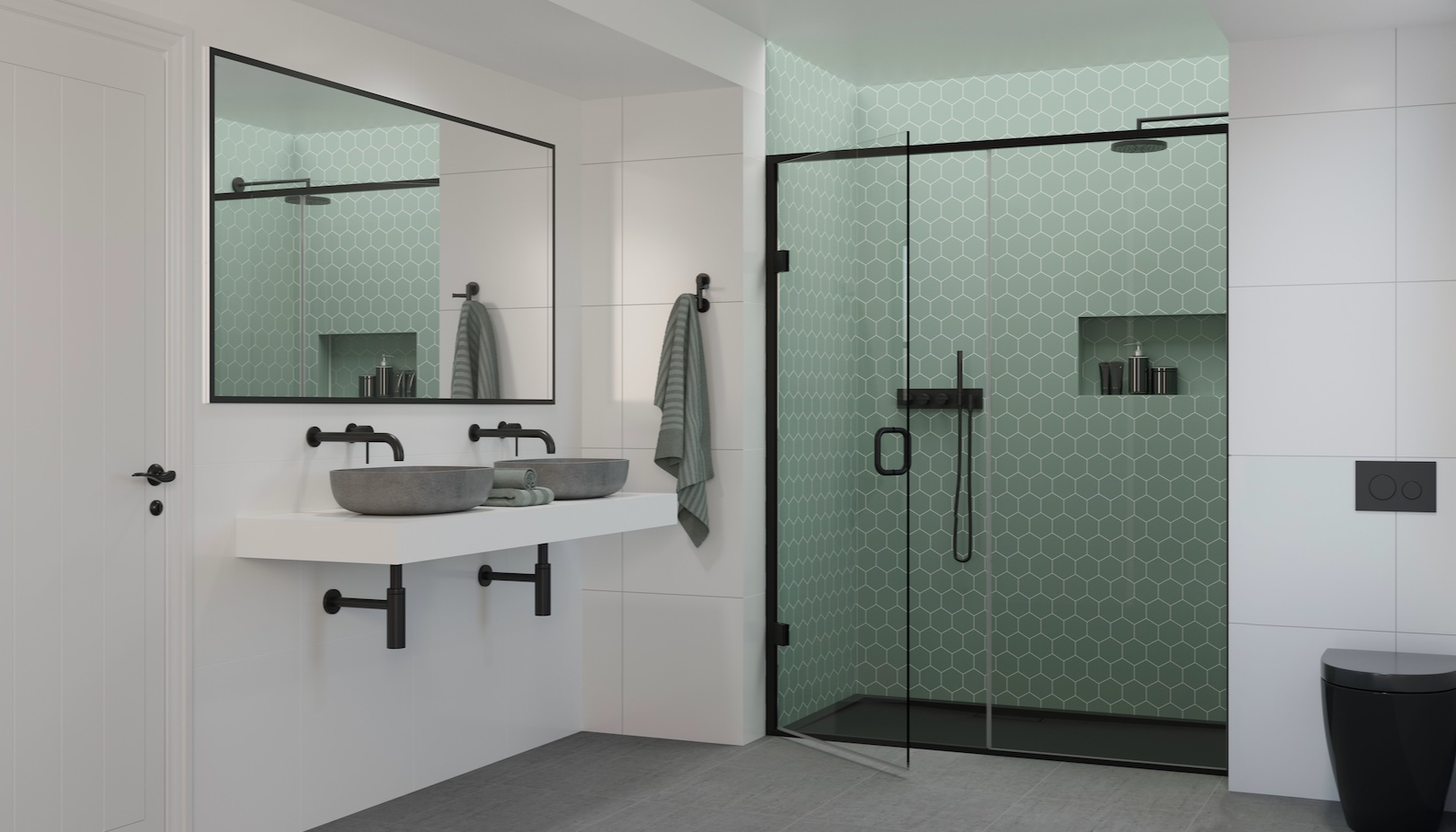
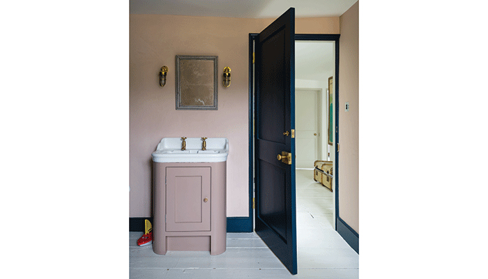
Bathrooms have become much-needed sanctuaries while we are spending more time at home, so they require beautiful calming colours that will nurture and revive. Simple schemes of closely coloured layers or indeed just one colour will create a peaceful environment. Strong White on walls with the slightly darker Cornforth White on woodwork results in an oasis of calm, while blush Pink Ground or Setting Plaster on the walls and woodwork makes for a warmer more wistful space. It is important to use Modern Emulsion which is made specifically to cope with condensation, and remember that taking the wall colour over the ceiling can often make the room feel bigger.
Overall, what colour palette will be most dominant next year in interiors and what particular trends do you see coming through?
Green is still gaining popularity in the home because of its strong connection with nature and we are both comforted and inspired by bringing the elements of the natural world into our interiors. Softer greens like Breakfast Room Green can feel reassuringly familiar, while more intense Duck Green serves to ground us.
Traditional colours like Treron on the woodwork or cabinetry and the slightly lighter French Gray on walls create rooms that somehow feel as if they have never changed.
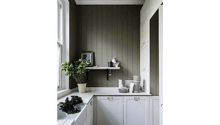
The smokey blue undertones of Card Room Green and Green Smoke result in a Mid-Century Modern feel and are much favoured in rooms that we use at the end of the day when we want to feel cosy and nurtured. Whichever green you choose it will evoke a feeling of calm for your client – much needed in these troubled times.
Tags: features, insight, colour trends, farrow & ball, joa studholme, paint, kitchens, bathrooms


