How Abitalia balanced style with practicality in a busy family kitchen
How Abitalia balanced style with practicality in a busy family kitchen
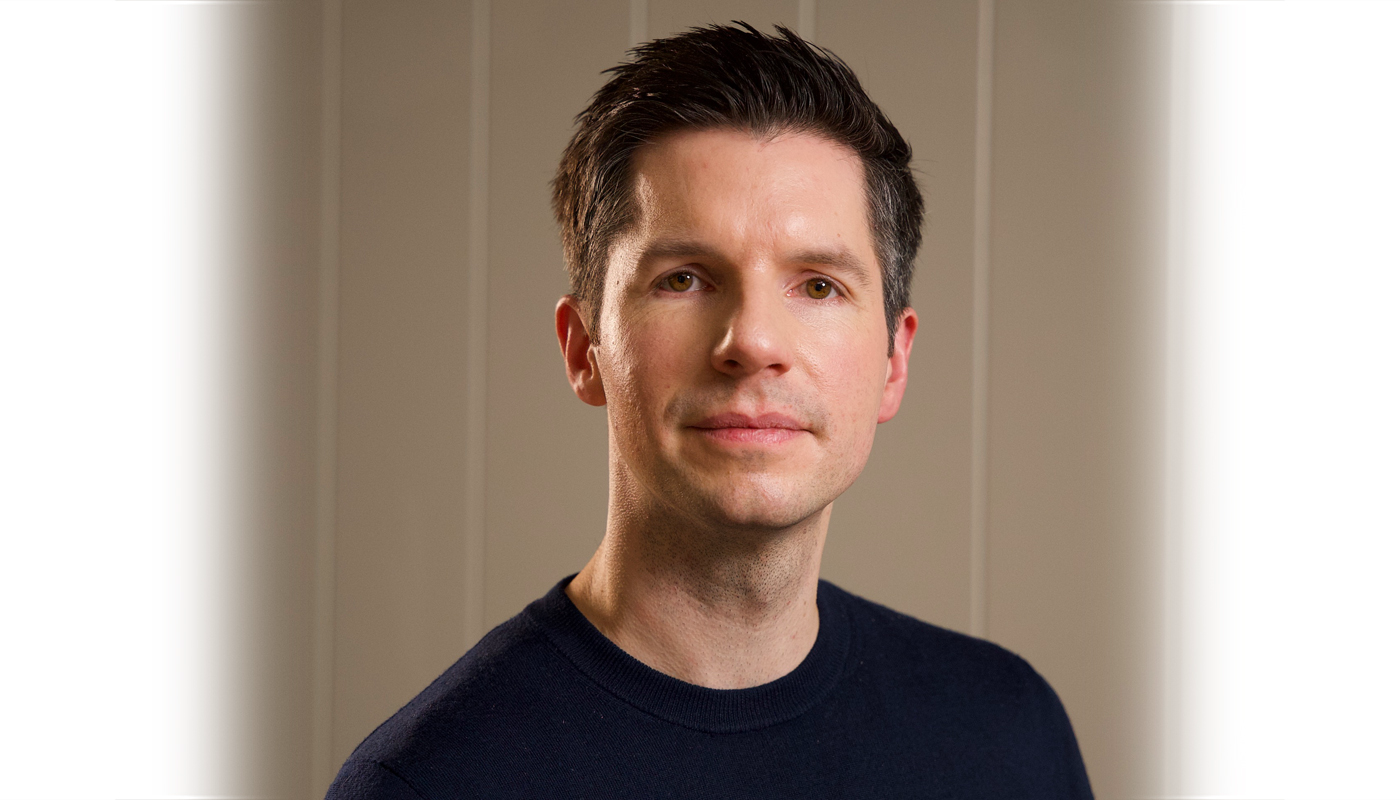
We talk to Gianluigi Moretti, creative director of Cheltenham-based kitchen studio Abitalia, to hear how he created an elegant space for entertaining that also meets the needs of his clients' hectic family life. Photos by Nick Smith Photography.
Q: What type of property was it in and who was the project for?
A: Our clients wanted us to design a kitchen for their new detached house in the Cotswolds countryside. They weren’t happy with the layout of the kitchen that had been proposed and were looking for a more inspirational design. Originally, given the location of the property, they had in mind a more country looking design – perhaps something along the lines of Shaker style.
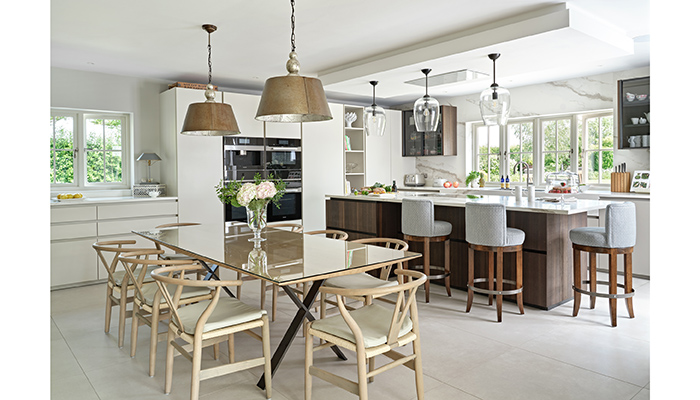
Q: How did you go about meeting the brief?
A: The first concern for us was to design something relevant as we knew the clients. At the same time we wanted to create a proper working kitchen, this being a real family house. So at the beginning we didn’t focus too much on the style of the kitchen – the layout was the real challenge, as previous ideas just didn't seem to be working.
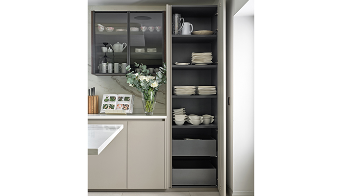
Q: What type of cabinetry did you choose?
A: When the layout was finally agreed, we were able to discuss the furniture style. We felt that the clients' lifestyle and tastes were actually more contemporary than traditional or country style. They also already had a taste for Italian-designed furniture in their previous homes, and said they really liked it. This was why we proposed a Zampieri Kitchen, which has a contemporary twist, from our Italian kitchen supplier.
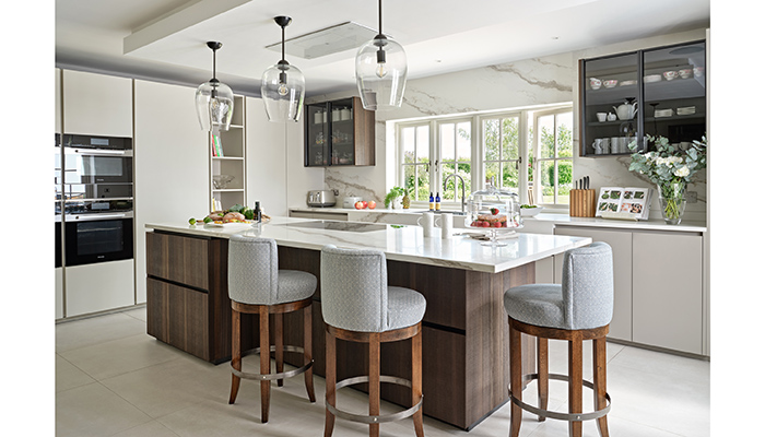
Q: What materials did you use?
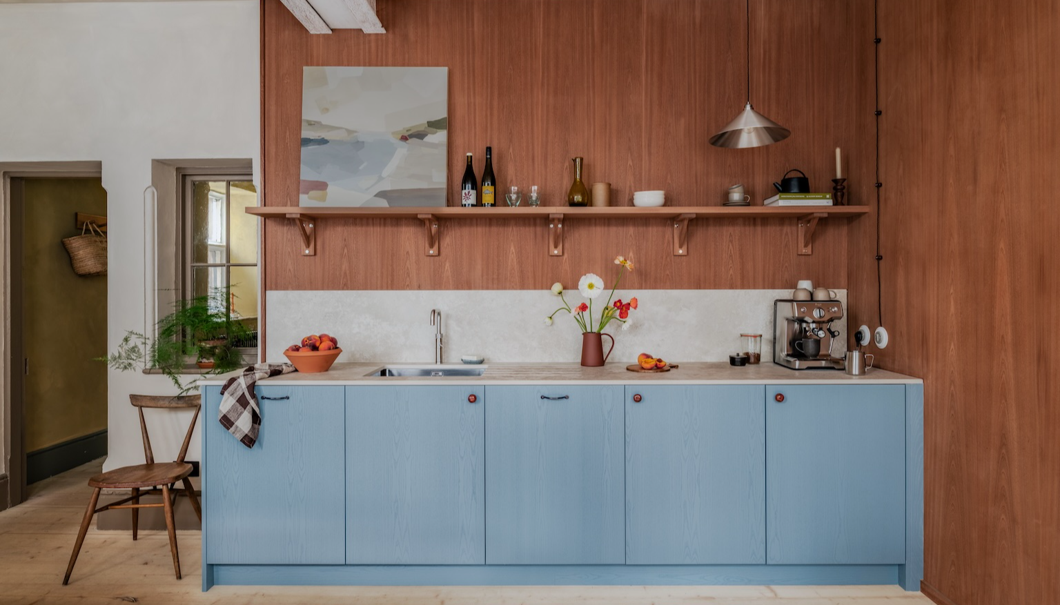
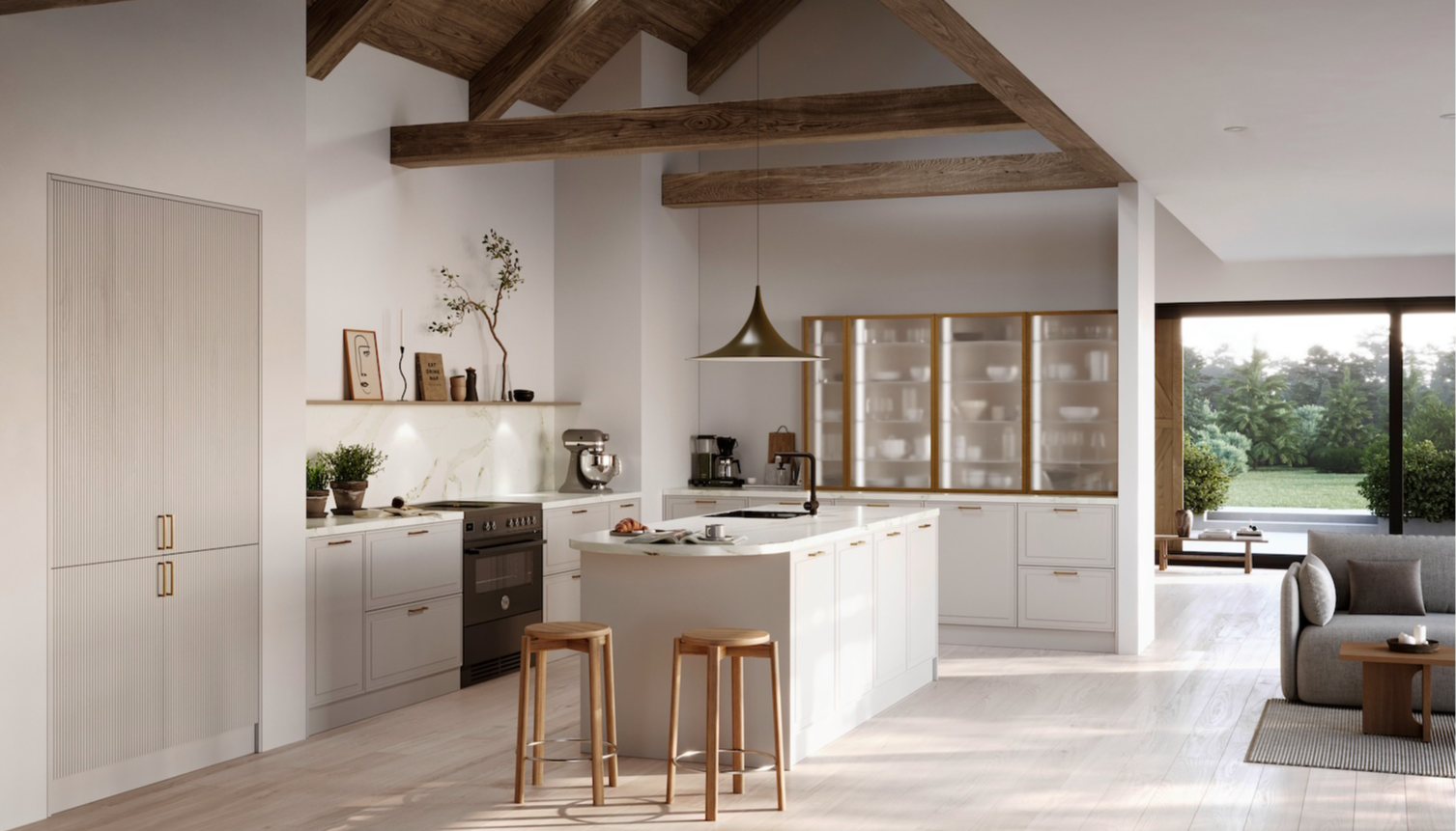
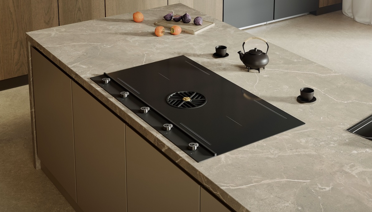
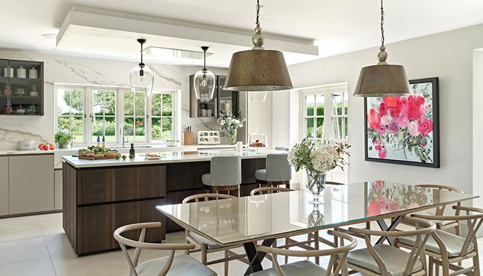
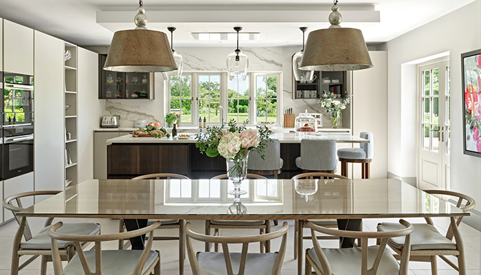
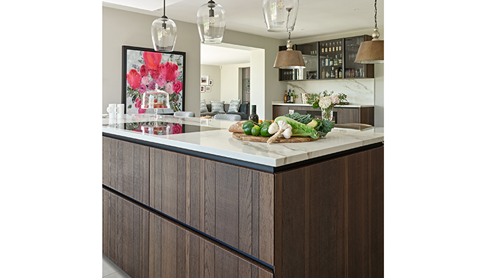
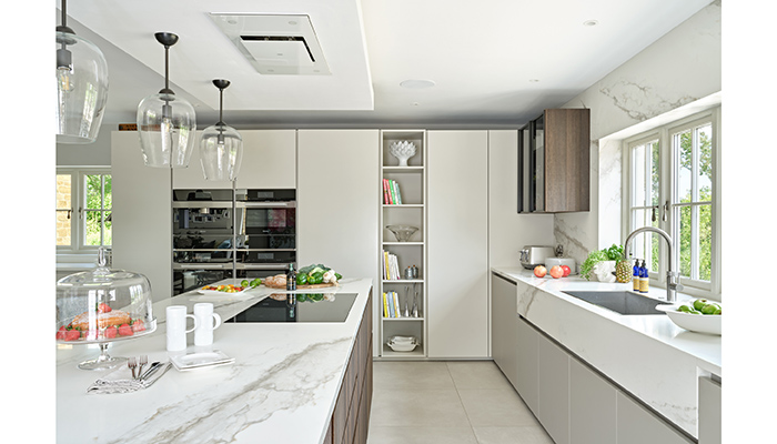
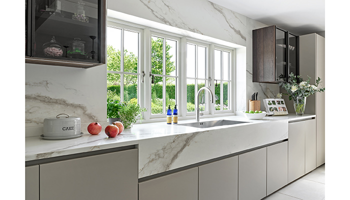
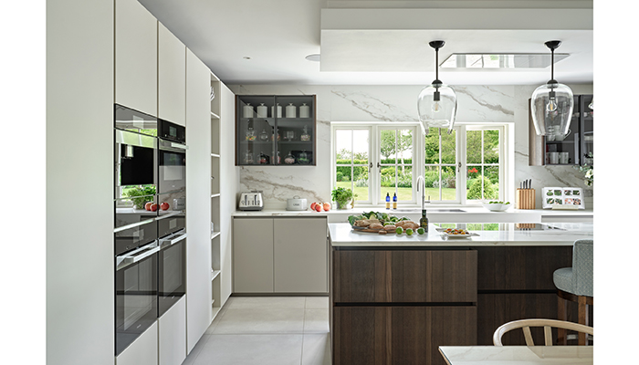
A: Two elements were decisive; the fantastic veneer with the exposed cut texture, with neutral lacquered tall units, combined with an incredible marble-looking porcelain top and wall cladding. These were the winning elements in this design. The result is a very elegant kitchen, but with a really warm touch – a timeless look for a genuine family home.
Q: What made you choose the Westin cooker hood?
A: We needed something ceiling mounted that was very efficient, but also a design to complement the kitchen – not too present, but with a strong identity at the same time. Westin Stratus Mono in Glass had the right combination and was the perfect choice.
Q: What were the particular challenges that you faced?
A: The biggest challenge was to re-position the kitchen and a number of designs were considered. Our favourite design brought with it some complications and meant that some building work was involved as well. But we felt that this design would greatly improve the feeling of the room and we knew it would work brilliantly for them as a family. We managed to explain this to the client and I'm happy to say that, once they appreciated what this would mean for the overall project, they embraced the whole idea.
Q: What is your favourite part of the finished project?
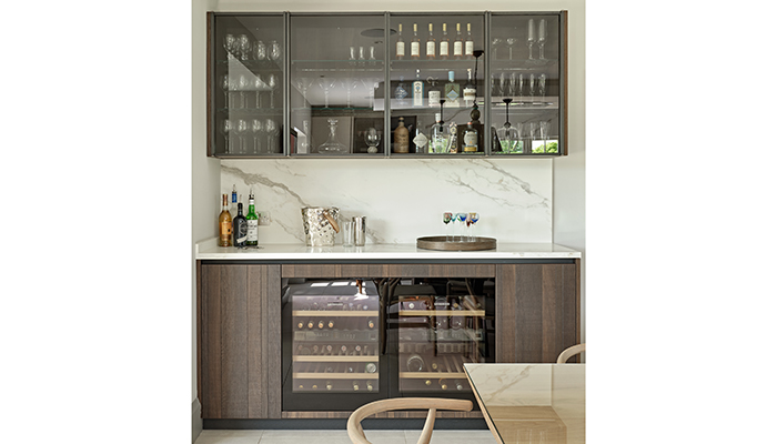
A: We particularly like the harmony of the kitchen and how the different active areas work together: the cooking area, the breakfast part, the dining and – not least – the bar area.
Q: What is the client's favourite part of the finished project?
A: The client feels the same way: the kitchen looks amazing, especially with the marble cladding. But ultimately, it's a real family space where they can all come together to entertain friends and also enjoy everyday family activities.
Tags: kitchens, features, abiltalia, giuluigi moretti, westin, contemporary


