Woodhouse & Law's John Law on blending kitchen and garden spaces

Woodhouse & Law's John Law on blending kitchen and garden spaces
John Law, creative director at interior and garden design business Woodhouse & Law, reveals his strategies for creating cohesion between a new kitchen and an adjoining outside space.
Q: How do you approach a project where the brief is to blur the boundary between a new kitchen design and an exterior space?
A: When designing spaces, we always look at them holistically. If we are approaching a design from scratch, then every element of our design could potentially help link the spaces. We’d always advocate developing a mood and/or materials board for the home and garden as a whole. Start the board with materials you have to work with; for example, the brick or stone that the house is constructed in. Then identify what fabrics, plants or materials will sit comfortably together.
For example, we often use a floor finish in the kitchen that either complements the materials used on an adjoining terrace, or is the same. Many types of limestone can be used inside and out with the right treatment. This can help unify the look and feel of the spaces. Where this isn’t possible, a material in a complementary tone can be equally as successful.
Q: Which strategies work best when blending the two spaces?
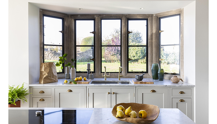
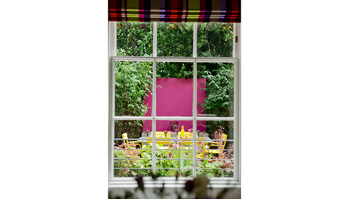
A: A seamless, subtle sense of consistency between both spaces is key. Reflecting colours in the garden that you have in the home will help create a much more cohesive feel between both spaces, making for a more relaxed calming transition between indoor and out. These complementary colours might come from paint tones, but just as important are flower choices, foliage tones, and the finishes of furniture, or lighting.
We would look at planting that provides form and texture whilst also offering the colour palette of the rooms looking onto the garden. So, if we were looking to include blues in a scheme, we might consider drifts of spring bulbs such as Muscari armeniacum; these would put in a great show before the summer-flowering blues of perennials such as perovskia, agapanthus and baptisia. Just as these perennials begin to fade, the inclusion of Liriope muscari would offer some much-needed autumn cheer with its deep-violet flowers.
Q: Do you have any examples of your own work where you think this has successfully been achieved?
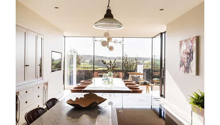
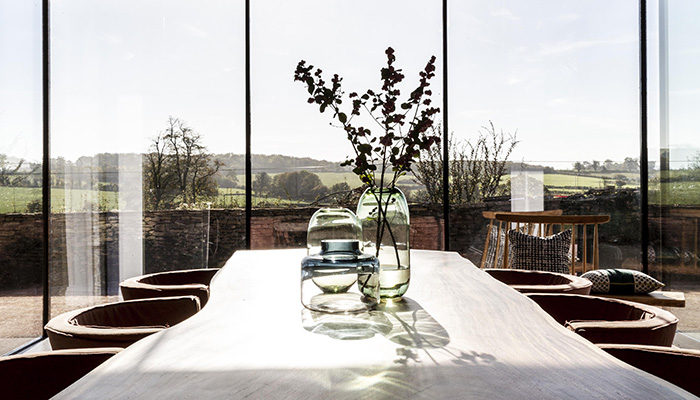
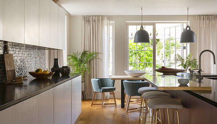
A: We have recently worked on a project in Bruton in Somerset, enjoying stunning views over the rural landscape beyond. To ensure that key connect between inside and out, and that views weren’t interrupted, we introduced minimal, simple glazing to the doors and windows, alongside architectural, simple glass spheres in warm, neutral tones for ceiling-fixed lighting. And to bring the outside in, we introduced bowls and accessories in natural materials and organic shapes in the form of pottery and ceramics.
On another project in Devon, the choice of splashback tiles was made to reflect the colour tones of the planting beyond. Lightweight fabrics were also used on window treatments to ensure a less heavy barrier between indoor and out. And to complete that sense of cohesion, indoor plants were introduced to ensure a gradual transition to the outside space.
Q: What are the key pitfalls to avoid?
A: We’re always keen to avoid following short-lived trends, which can easily date. Instead, we prefer to create a more timeless look that will endure and can be easily adapted over time, as tastes change. Clients can be a little nervous about committing to a bolder colour, so we often look to Shaker-style kitchens that can be re-painted in the future. Not only is this more sustainable as the life of the kitchen is extended, but it also enables them to change the colour as trends change.
Equally, it’s important not to become obsessive about linking the two spaces. It’s often harder to hold back and know when to stop. If you are not careful, it can result in a scheme feeling uptight and overly designed. We would encourage people to start with subtle references. For example, by referencing colours in planters on a terrace with the soft furnishings in the kitchen. This is often enough and will result in a far more sophisticated and timeless result.
We’d also suggest you don’t approach the project too literally. For example, the warm hues in a CorTen rusted steel planter could be reflected inside in the bronze frame of a mirror, or the colour of silk on lampshades, rather than direct repetition of the material.
Q: How much can a kitchen design be improved by flowing into an exterior space?
A: In introducing greater cohesion, a good garden design will instinctively bring a client’s individuality into an outdoor space too, creating a space that they will instantly feel more comfortable and at home in. Even though these links can be subtle and nuanced, they can help break down visual barriers between the two. In doing this, the garden can very much start to feel like part of the interior of the home and vice versa, which can make a home feel bigger. Clever use of lighting can also create interest during the evening so that elevations with windows become ever changing elements of the design.
Tags: insight, features, john law, woodhouse & law, kitchen design, garden design


