How Ripples fused traditional and modern to create a boutique bathroom
How Ripples fused traditional and modern to create a boutique bathroom
Kerri Asker, senior designer at Ripples Winchester, reveals how a clever blend of classic and contemporary transformed a family bathroom into a cool space that is still in keeping with a period property.
Q: What type of property was it in and who was the project for?
A: The house is an Edwardian terrace in the centre of Winchester, and the project was for a couple – Dee and Mark – and their baby.
Q: What was the brief from the client for this project?
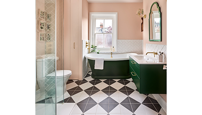
A: The client wanted a traditional bathroom but with modern practicality. It's the only bathroom in the house so it had to be suitable for family use but they also wanted it to have a wow factor at the same time. Dee wanted a freestanding bath, walk-in shower, plenty of storage and lots of character! Also Dee loves colour.
Q: How did you go about meeting the brief?
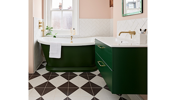
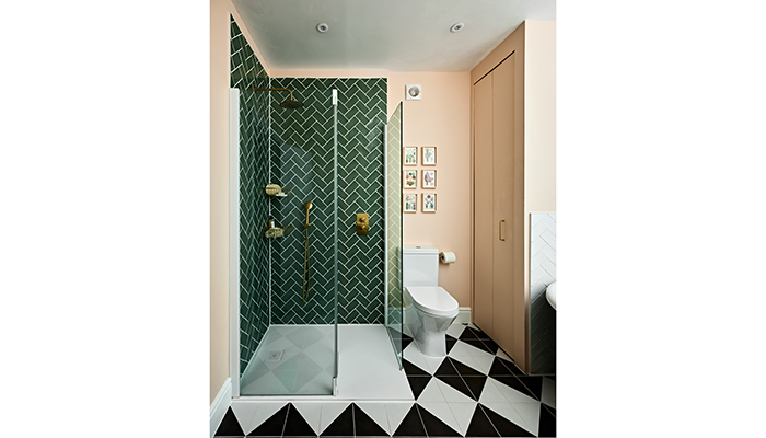
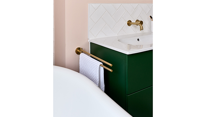
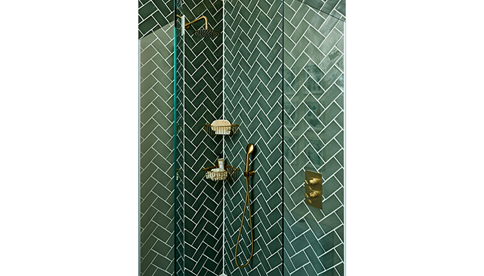
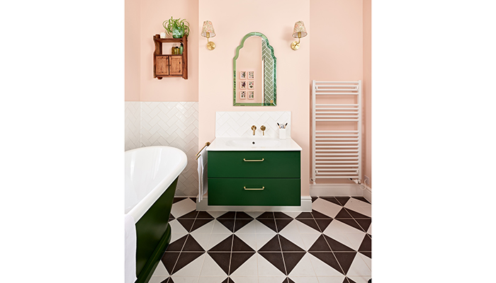
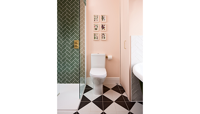
A: I specified a feature painted roll-top bath, that could be painted in a heritage green colour, and then positioned it centre stage under the window, so this is the first thing you see when you open the door. Whilst space was tight, we managed to achieve a good walk-in shower with a lovely green metro tile in the walk-in shower, which the brass brassware fittings work really well with.
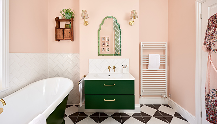
Shaker-style painted wall-hung storage retains the feeling of space, whilst the practicality of it being a drawer means its really easy to use. The basin is really easy to clean and having the tap wall-mounted keeps the area clutter free visually. A pretty warm dusty pink on the walls creates a lovely 'hug' when you come in the room, whilst the monochrome feature floor brings it all together, and gives a nod to the traditional style of the property.
Q: What were the particular challenges that you faced during this project, and what were your solutions to overcome them?
A: Creating a walk-in shower in a limited space was tricky. The use of the flipper panel means when folding out it creates a larger showering area and keeps water overspray to a minimum.
Q: What materials did you use? Did you use anything different or unusual?
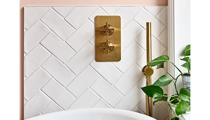
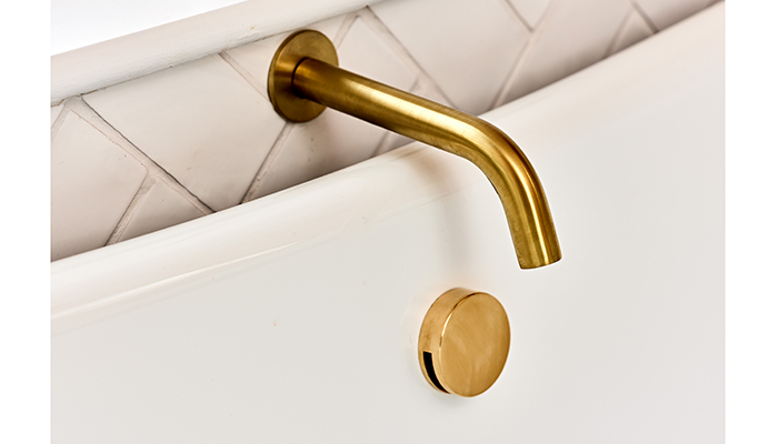
A: We used porcelain tiles on the floor and around the basin for its practicality and hardwearing nature. Also PVD brassware is ideal due to its durability, which is important as this bathroom will have heavy use.
Q: What were the different products that you and the client chose, and what made them the perfect choice?
A: We went for tiles mainly in the shower – we were going to go more natural but Dee loves colour so we decided to go bold with green and it really paid off!
Q: Are there any design elements that you’re particularly proud of?
A: I really like the basin and unit centralised on the chimney breast with the wall lights and the decorative mirror – it makes a real feature and the Pooky wall lights are so pretty. I am particularly pleased with the floor as well – it creates such a statement.
Q: What is the client's favourite part of the finished project?
A: Dee loves the tiles, the wall colour and the bespoke painted items. The pinks, greens and monochrome floor works so well and gives the character she was looking for.
Tags: bathrooms, features, ripples winchester, kerri asker, monochrome


