How PAD's vibrant scheme let the client's personality shine through
How PAD's vibrant scheme let the client's personality shine through
When London-based kitchen company PAD was tasked with incorporating a bright red Bertazzoni range cooker into a design, founder Selina Quick and designer Libra Dalligan came up with an eye-catching scheme that gave the client free rein to put her own personal stamp on it.
Q: What type of property was it in and who was the project for?
A: The property was a period, terraced family home located in Wandsworth, London. This kitchen was designed in collaboration with the residential interior design studio, The Unruffled, which had been commissioned to renovate the interior of the property and transform it into a vibrant, warm family home which included a new kitchen. I worked on the project with our designer at PAD, Libra Dalligan.
Q: What was the brief from the client for this project?
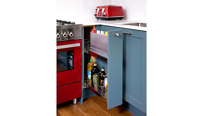
A: PAD was tasked with designing and installing a bespoke kitchen, along with appliance recommendations based on a design concept that Debbie Hannah, the designer from The Unruffled Interior Design Studio had created. Debbie described how her client enjoyed cooking and entertaining and envisioned a bright, vibrant kitchen with ample worktop space that seamlessly flowed into the open-plan dining and living area. The client requested a finished design that would "make her smile each time she walked into it", so careful consideration of the colour scheme, finishes, design features, and appliances was essential to fulfil this brief. On the client's appliance wish list was a bright red Italian Bertazzoni freestanding range cooker and they also had an existing fridge-freezer and microwave that they wanted to integrate into the scheme. The client had a collection of favourite artefacts, memories, and recipe books, and wanted to showcase some of these items as display pieces while having easy access to favourite recipe books whilst cooking.
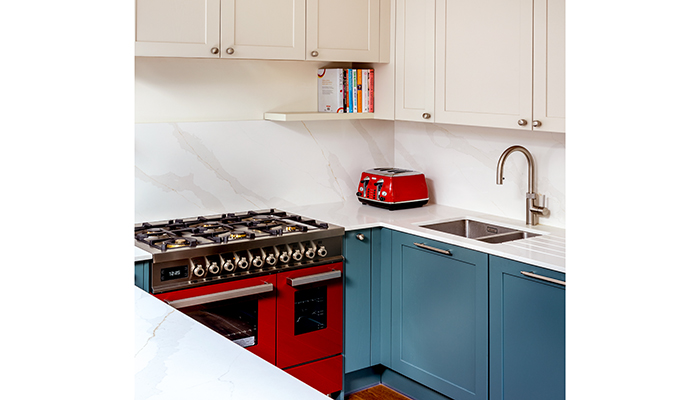
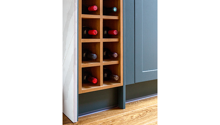
Additionally, the client emphasised the importance of ample storage to keep the space tidy and organised. They also enjoyed entertaining so hoped that a wine fridge could be easily accessed when hosting friends and family.
Q: How did you go about meeting the brief?
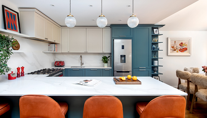
A: We worked closely with Debbie from The Unruffled to create an eye-catching design scheme that featured the perfect layout and vibrant design finishes the client desired while accommodating the wish-list appliances, existing appliances, and decorative shelving displays. Careful consideration of the final choices also had to blend seamlessly with the interior design scheme The Unruffled had designed in the open-plan space.
Q: What type/brand of cabinetry did you choose and what made it the perfect choice?
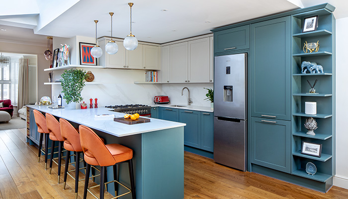
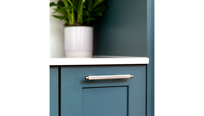
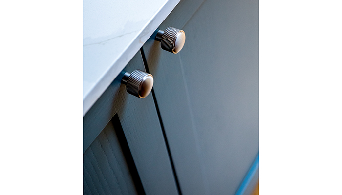
A: To address the brief, we selected the Finch cabinetry range from our St John's Wood bespoke cabinetry collection and added a Putty neutral paint colour finish for the wall units, which was complemented by attractive door handles. For the base units, we chose a striking Baltic Green tone from the same cabinetry range to add vibrancy and act as the strong, dominant colour in the scheme. The decision to use handles for the base cabinetry instead of knobs added definition and further interest. These colour choices were important as they needed to complement other elements in the final design scheme – for example, the orange leather stools.
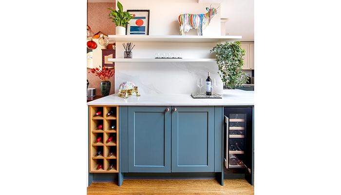
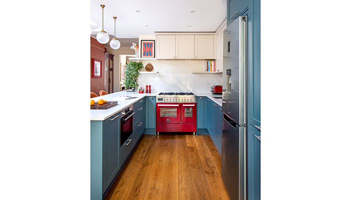
To showcase the client's favourite artefacts and recipe books, we added a long decorative shelf unit in a matching Baltic Green tone that was positioned next to the large pull-out larder unit. To introduce softness and warmth to the design, we also added shelves in a matching Putty tone to the wall cabinetry. These shelves were placed above the range cooker to hold recipe books and the client's additional artwork and smaller ornaments.
Q: What materials did you use? Did you use anything different or unusual?
A: Our St John’s Wood kitchen range is made in our UK factory with FSC-approved wood. It has a traditional solid wood lay-on door design, which has a grained finish and a variety of beading options.
Q: What were the particular challenges that you faced and what were your solutions to overcome them?
A: Many of our clients express a desire for island units, but due to the limited space in this open-plan area, we opted for a peninsula design instead of an island. This decision saved space, offered ample worktop space, and maintained an aesthetically pleasing design. The peninsula design allowed the client to socialise with up to four seated guests while cooking or simply relax with friends over a coffee or glass of wine. Another early challenge was accommodating the vibrant red Italian Bertazzoni freestanding range cooker in terms of size and style. Not only was it large, but its radiant red colour needed to harmonise with the two-colour tones of the cabinetry and be situated for easy cooking and accessibility.
Q: What is your favourite part of the finished project? Are there any design elements that you’re particularly proud of?
A: I love the Baltic Green and Putty cabinetry and shelving choices and how these tones complemented the room's aesthetics, creating a cohesive and inviting atmosphere. The decision to include a peninsular also provided more space and an enhanced layout for the owner.
Q: What is the client's favourite part of the finished project?
A: The client loves the colours and vibrancy in the final scheme. She's also mentioned the overall quality of the kitchen, and how she believes when she considers the whole journey and final result, she really got value for her money.
Tags: kitchens, features, pad, selina quick, bertazzoni


