Insight: I'm a bathroom specialist – this is how I designed my space
Insight: I'm a bathroom specialist – this is how I designed my space
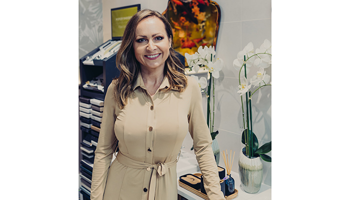
Being married to the co-owner of a bathroom showroom and the project manager of the installation team has its perks, but redesigning your own bathroom can be the last priority – as Koralia Hume of Quarrybank Boutique Bathrooms explains.
We have this saying in Poland: 'The shoemaker goes without shoes', which means that when you work in a particular field, you are the last one to benefit from it. Such was the case for me and my husband Steven, the owners of Quarrybank Boutique Bathrooms in Cheshire. The wait for my own bathroom was a testament to patience, lasting nearly 2 years.
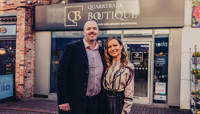
We extended our home back in 2021, bringing forth a new kitchen, dining area, a larger living room, a brand-new master bedroom, and a bathroom converted from the garage. The challenge? Balancing the demands of the showroom and client installations while patiently awaiting our turn. Nothing worked on Steven to bring the bathroom project forward, he was just so busy with booked installations, even the bribes didn’t work.
Finally, in January 2023, the moment arrived. The downstairs bathroom project kicked off, and I was beyond excited. Having been part of numerous client projects, I understood the importance of starting with ideas of an ideal space and playing with options. This time, I had to start with what we had available in the showroom to ensure cost-effectiveness without compromising on the attractiveness of the results.
I was very clear on my mission to bring colour and vibrancy to our bathroom and portray the character of the household. I also knew that this project would be a testament of my values and personality and I wanted to ensure that every person using the space could feel it.
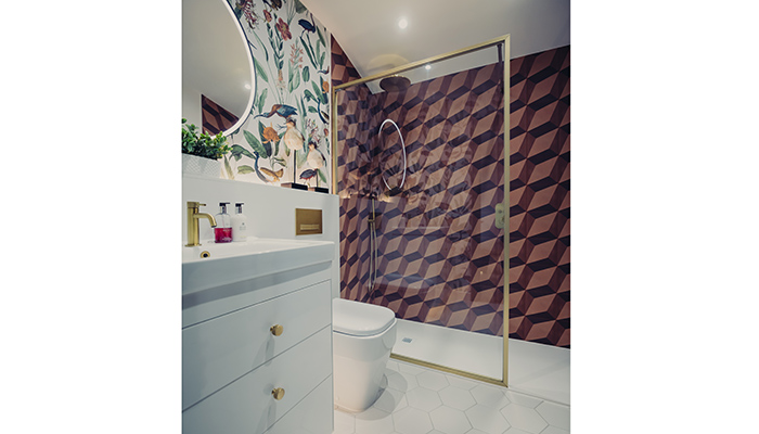
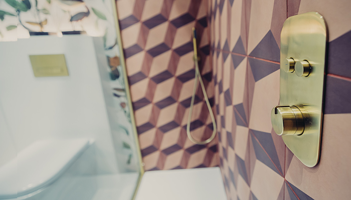
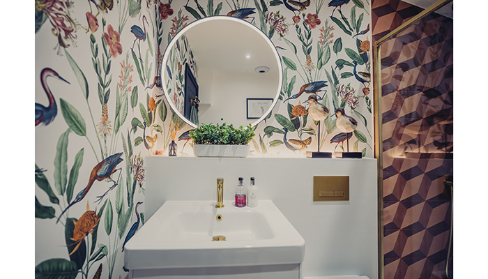
Rummaging through leftover tiles and display items from the showroom, I discovered geometric tiles in rusty reds and oranges, originally chosen for the showroom floor. I thought they would make a stunning shower feature wall as they create an optical illusion of cubes. Couple of old boxes of matt white hexagonal tiles became the perfect flooring, introducing a new shape to the space.
A spare vanity unit from Roper Rhodes, a simple shower screen in a brushed gold finish by Tissino, and a matching brassware by Armera created a synchronised look across the room. The design process itself felt like creating a childhood moodboard, piecing together elements that reflected my favourite colours and passions.
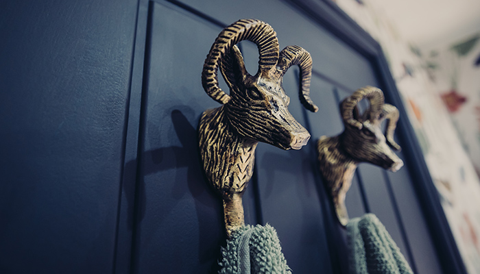
Colour and nature play a significant part of my life. Inspired by birds and animals in my garden, a beautiful wallpaper by Graham & Brown added a touch of the outdoors. An illuminated mirror enhanced the ambience and brought additional light, and the rest was just about adding those little extras which actually made a whole lot of difference. I found a cute pair of wooden birds by Mindy Brown in our local interior shop which enhance the pattern of the wallpaper. The hooks on the door are a nod towards my earthy star sign – Capricorn. I found these in Homesense and they don’t go unnoticed even though they are on the back of the Notre Dame painted door.
The result of my work was a bathroom that stood out from the conventional, with rust and reds making an unapologetically bold statement. The whites in the design beautifully balanced the reds, creating a spacious and light-filled room even though there is no natural light there.
Converting the garage into a utility room and bathroom presented spatial challenges. However, working with existing furniture and tiles led me to some creative solutions. I had to work with what we’ve got rather than get everything new. It made me think outside the box to create something special with restricted availability of resources. It was a great exercise for me, as a bathroom designer and a fun challenge to work with. We saved on costs and found home for leftover items. The room became a harmonious blend of character and functionality and my family and visitors adore this space.
I love working with colour and I always try to encourage our clients to inject vibrant and bold hues into their space. Even though we still don’t see many bathroom designs that include rust and reds, I notice that the trend is coming in this year as tile manufacturers introduce terracotta and ochre into their designs and furniture makers follow the path. I hope that my bathroom design will help clients see that bold choices can really pay off and the colours, previously not associated with bathrooms, can create a unique and memorable experience.
Now, I am on the waiting list for the master bathroom. I have no hope it will happen this year as Steven is booked up until September already but I’ve been putting aside tiles from various projects. This project will be called 'Heaven' to express my love for clear skies. It will be my place of relaxation and serenity. Can you tell what the dominant colour will be?
Tags: insight, features, koralia hume, quarrybank boutique bathrooms, bathroom design


