How Searle & Taylor designed a kitchen around a vintage collection
How Searle & Taylor designed a kitchen around a vintage collection
Darren Taylor, MD of Searle & Taylor, reveals how he and his team devised a characterful kitchen for clients after a contemporary scheme that doubled as the perfect display space for their collection of vintage glass and ceramics
Q: What type of property was it in and who was the project for?
A: We were briefed to design a modern Signature Bespoke kitchen for the newly built contemporary home of repeat clients, who are property developers with a keen interest in collecting 20th Century antiques, including glass and ceramics.
Q: What was the brief from the client for this project?
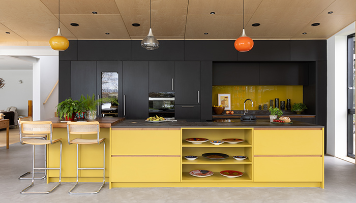
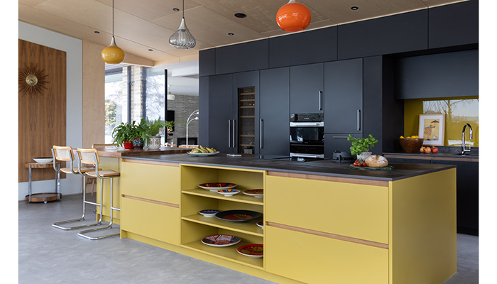
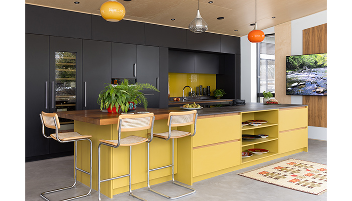
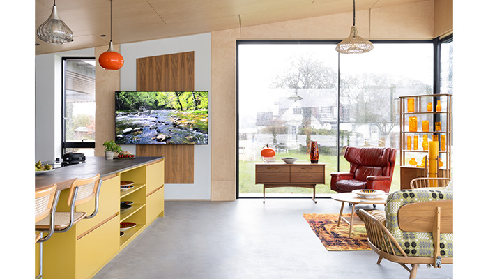
A: This kitchen was a bit of a departure for our clients as their previous Searle & Taylor kitchen had been a traditional bespoke style. They wanted a statement contemporary kitchen with a mix of tall cabinetry with handles, but with handleless doors and drawers for the kitchen island, which was to be used for cooking and as an informal seating area. It had to be British-made to keep the carbon footprint low, yet with a nod to Scandi styling to suit the open-plan space. This has a panelled Birch-faced plywood ceiling and American Walnut rectangular feature panels mounted on white walls on either side of the island. They also wanted it to work well with their midcentury modern furniture and decorative pieces, and for the colour to be dramatic to emphasise the colours of their antique Holmegaard pendant lights. In addition, they did not want any overhead extraction to distract from the ceiling or the lighting.
Q: How did you go about meeting the brief?
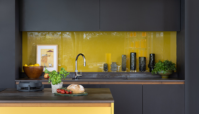
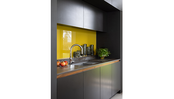
A: We designed specific areas in the kitchen so that our client could display her collection of artworks. This included a specially created upstand beneath the splashback for her vintage glass vases and open shelving in the central section of the island for her collection of Clarice Cliff ceramic plates. We created lots of deep drawer storage in the island, while the tall cabinetry run was used for cupboard storage and to house cooling and built-in cooking appliances, with a recessed wet run next to it.
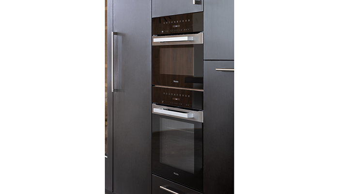
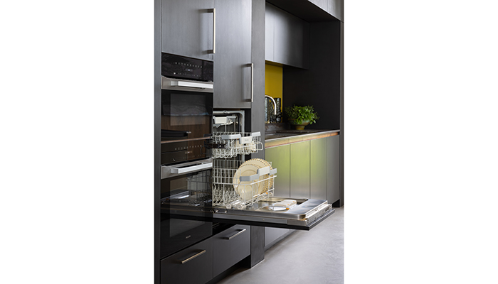
All the appliances that our clients chose for this kitchen are on display at our 2-floor showroom in central Winchester, and we were able to demonstrate them all at the design consultation stage. Within tall cabinetry, they chose to have a bank of ovens by Miele alongside a cooling wall of integrated Liebherr appliances, with a built-in wine climate cabinet at the centre of a tall freezer with ice maker and tall larder fridge on either side. The adjacent mid-height integrated dishwasher is also by Miele.
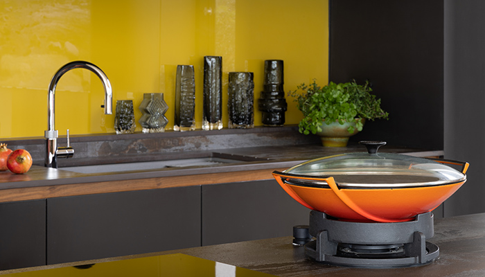
For surface cooking on the island, they chose a Novy Easy 80cm Vented induction hob and a Novy Azuma Gas Wok, which sits directly into the 20mm thick Trillium worktop by Dekton. The undermount sink by Franke and the Quooker Boiling Water tap with Cube function were ideal for the clients’ needs.
Q: What type of cabinetry did you choose?
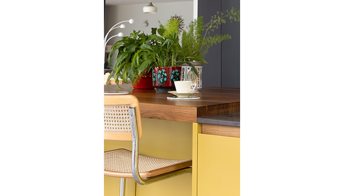
A: The bespoke cabinetry was designed by my design manager, Gavin Alexander, with additional bespoke elements added by me, and it was made in Wiltshire for Searle & Taylor by our team of master craftspeople. Being bespoke meant that we could utilise all the available space with the run of tall cabinetry and we could include some special elements for the island, such as the raised walnut breakfast bar and the walnut handle rails which would be hard to specify off-the-peg from a non-bespoke kitchen brand. The task side of the island features soft-close drawers above storage cupboards, while the facing side includes the open shelving between deep soft-close drawers. One end of the island is recessed in an L-shape so that our clients could include their vintage bar stools as informal seating for 3 people.
Q: What materials did you use? Did you use anything different or unusual?
A: The paint colours were chosen by the clients and sourced by us. The tall run is handpainted in Black Beauty by Benjamin Moore Paints and the island is painted in Grapefruit S302 by Tikkurila, a Finnish paint brand. We then had the glass splashback colour-matched to perfectly complement the island and the yellow pendant light. To add an accent, we used walnut in 60mm thickness for the breakfast bar and for the handle rails to match with the wall panels. The Trillium worktop combines the black, brown and yellow hues.
Q: What were the challenges that you faced and what were your solutions to overcome them?
A: While our clients wanted a bold look to the kitchen to suit their interior aesthetic, we wanted the design itself to be functional and to stand the test of time. We also had to include special shelving to accommodate their artworks – the open shelving in the island and the special upstand shelf are ideal for those needs.
The design of the island was a challenge as had to be central and symmetrical within the open-plan room, yet we had to factor in ample space for the 3 large retro bar stools. We also had to incorporate both gas and electrics into the island to accommodate the various surface cooking options, but the result looks fantastic and is exactly what our clients wanted.
Q: Are there any design elements that you’re particularly proud of?
A: While the colours are bold, the design is understated. It packs in a lot of storage and I love that we placed the dishwasher in a tall cabinet. By raising it off the ground makes it far easier for loading and unloading. The luxurious walnut accents work well within the yellow island and the Dekton Trillium worktops tie it all together beautifully.
Q: What is the client's favourite part of the finished project?
A: They loved how we embraced their vision of having a kitchen that would be used, in part, to display their extensive vintage glass and ceramic art collections right from the start. It was an unusual design brief, but a very enjoyable one.
Tags: kitchens, features, searle & taylor, darren taylor, midcentury modern


