How PAD created a light space while using vibrant dark blue cabinetry
How PAD created a light space while using vibrant dark blue cabinetry
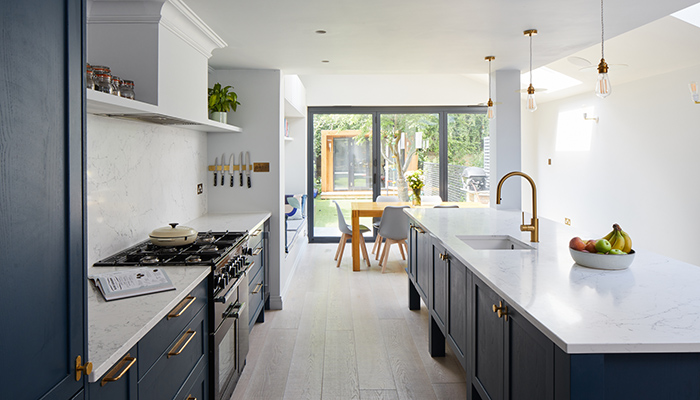
Libra Dalligan, designer at London-based kitchen company PAD, collaborated with Muchmore Design to create a design for a client whose priority was to have a dark blue kitchen while keeping the space as light as possible.
Q: What type of property was it in and who was the project for?
A: The kitchen was within a new rear extension in a family home in Rotherhithe, SE London.
Q: What was the brief from the client for this project?
A: To design a bespoke kitchen and utility room in collaboration with interior architectural design studio, Muchmore Design. Muchmore Design created the original design concept and briefed us to create a scheme with their cabinetry and appliance recommendations for clients who wanted a functional, yet sophisticated ‘dark blue’ kitchen.
The brief also asked for a large central island that wouldn’t dominate the extension space and to consider design choices that would keep as much light and ‘openness’ in the extension.
Q: How did you go about meeting the brief?
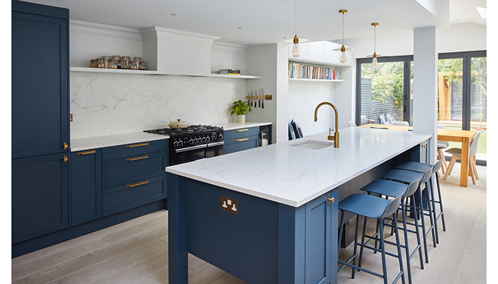
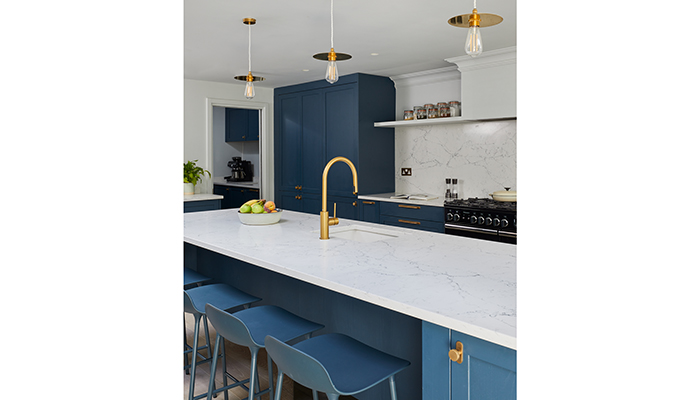
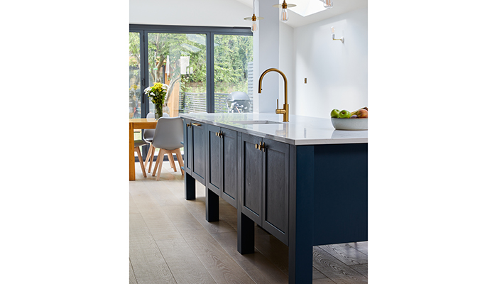
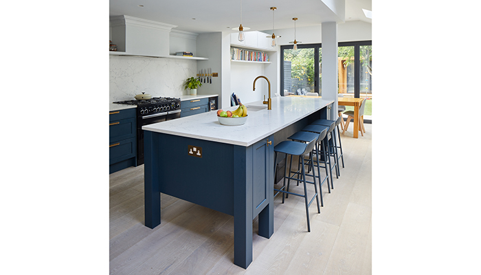
A: We implemented Muchmore Design’s original design brief by initially including a central island within the extension that was raised off the floor; so it looked more like a piece of free-standing furniture. The island included additional storage, a sink with a brass boiling water tap and seating for up to 4 people.
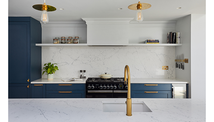
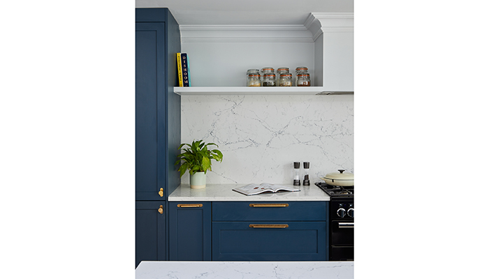
We choose open shelves instead of closed heavy wall cabinets to ensure that the space met the brief by remaining as light and open as possible – the shelves also allow the owners to add decoration and personality with favourite books, pictures and artefacts.
The inclusion of a PAD Pantry provided additional drawers at the bottom, shelves above, and space for small appliances. An integrated fridge freezer directly next to it was designed to allow ultimate efficiency in unpacking shopping and at meal prep time. To keep the space tidy and organised, we added a matching dresser and wall cabinets in the utility room space.
Q: What type of cabinetry did you choose and what made it the perfect choice?
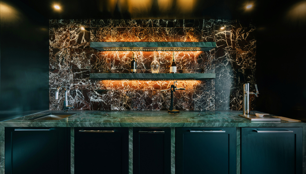
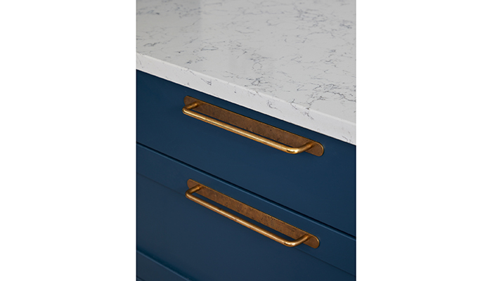
A: We selected our PAD classic ‘Elgin’ cabinetry range from our St John’s Wood collection which was painted in a contemporary Deep Ocean colour tone that we matched with sophisticated brass handles and knobs.
Q: What materials did you use? Did you use anything different or unusual?
A: To add warmth and contrast, we chose Caesarstone’s White Attica worktops which we matched as a statement splashback.
Q: What were the particular challenges that you faced and what were your solutions to overcome them?
A: Bringing the raised island to life was a technical and plumbing puzzle, but since the clients wanted their dishwasher in the utility space, we could design the raised island to not only look visually appealing but practically hide the sink plumbing with mirror boxing.
Q: Are there any design elements that you’re particularly proud of?
A: We love the effect of the raised island and the Antique Brass handles and knobs against the Deep Ocean blue finish looks so elegant!
Tags: kitchens, features, pad london, libra dalligan