Kitchen focus – Top designers reveal their boldest projects of 2024
Mon 16th Dec 2024 by Emma Hedges
Kitchen focus – Top designers reveal their boldest projects of 2024
With 2025 set to be the year of the bold kitchen, Emma Hedges talks to designers about their most striking projects of 2024 and hears how consumers are the bravest they've ever been when it comes to style.
1. Leila Touwen, co-founder, Pluck
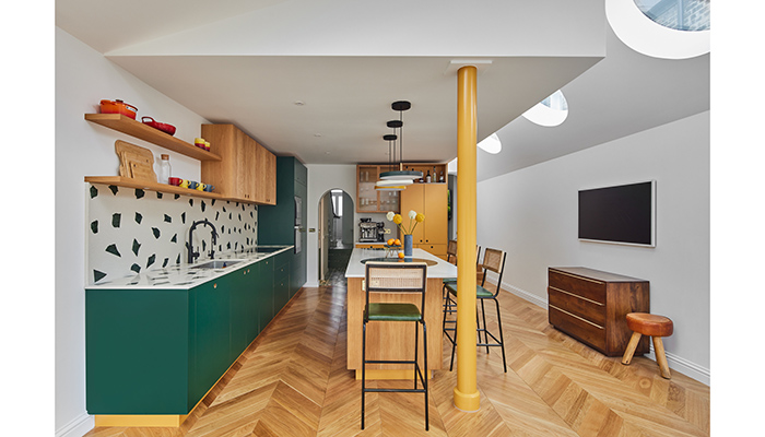
"This kitchen is modern and bold with a striking confidence in its design. Boundaries are pushed with contemporary materials, with oversized circles on the bespoke terrazzo worktop and crenellated texture on the fluted oak cabinetry. Architect Peter Morris’s aim was to create ‘a joyful and surprising home’ and there are primary shapes throughout the characterful extension. There are curves too, this is a room full of surprises – the closer you look the more you see! Projects like this are always a delight."
2. Helen Parker, creative director, DeVol Kitchens
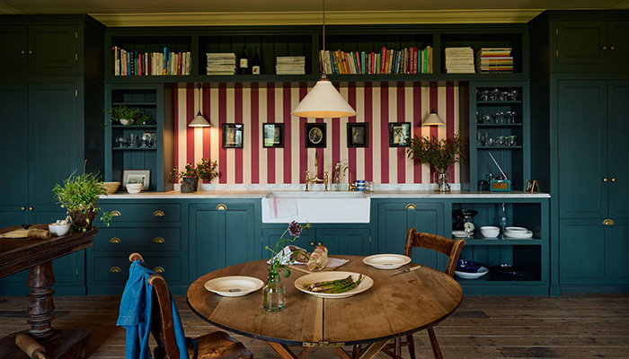
"These customers are an interior duo called Clarence and Graves, so their ideas were at the forefront of this kitchen design. They are bold designers and moved from London where they fitted an equally original deVOL kitchen with pistachio coloured Crittall windows. This colour window has since become one of their trademark looks, because it was such a bold statement. They were most definitely the instigators of the bold statements within this kitchen.
"I love the simplicity, the light and most of all the empty space in the room, I love the choice to go for a small round table in such a big space. Leaving space is as much a part of designing a room as filling a space, this kitchen is all about the simple open spaces.
"I guess the wallpaper was a bold statement, but a statement that could easily changed for a completely different look. I like this bold but changeable option, as it allows you to be brave yet fickle! Completely changing the look of the room very quickly and easily with a couple of rolls of wallpaper."
3. Shehryar Khan, MD, Sheraton Interiors
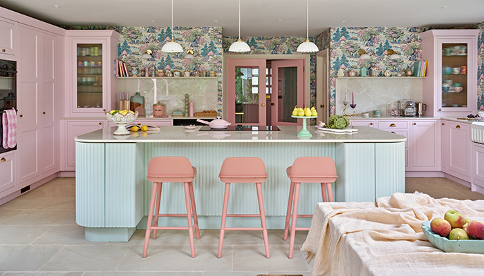
"This project stands out for its unapologetically bold and colourful design approach and reflects the personality and creativity of the homeowner, Sophia. Traditional cottage charm with contemporary design in a way that feels both personal and cohesive. The pink cabinetry is the boldest choice in the room. Kitchens often lean towards neutral or classic tones, but the rich, pastel pink chosen for this design challenges convention. The mint green island for contrast further emphasises the playful yet balanced colour scheme, making it a statement feature of the home.
"Sophia was confident in her bold choices from the start, driven by her desire to make the kitchen a reflection of her vibrant taste and lifestyle. Our mutual alignment made the decision-making process smooth and collaborative."
4. Alex Main, director, The Main Company
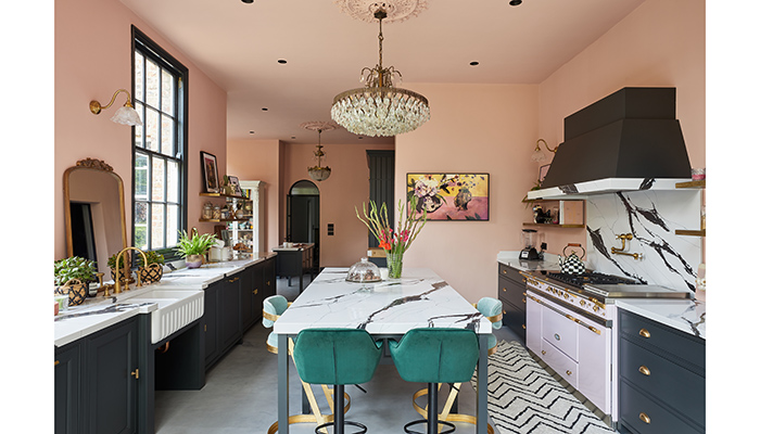
"Packed with personality, quirkiness and charm, this stunning Victorian townhouse in York combines eclectic style with original features and the homeowner's colourful and adventurous style.
"The dark tones of the cabinets pair beautifully with the striking Calacutta Black quartz worktops that span throughout the space, whilst also contrasting with the soft pink walls. The open-plan layout results in a seamless flow, providing natural zoning within the space. From the jewel-coloured bar stools at the kitchen island at the centre to the oval dining table and cosy window seat, it is truly a space for both relaxing and entertaining."
5. Jayne Everett, creative director, Naked Kitchens
"It is always wonderful to see a combination of a colour and oak used together. This project is in a fabulous size room, which showcases the use of colour, pattern and texture, which all work wonderfully together to deliver a dreamy family kitchen. Although the colours are fairly bold, the project is propelled to another level of boldness with the clients' choice of worktop.
"The design works so well as although individually the choice of colour and materials are all fairly bold they complement each other to produce a visual delight. The end result was loved by the client who really pushed the boundaries of bold material choice within their kitchen to create an exciting and hugely welcoming space. We even designed a wonderful bench seat to sit and enjoy kitchen life."
6. Stacey Cobley, senior designer, Harvey Jones
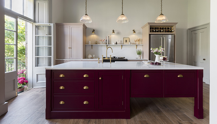
"Red is having its moment. With the ‘unexpected red theory’ taking the internet by storm earlier this year, many have found new and creative ways to introduce pops of red around the home. We’re starting to see bolder braver colour choices that ooze warmth and playfulness.
"Blood red is the perfect colour to invite this feeling to a kitchen space. Try replacing the cooler tones with this deep colour to create a space that emanates a cosy, retro-inspired vibe while seamlessly blending comfort and style. In my opinion, the more the better. Try painting walls in the space, or switching up cabinetry with this colour. I don’t think you’ll regret it.”
7. Antony Arnold, kitchen designer, Atlantic
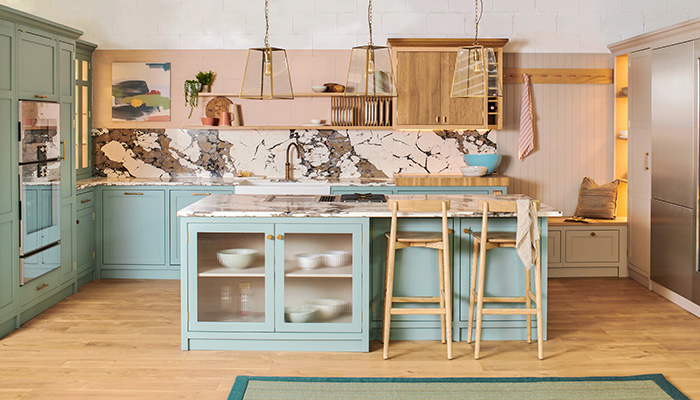
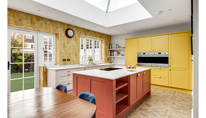
"While the majority of clients are still looking for neutral tones, we are seeing a growing trend towards personalisation and the celebration of individuality in the home through design and the use of colour, more than just a blue or green kitchen.
"This project showcases Callerton’s bespoke paint colours, blending subtle tones with bold statements to create a truly personalised space with the ultimate wow factor. Our client really embraced the use of colour which stemmed from a wallpaper swatch highlighting the pink, yellow and orange tones as a backdrop for their social media baking content."
8. Jayne Everett, creative director, Naked Kitchens
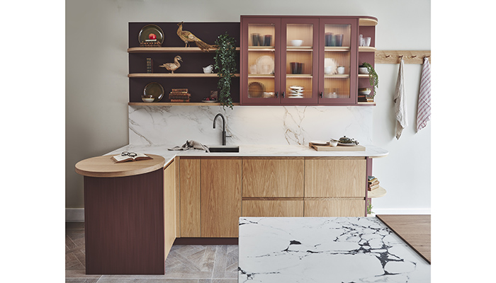
"The Rudham kitchen is a delight of interesting earth textural cabinetry. We used our oak J rail doors along with reeded panelling and glazed upper cabinetry in our Old Huns'ton, a wonderful earthy and versatile red.
"Our client wanted a timeless, interesting and earthy kitchen. The design had to work well with the feel of the rest of their modern house which had a lot of oak throughout. The end result was a hugely pleasing design which showcased lots of oak along with interesting texture for the panelling and fabulous oak floating shelves which tie the design together and soften the feel of the kitchen, blending the area into the living room of the open plan.
"The use of our rich Old Huns'ton red was a bold choice of colour, but combined with the oak really brings it into its own and enhances the earthy feeling of this tone. We absolutely love the combination of the rich colours with oak and the use of the painted readed paneling which works wonderfully to add interesting texture to the project. The clients totally love the final result as it works so well with the overall feel of their house and really embraces the natural materials. It was very easy to persuade the clients to push the boat out by being bold as they knew they wanted to have a totally unique design to showcase their creativity."
9. Leila Touwen, co-founder, Pluck
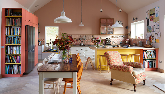
"The first impression of this kitchen is the size of the room, a dramatic double height ceiling and a pitched roof. The second is that the room feels so welcoming and comfortable, and this down to the colour and material choices. The soft pink wall forms the backdrop for cabinetry that includes four Pluck colours; all the hues are warm, a sunny yellow, pinks – even the grey is on the warmer end of the grey spectrum. There’s a mix of woods too, it makes the kitchen feel homely, with furniture collected over time.
"This is a family kitchen and it is lived in, there is evidence of existence and comfort, life clutter. I love that this space invites you to sit in it, to cook, to breakfast, to have friends for supper, even to curl up with a book and read. It is a place with many inviting possibilities! Our clients came to us because they wanted to use colour, so it was wonderful exploring the options and working together to reach this final design. I also really like that they opted for a peninsula, as opposed to an island – it fits seamlessly with the layout, adding to the sense of harmony here."

10. Jayne Everett, creative director, Naked Kitchens
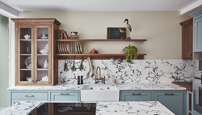
"This kitchen is a feast for sore eyes. Just gorgeous bold colours and really interesting colour combinations. Our statement First Flight dusky blue is combined with unstained walnut for the glazed cabinet, interior painted in Wild Heather and introduces textures with the readed walnut upper cabinet. Quite a sumptuous combination and elevated even more by the strong choice for the worktop.
"The cabinetry colour is a super bold choice but the client really wanted the design to sing and be a wonderful inviting space to work well in their open plan kitchen dining area. The clients just love the whole design which works wonderfully with their property and the pallet of colours, patterns and textures just keep on pleasing. It's a super happy space to work in with layers of interest from the different worktop materials to the gorgeous natural walnut used for the shelves and some of the joinery which ties in with the dining area cabinetry. The client really embraced using bold colours. They are very keen to make a statement, which made the project very exciting to work on."
Tags: kitchens, features, bold kitchen designs


