Tile trends: Using pattern and contrast to create daring designs
Fri 12th Feb 2021 by Emma Hedges

Tile trends: Using pattern and contrast to create daring designs

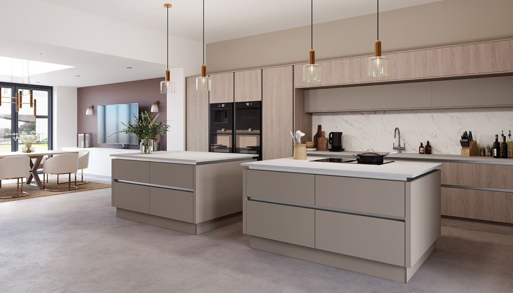
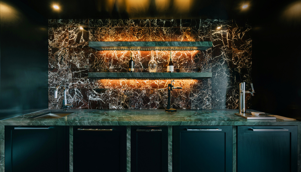
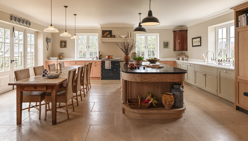
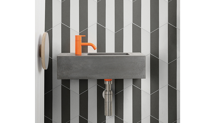
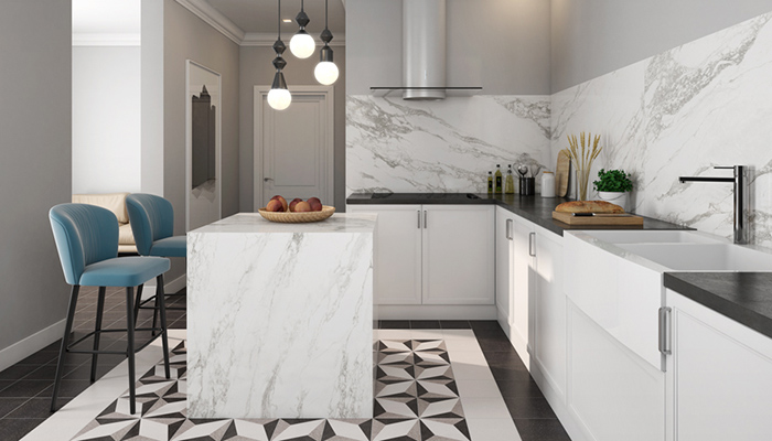
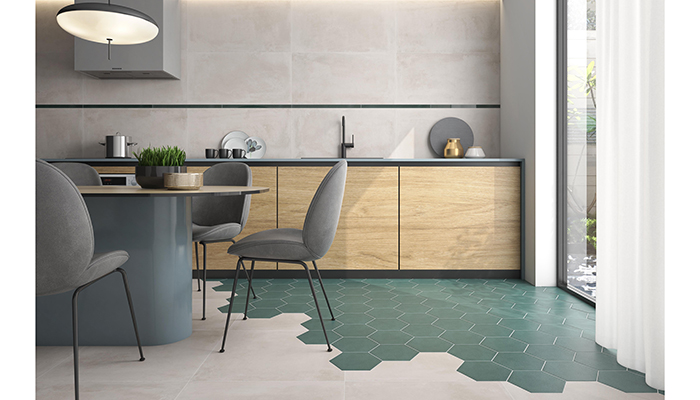
With consumers becoming increasingly keen to add a distinctive flourish to their kitchen or bathroom designs, it’s no surprise that the latest tile trend offers myriad ways to experiment with strident tones and project strong personality. “It’s all in the laying pattern,” explains Peter Vann, director of Céramique Internationale. “The same tile can be used a multitude of different ways to create feature walls, accent areas and splashbacks, and to catch the eye in the often narrow, tucked away area between wall-mounted cabinets and work surfaces. Trending patterns include herringbone or chevron half-bond brick style; stacked brick style or portrait to create a striking and very modern effect.”
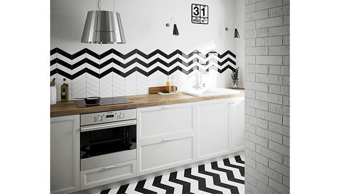
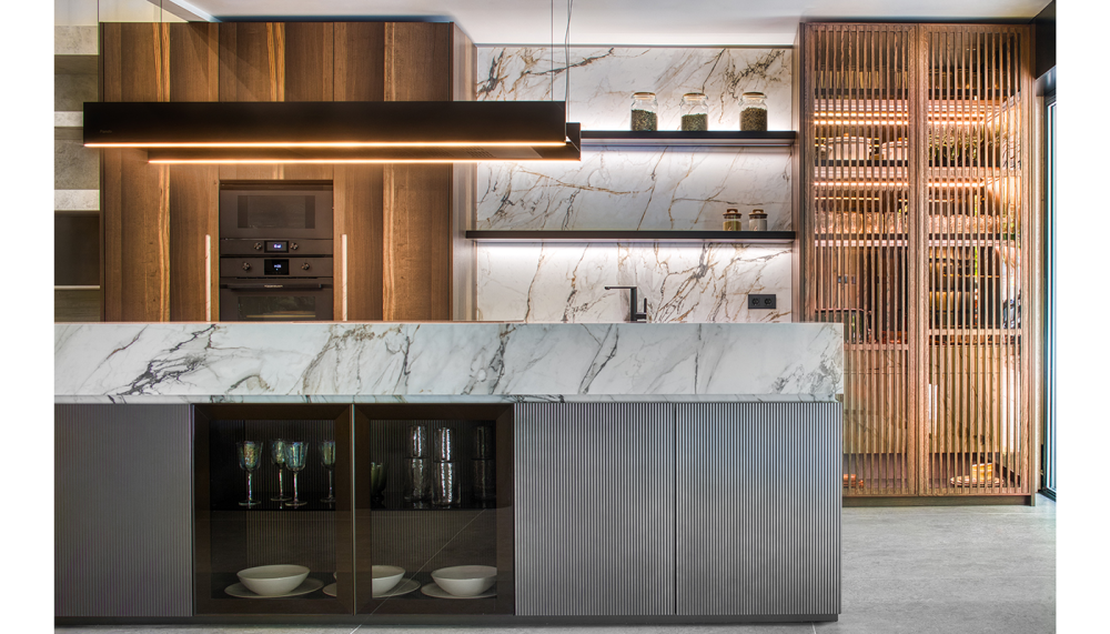
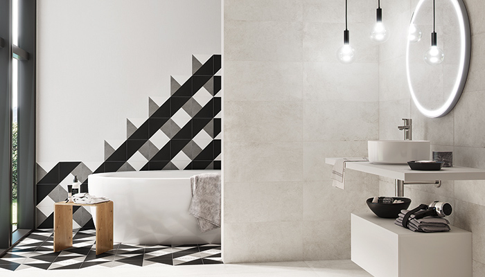
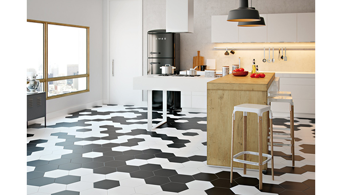
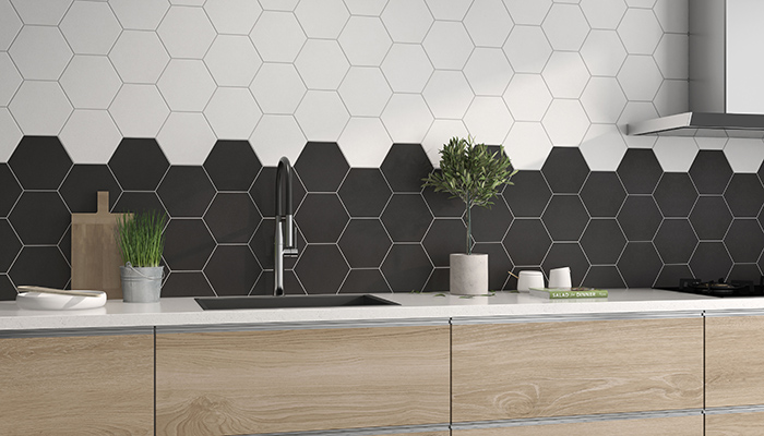
As well as metro and chevron tiles, square and hexagonal tiles with striking decors in contrasting tones can be another way to achieve a similarly statement wall or floor look.
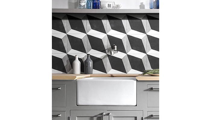
Added to that, layers of complexity can be introduced with more intricate designs.
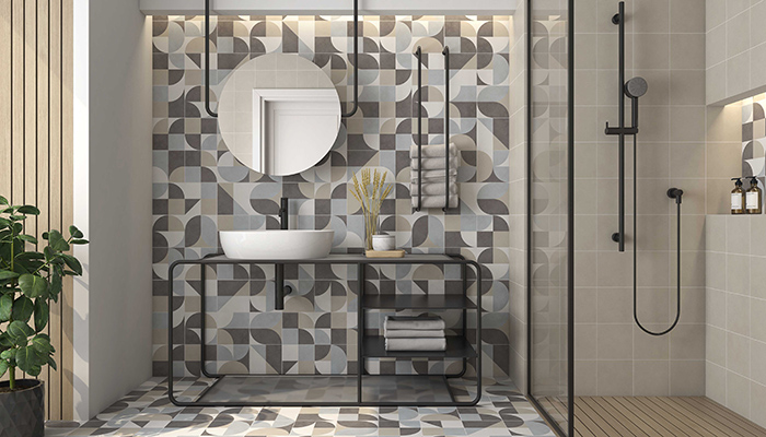
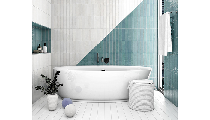
“We’ve been noticing the trend towards the use of colour for some time now, and the use of tiles to enhance specific areas in the house,” says Ana Ortega, head of marketing for Pamesa, explaining that balance is key when using striking colour combinations and pattern. “For instance, we would recommend matching a hydraulic floor tile with a similarly toned base tile to provide some balance,” she adds.
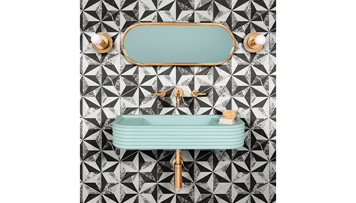
Arantxa Martinez, design manager at Roca, agrees there is a trend towards contrasting tones, “but the trend is mostly towards monochrome, rather than towards the combination of strong colours,” she clarifies. “The effect of blocks of colour can be softened by using white as a balancing colour, and by focussing on specific areas."
Breaking away from a rigid laying pattern and introducing random elements can be another effective way of making a style statement, and taking that desired individual look to the next level.
But for guaranteed impact keeping it simple is key, and colour blocking never fails to deliver results.
Tags: features, insight, equipe, ca pietra, ctd architectural, saloni, ceramique internationale, pamesa, roca, harmony

In Other News