How to style a showroom or get a client's kitchen photoshoot ready
How to style a showroom or get a client's kitchen photoshoot ready
As well as being PR to a number of high-profile kitchen companies, Alex Crabtree has perfected the art of styling clients’ kitchens for magazine photoshoots and dressing showroom displays to attract customers. Her Instagram account @alexcrabtreepr, where she posts photos of her beautifully styled home, has amassed almost 20,000 followers. Here she shares her top tips on how to style different settings, and what to avoid like the plague.

• How did your styling career start?
I joined my family company Crabtree Kitchens as their PR and marketing director to help my father and brother promote the company. They had many beautiful kitchens and simply hadn’t ever photographed them professionally. So, I set out to find a fabulous photographer and started to style the kitchens too. I found very quickly that I not only loved styling, but that magazines also loved our images.
• What are your top tips for dressing a kitchen showroom?
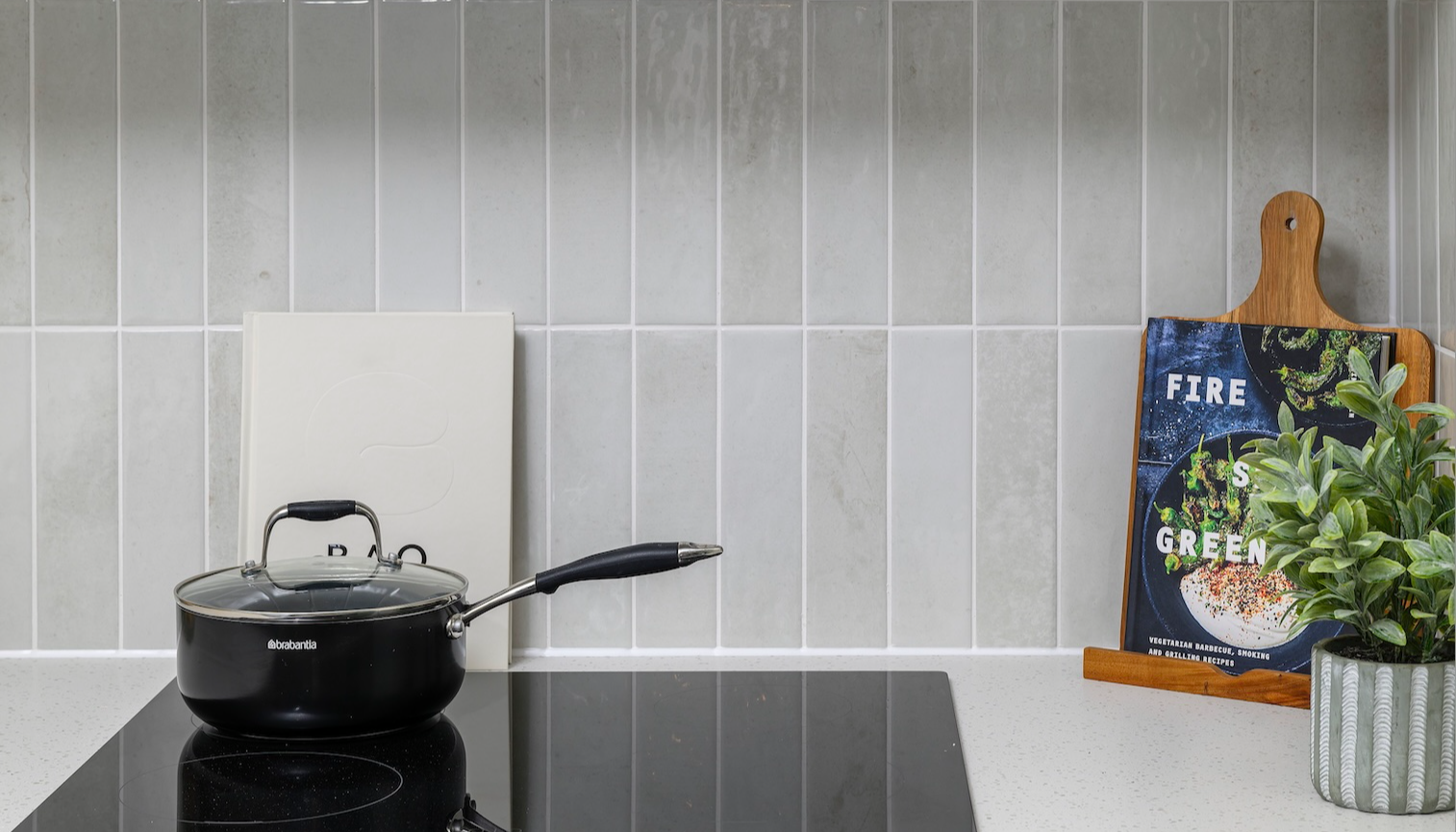
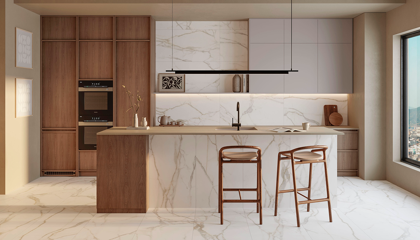
I feel strongly that you should not just prop the surfaces but also the inside of the cupboards – larders and pull-outs, and so on. People need to see how the kitchen would work in their own home. Re the worktops, it’s best to choose a few really high-quality gorgeous individual pieces rather than clutter with lots of less exciting pieces. Of course, if the kitchens are of a contemporary style less is more – not so much with traditional kitchens.
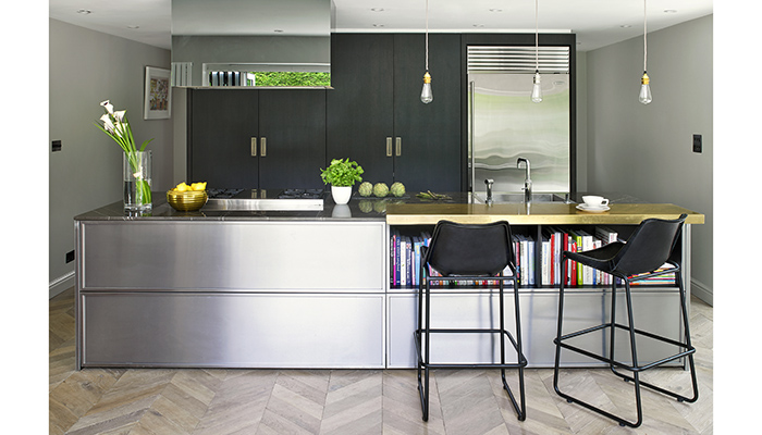
• If there are multiple displays, should they all be dressed differently, or should they share the same aesthetic?
This depends on the layout of the showroom. If there are clearly defined sectioned-off areas and one was a traditional and another contemporary one could slightly vary the styles, but there does need to be consistency throughout so as not to confuse the look, and to create uniformity.
• How about window displays?
Some of my favourite showroom window displays have been the ones where they have sourced beautiful unique pieces that no-one else would have, like a sculpture or a piece of vintage glass to attract a potential client’s eye and draw them inside.
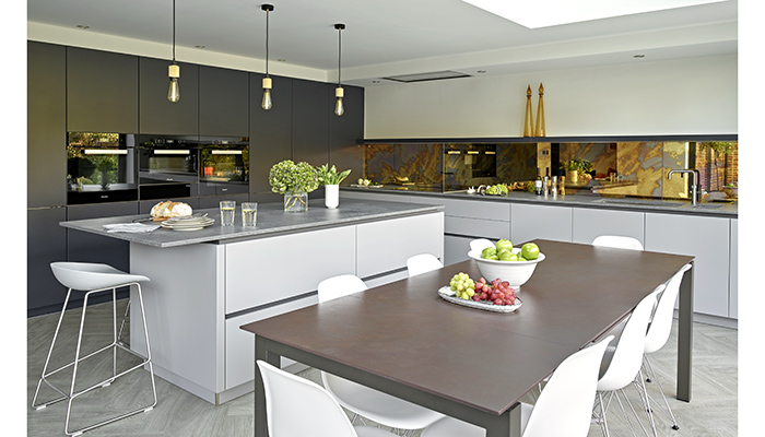
• What do you need to bear in mind when styling a client’s kitchen for a magazine or website?
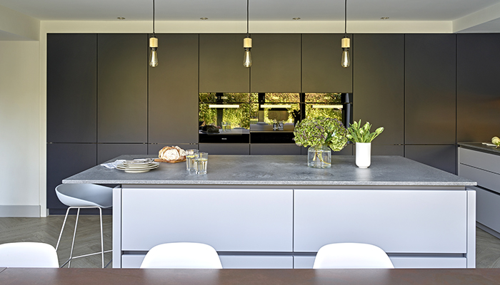
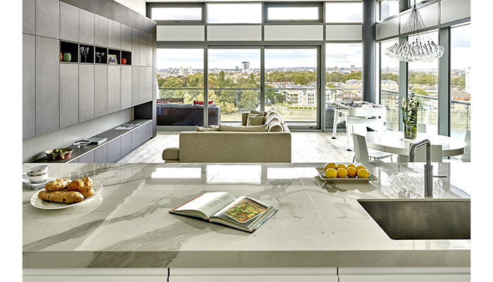
Look at some snaps beforehand so you can assess what you need to take before you go. I always buy fruit, veg and flowers, and I always take along two large wheeled boxes of my own props, although I do like to use the homeowners’ pieces if at all possible. Over the years styles have changed. In my heart I am a maximalist, but I style in a minimalist way for client shoots as these days that is what the magazines prefer.
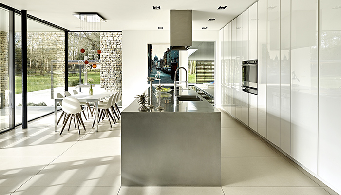
• What are the key things to avoid?
Over propping – so not too much visually distracting clutter – and no meat or fish – anything that might offend anyone. Always take out clients’ framed photographs and anything very personal, and remove paperwork from the worktops and stuck to the fridge – generally tidy up. It’s a no to lots of cookery books. Remember to take a snap before you move anything so that you can put the pieces back in the correct places after the shoot. Always tidy up larder cupboards and remove anything that isn’t so attractive such as half-opened packets. Also, always have lights off – magazines don’t like them on – and take time to work with the photographer to create the best look, even if that means moving things around a lot. Also, don’t move a vase of flowers around and then shoot it in different locations – magazines need to see the pieces in the same place throughout all the images for consistency.
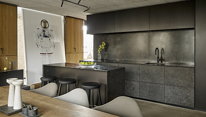
• What trends do you see coming next?
I feel styling will stay pretty minimalist for now, but if you’re after a beautiful, curated look for your showroom, I suggest sourcing interior pieces from some of the inspiring accounts on Instagram and Pinterest. There are so many different styles now, and that way you can find the one that best suits your aesthetics.
Tags: kitchens, features, alex crabtree, styling, matrix designs, brayer designs, minotticucine


