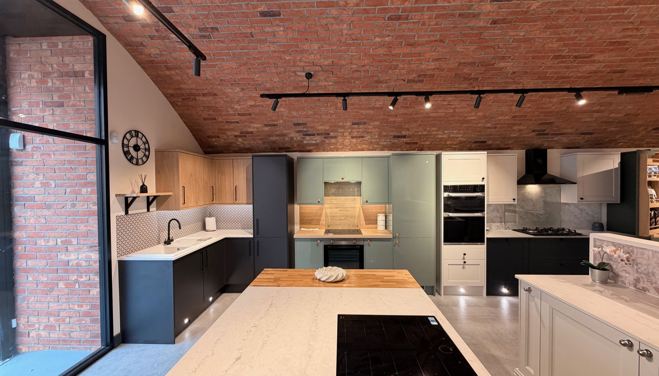
New PWS launches reflect the mood of the moment, says Harvey Mallinson

New PWS launches reflect the mood of the moment, says Harvey Mallinson
The last year has seen seismic shifts in consumer behaviour, and one brand that has been paying close attention to how these have developed has been PWS. We talk to product designer Harvey Mallinson to find out more about how the company's additions to its expanding portfolio are all engineered to reflect key trends.
Q: Tell us about the latest product launches.
A: This year, we’ve introduced various new product innovations to our extensive collection, as well as seven brand-new colours, a new tray style for our Kesseböhmer range and even more handles, with the aim of ensuring we remain market leaders.
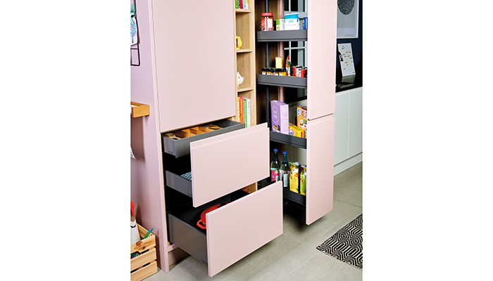
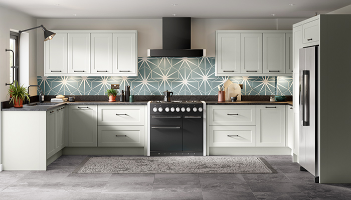
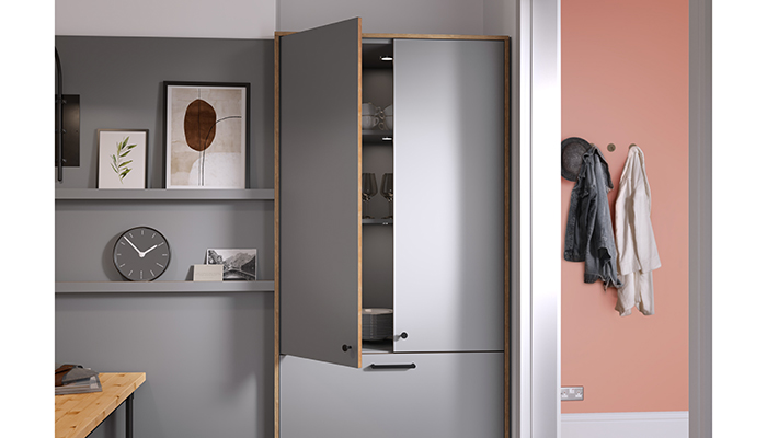
The new innovations include Hunton Dove Grey from stock, Belsay Indigo from stock, seven new finishes in Stanhope, a brand-new Multiplex edging for our Unity door and a further enhanced 1909 Kitchens collection – including new SKUs to help customers create key in-frame looks, such as extra tall appliance housings and stunning feature units.
Q: Are they in response to customer demand and to any particular trend?
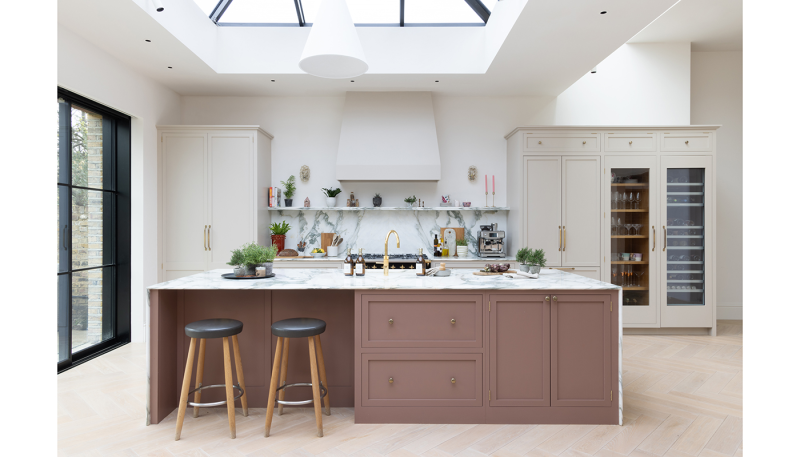
A: We’ve been noticing that homeowners are being more adventurous with colour and texture, focussing more on the finer details too, so in response to this we wanted to include a diverse palette which allows customers to be even more creative with their designs.
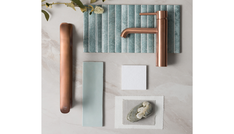
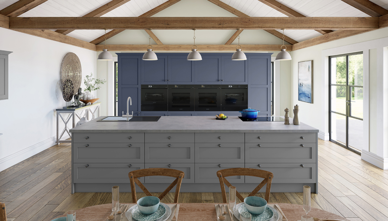
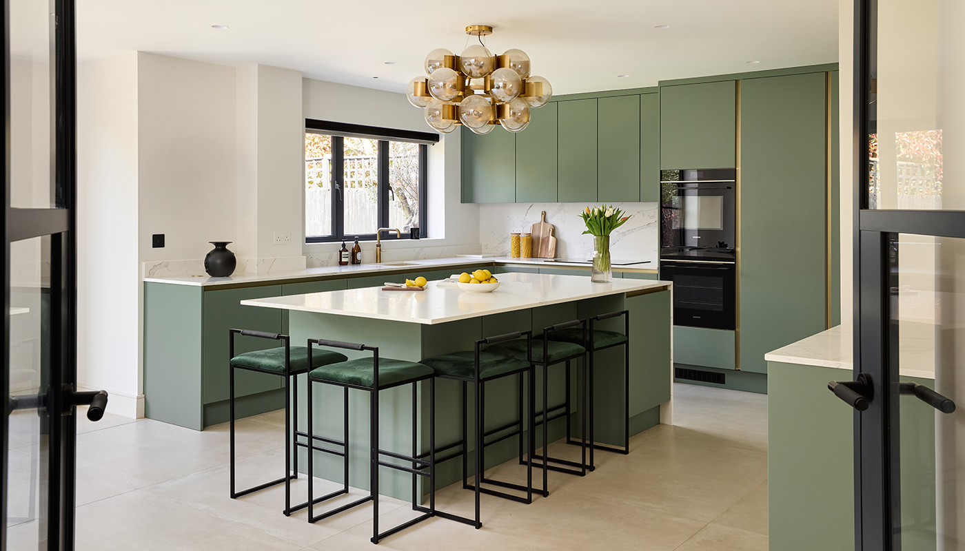
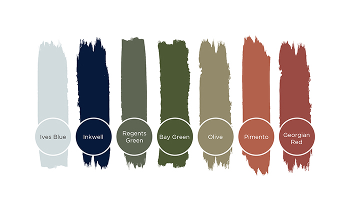
We have also seen a big rise in blues and greens which reflects a movement in trying to “bring the outside in”, so we were keen to add different shades into those categories so that we could cater for a more natural aesthetic. For example, our new Ives Blue can create a light and elegant environment, whereas our new Olive green can add warmth and earthiness. Bolder blues have been particularly popular, hence our inclusion of Belsay Indigo into the colour palette and stock for Belsay.
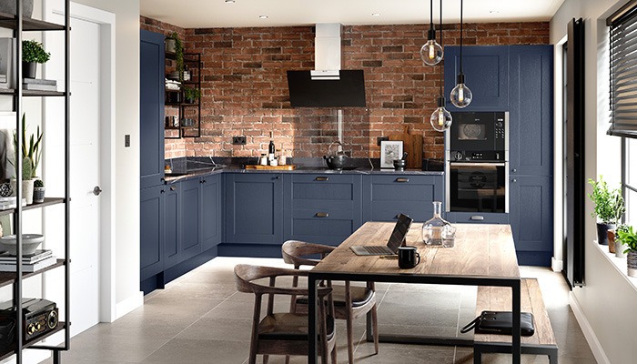
The inclusion of our new Red palette reflects this leap into bolder colours which are used on more statement pieces within the kitchen, with Pimento and Georgian Red allowing for more punchier hits of warm accents which work great when bringing attention to an Island or Gin Cabinet.
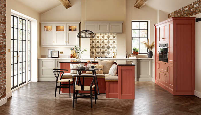
Adding more tones into each colour category allows for people to create subtle tone changes within their designs. This allows you to cleverly zone areas of the kitchen while still sticking to a general colour theme.
Moving onto handles, brass is really emerging as a standout finish, so we have included additional modern designs which feature Brushed, Satin and Aged brass finishes, that can be used in both contemporary and classic kitchen settings.
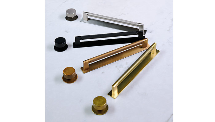
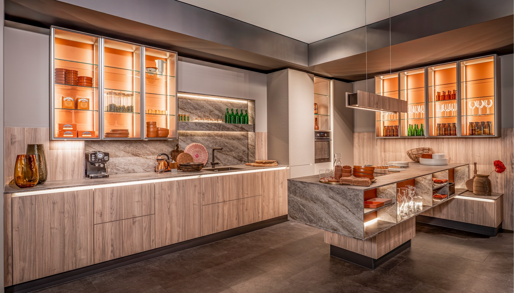
Texture is becoming an ever more prominent thought when it comes to kitchen design. So handles like the Didsbury family and the Dunston handle feature textured surfaces, which can add an extra layer of tactility but on a smaller scale, whereas our new work surfaces provide even more tactile character on a larger surface.
New ‘Multiplex’ edging in Unity would be an inclusion that highlights the customers interest in finer details, allowing for more depth and creativity when considering each aspect of their design.
Q: Is there any particular aesthetic theme running through them?
A: It’s probably not about catering to a certain aesthetic or theme, but more about carefully considering individual elements that can then fit within multiple themes, allowing more diverse and creative designs.
Q: Which kitchen trends do you see gaining traction at the moment?
A: We think there will be a larger injection of colour for sure, whether this is to create boldness or brightness within a space. This can be utilised through painted palettes or more daring material choices allowing for extra layers of texture.
After an odd year we think people more than ever want a connection to the outdoors, so natural colours and textures such as timber might be more on people's minds when trying to inject a bit more life into their environments.
Tags: insight, features, pws, kesseböhmer, harvey mallinson, kitchens
Sign up to our newsletter
Most Read
Designing with colour: The timeless appeal of painted kitchens
Sun 26th Apr 2026


