How Sheraton Interiors designed a dark kitchen that maximises light
Tue 1st Jun 2021 by Emma Hedges
How Sheraton Interiors designed a dark kitchen that maximises light
Dark kitchen cabinetry may be proving popular with consumers at the moment, but incorporating it successfully requires careful consideration. We talk to Shehryar Khan, senior designer and director at Twickenham-based showroom Sheraton Interiors, to hear about one of the company's latest projects.
There are many advantages for designers when it comes to taking on projects in 1930s period properties. For a start, the layout of these houses tends to lend itself naturally to practical family living and the proportions of the rooms are invariably generous. Added to that is the fact that the style of the space can be taken in either a traditional or contemporary direction, depending on personal taste, and still look perfectly in place. However, for Shehryar Khan's clients, a fusion of the two was in order.
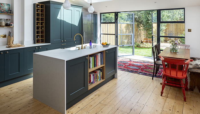
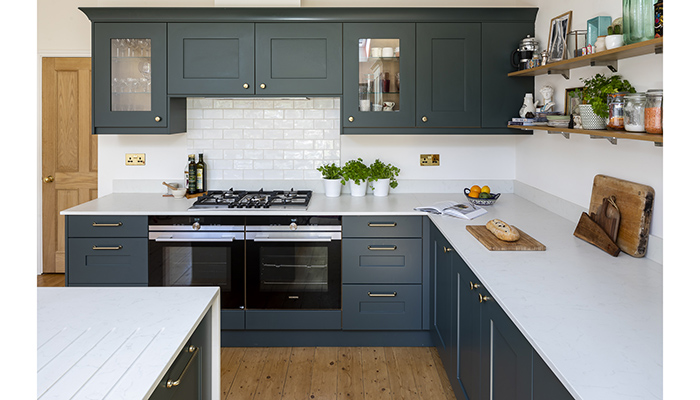
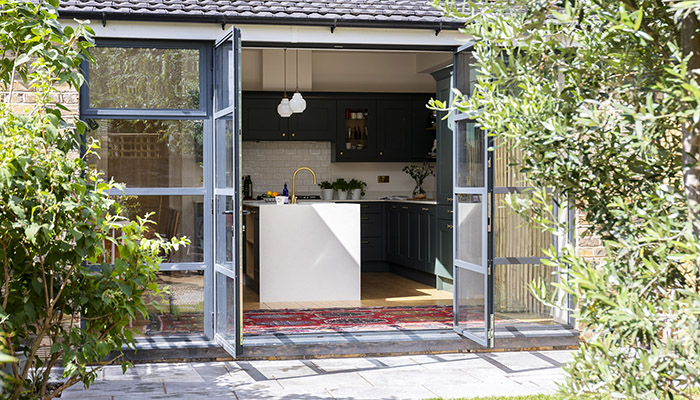
"The clients wanted a modern take on a classic design, with a simplistic layout and clean lines in keeping with the house," he explains. An additional request was to create a focal point with an island, with some dining space within the kitchen, but a key part of the brief was the colour of the cabinetry. "They wanted a dark kitchen, but still wanted to take advantage of the natural light coming in."
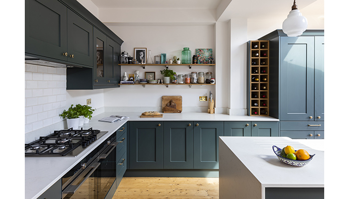
After considering various different options, the family decided to go for a classic Shaker-style kitchen with a smooth painted finish, and selected the Fitzroy door by Second Nature, opting for rich Copse Green. "They loved the design of the door," says Shehryar. "It has modern-style chic, and a contemporary feel."
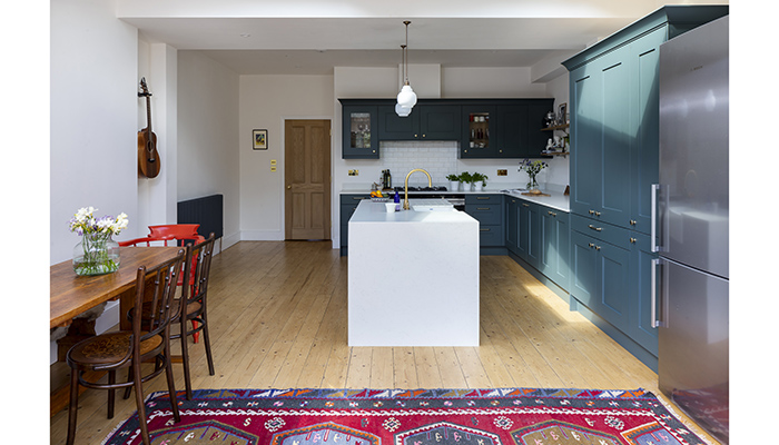
"We needed to create a light and airy feel, and incorporate a cooking area, a pantry, fridge-freezer and focal island. We had limited space as it was quite a small area, so to incorporate all these features was a challenge," he remembers. The team also needed to ensure that the design made the most of the available natural light flooding in through a skylight, and doors leading on to the garden. This was achieved with bright white worktops in the form of Silestone Arial Quartz, which helped reflect light around the room and acted as an effective counterbalance to the dark green doors.
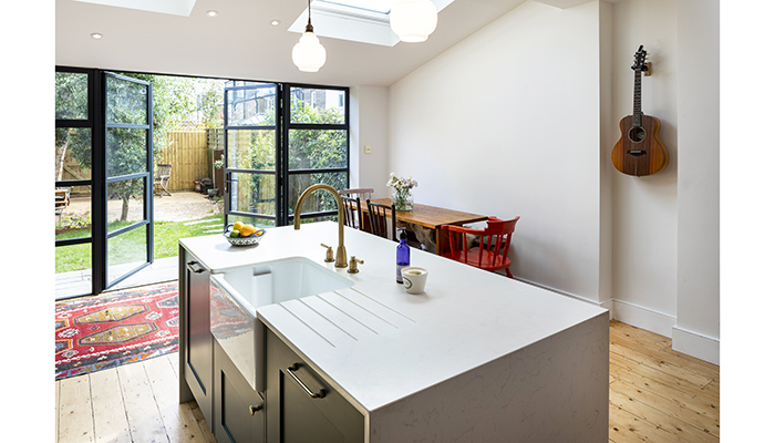
"We minimised wall units and used open shelving to stop the kitchen from being too overpowering in the space," adds Shehryar. "We introduced wood to create warmth and make the space feel cosy and a book shelf in the back of the island, giving the client the freedom to personalise their kitchen. The tall units were stacked towards the back of the room to maximise the sense of space as you walk into the main area."
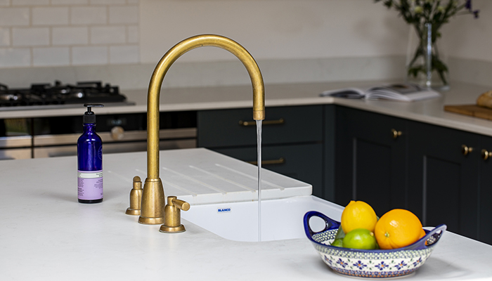
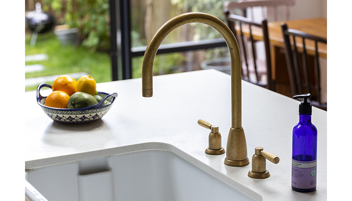
So what is his favourite part of the finished project? "I think it would be the island as to me it is picture perfect. The Villeroy & Boch butler sink along with the Perrin & Rowe handmade tap work in harmony to help create a stunning focal point. I also love the dropdown worktop features at either end," he adds.
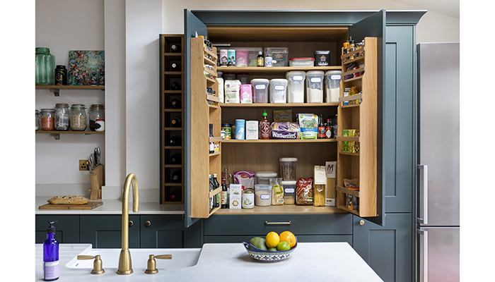
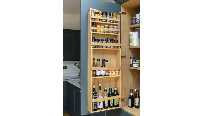
"The client's favourite part of their new kitchen is the pantry," he reveals. "Apart from looking pretty impressive as it's an attractive piece of furniture, it's also an extremely practical storage solution, giving them ultimate capacity without having to fill their kitchen full of wall cupboards. It also allows them to see exactly what they have at a glance."
So what would his advice be to another designer who was starting out on a similar project? "I would say focus on symmetry, and don't be scared to choose bold colours," he says. "But above all, listen. Listen to your client's brief – and come up with more than one design."
Tags: kitchens, features, sheraton interiors, shehryar khan, second nature, pws, silestone, perrin & rowe, villeroy & boch


