Valentina Bertazzoni: How to use colour in kitchen showroom displays

Valentina Bertazzoni: How to use colour in kitchen showroom displays
Valentina Bertazzoni, director of style and communications at Italian appliance brand Bertazzoni, highlights several ways retailers can take advantage of the latest kitchen design trend to add a splash of colour to their showrooms.
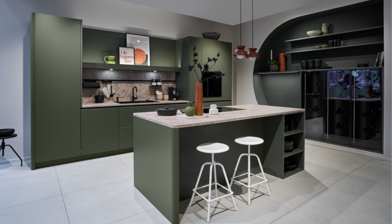
"As the heart of the home, the kitchen is the best place to start when it comes to interior design – and homeowners are increasingly injecting vibrancy into their homes with striking options and looking beyond ‘traditional’ colour schemes.
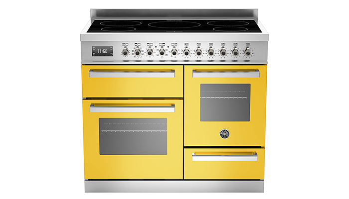
"Using a bright and bold range cooker as a focal point is the perfect way to implement colour, not only at home in a kitchen environment, but also in a showroom as it is likely to grab the attention of passers-by and provide a real talking point for customers visiting the store.
"Thanks to its grandeur, aesthetics and position in the room, a range cooker will always take centre stage in a kitchen and this impact is enhanced further when a bold colour choice is made. Allowing a consumer to visualise this first-hand from a display is going to be very powerful and have much more influence than just showing them a brochure.
"Colour trend forecaster, Pantone – another brand that is looking towards a brighter future – named two independent hues as their Colour of the Year for 2021 – yellow shade Illuminating teamed with Ultimate Gray – in the hopes of inspiring more promising times ahead. Yellow in unison with its other nomination, a muted grey, represents a practical and solid foundation with a warming optimism, to highlight the strength and positivity the world will maintain in the year ahead.
"Yellow is the perfect shade to associate with the promise of 2021, and it has already become a prominent element in design across a variety of industries this year, especially within homeware – it can even be seen the appliances of our very own Professional Series. Available in seven striking colours, Bertazzoni’s Professional Series range cookers include eye-catching hues of red, orange, dark red and yellow. Contrasting against a white kitchen, it can add plenty of wow factor, especially when accessories are matched.
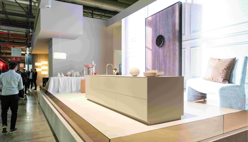
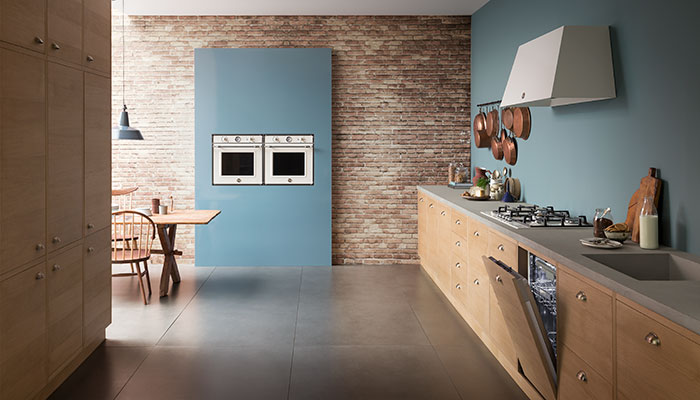
"While vivid colours are eye-catching, luminous metallics can also be used as a focal point in a room or simply as an accent to the rest of the décor. There are a number of ways metallics can be incorporated in the kitchen, from cabinetry and worktops, through to brassware, tiles and even the kitchen sink!
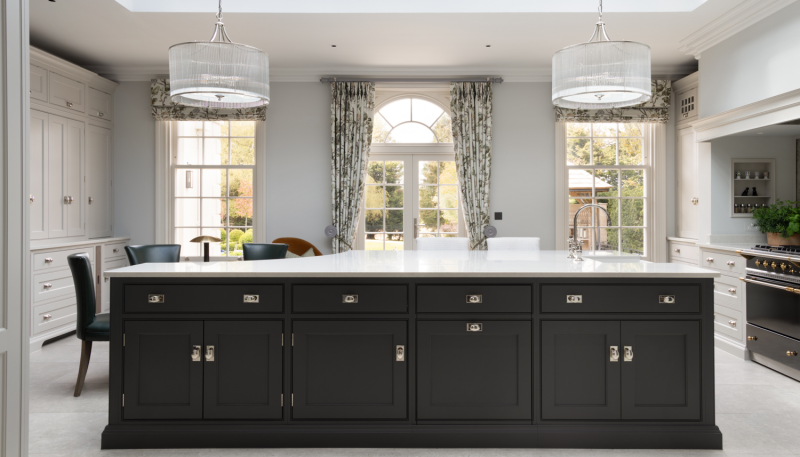
"When we think of colours, we think of brighter shades – and while this is a great option for some, others may want to opt for a darker kitchen. In fact, according to Pinterest, ‘black kitchens’ searches are at an all-time high. As such, retailers may want to consider creating a kitchen that uses dark-hued statement models to add a ‘hero’ element and visual weight to the kitchen, or even create a grey, black and jewel-tone palette to promote a colour scheme further.
"Metallic finishes and accents have been utilised in new built-in models from the Bertazzoni Modern Series. Several of the ovens are hand finished in either copper or zinc. They can also be featured alongside same-brand microwave and steam ovens when baking – all in the same striking metallic finishes.
"With colour becoming a widespread trend this year, it’s important that retailers optimise its current popularity in order to appeal to more consumers, which can be achieved via a variety of methods. We don’t envisage the market for colourful kitchens changing any time soon. White and other neutral tones will always have their place, however colourful accents and visual contrasts remain well suited to a whole range of house types and décor styles, ensuring their continued appeal to UK consumers."
Tags: insight, features, valentina bertazzoni, bertazzoni, colourful kitchens, appliances, pantone, kitchens


