How Simply Bathrooms created a space that's packed with personality
How Simply Bathrooms created a space that's packed with personality
Husband-and-wife team Sophie and Neil Harrold of Surrey-based Simply Bathrooms are specialists in unique and considered bathroom schemes. We talk to Sophie about one of their latest projects, and find out how the pair went about creating a vibrant space that is full of bold patterns and design flourishes.
Q: Can you tell us a bit about the project itself?
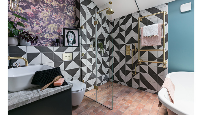
A: Our customers were a fun and vibrant couple living in a unique riverside lodge positioned along the banks of the Thames by Hampton Court Palace. The property was a built in the 1970’s on the plot of old badminton court built for a 1920s mansion block, which backs onto the riverbank. The property has a quirky and characterful vibe, just like it is owners, which we wanted to replicate within the bathroom design. As a result, we created a very transitional bathroom design, which blurs the boundaries between contemporary and traditional to suit this property’s style. This quirky style combination required a carefully thought-out design, which may look thrown together but had the perfect balance of pattern and colour to hang everything together.
Q: What was the brief?
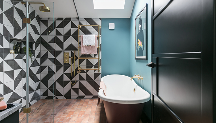
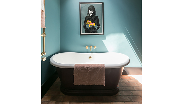
A: The bathroom had not been updated since the property was built. Our customers had inherited a very retro bathroom in much need of refurbishment – due to a problematic leaking shower-bath they had not actually been able to use the bathroom properly for a long time. The main brief was to have a large spacious shower area. Due to the size of the room, our customer had been told they would not be able to fit a large shower and a freestanding bath. However, we suggested using a bi-fold shower screen and tiled shower wetroom to allow the floorspace to fit in a beautiful BC Designs freestanding roll-top bath as well.
Q: What was your inspiration for the interior design and why did you choose the unusual pairing of tiles?
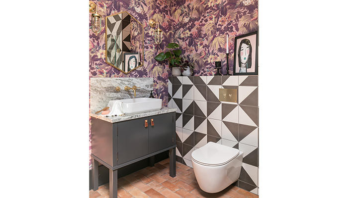
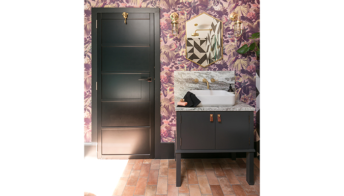
A: We wanted this space to feel like a liveable piece of art. Something that would spark joy, and really encompass our customer’s style. We chose the unlikely pairing of these two tiles because we loved the perennially popular café Parisian print in the bold monochromatic colours, knowing this would work well set against the incredible House of Hackney Pink Limerence wallpaper. We wanted to bring out the warmer colours in the paper but wanted something more earthy, with a slight industrial feel for the floor, in order to balance out the more decorative walls. Real terracotta wasn’t an option as it was too porous for wetroom floor usage, so the new National Trust porcelain terracotta was a perfect and practical choice.
Q: How did you go about choosing the other products in the room?
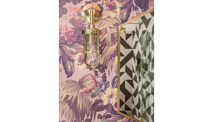
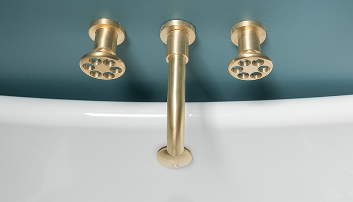
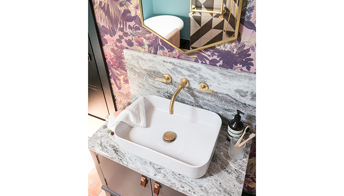
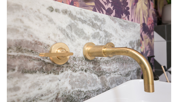
A: We love a feature wallpaper and especially favour House of Hackney prints, they add real depth of colour into a space. Their maximalist style is perfect for a bathroom when there are so many design elements to balance. They were the perfect choice for this couple’s design. Alongside the more decorative elements of the bathroom, we layered in some industrial touches which our customer loved; adding in Studio Ore’s brushed brass fittings (with a mixture lever and steam wheel handles), an incredible Bard & Brazier Lafayette towel rail, Bathroom Origins beautiful Docklands hexagonal mirror and Mullan’s Lena lights. We love how the bright brass accent really pops against some of the darker colours within the room.
The vanity unit is a standout piece for us. We designed this in-house to suite the customer’s taste and bathroom design perfectly. Our carpenter made the unit, we had this lacquered in Farrow & Ball’s Off Black, and we used a local marble yard, selecting a unique piece of marble for the worktop. This was templated on site to ensure the worktop and splashback were book matched exactly. This really is a one-off piece of furniture that will stand the test of time within this incredibly unique bathroom.
Q: What is your advice for other people starting out on a similar project?
A: We adore Ca' Pietra tiles for our projects. They are our ‘go to’ for bold or interesting patterned tiles. No-one does colour quite like them! Ca' Pietra’s ranges are a great ‘go to’ for affordable but unique style as they have such a huge range. My other advice is not to be afraid of mixing interior styles to tailor the design exactly to a customer’s taste – not everything has to be super contemporary, fiercely industrial, strictly glam – or very traditional!
Q: What are your favourite parts of the finished design?
A: Tiles are one of the most important factors when designing a bathroom – people’s homes are not just functional spaces, they are their sanctuaries, their workspaces, where they love and how they live. The wall and floor tiles are the backdrop to any great bathroom design, and they give the customer the opportunity to be bold and reflect their style and values. It takes a lot of courage to invest in an interesting maximalist interior concept within a bathroom, but we think it’s really important to encourage clients not follow all the mainstream trends but go for something really unique and personal to them. So they’ll love it for a long time to come!
Tags: bathrooms, features, simply bathrooms, sophie harrold, neil harrold, ca pietra, bc designs, house of hackney, studio ore, bard & brazier, bathroom origins, mullan, farrow & ball


