How The Myers Touch designed a contemporary kitchen for a stately home
How The Myers Touch designed a contemporary kitchen for a stately home
When Keith Myers started work on a Grade I listed property in Hampshire he was surprised by how low the ceilings in the kitchen were – until a chance discovery led him to rethink his plans. Here he tells us how he created a supremely elegant space with lofty proportions. Photographs by Paul Craig.
Q: Who was the project for and what type of building was it in?
A: The Myers Touch designed this luxury kitchen for a couple who live in a Grade I listed stately home in Hampshire with their three children. It’s an elegant property, which was designed by English Baroque architect, Thomas Archer in 1715, and is now owned by the couple with their busy family and social life. They wanted a modern, contemporary family kitchen space that also remained sympathetic to the architect’s contemporary, Italian-influenced features.
Q: What was the brief from the clients? Were there any standout elements on their wish list?
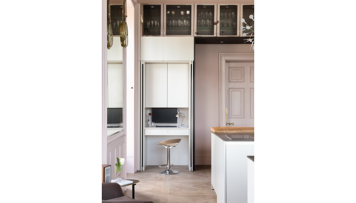
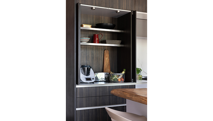
A: At my first meeting, I had many features to consider, not least because the ceiling in the space was lower than expected, but the design needed to preserve the stature of the property’s heritage and enhance its period features with a blend of modern cabinetry, worktops, appliances, materials and finishes. The client also wanted their old AGA to be included (which they converted to electric for the refit), a dedicated work-space area that could be concealed when not in use, and an easy-to-reach place for a Thermomix appliance that they often used, as well as additional furniture pieces to complete the space.
Q: What are the key things to bear in mind when designing a contemporary kitchen in a period building?
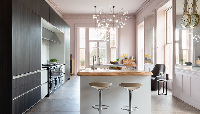
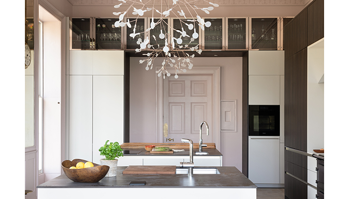
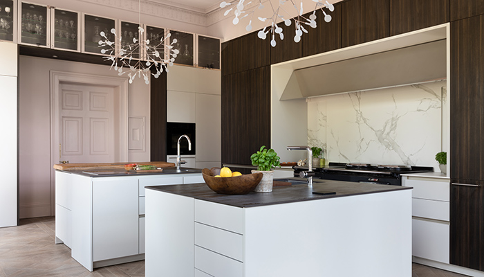
A: I suggested removing the suspended ceiling that had been installed in the 1970s and that revealed a magnificent four-metre-high ceiling! I then set the kitchen height to lead from the top of the window architrave, sweeping over the hallway door to create an entrance niche with large banks of storage on the opposite side. Of course, I also had to consider what internal restrictions and materials could be used considering the property was listed, so I worked with the owners to ensure we met building regulations for internal alternations.
Q: What was the thinking behind the choice of cabinetry?
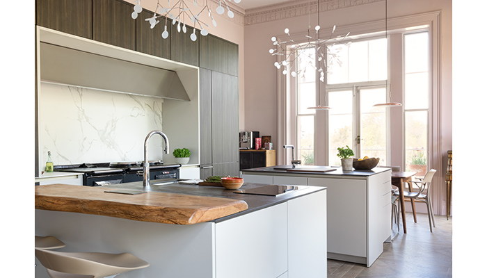
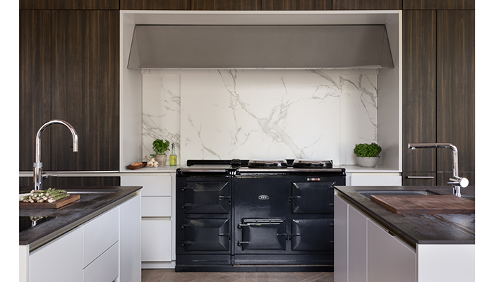
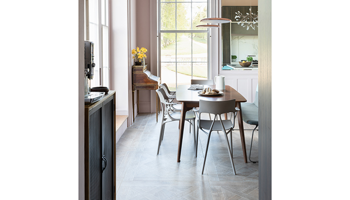
A: I mapped out three core zones – preparation, cooking, and dining, with the inclusion of storage space as the family often entertained. In particular, the preparation zone was designed to be divided into two islands to create symmetry in front of the elegant Pewter AGA that was placed to be in an area of visual focus. At the rear of the AGA section, I also designed a hidden cupboard for books and brooms.
The double islands consist of two individual zones – the first island was created for the family to sit at a breakfast bar for breakfast, coffee and snacks, and the second island was designed to position a family dining table next to it for casual dining. There was also a hidden desk space behind pocket doors that I created for homeworking/home admin purposes and a breakfast cupboard where we also stored the homeowner’s Thermomix for use at breakfast and throughout the day.
Q: What products and materials did you choose – did you choose anything different or unusual?
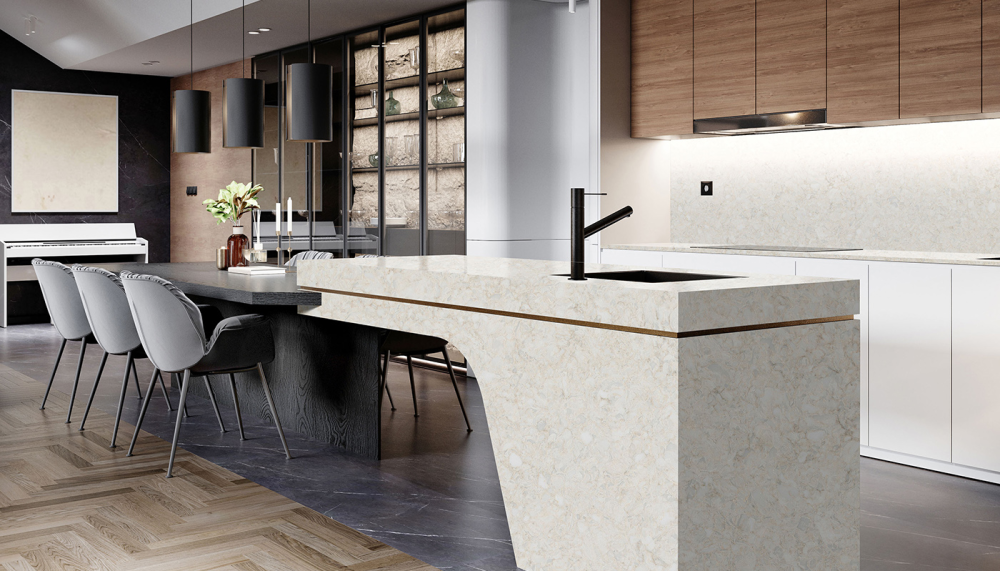
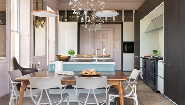
A: Dekton Aura marble worktops were chosen to frame the AGA and act as a splashback, with contrasting Dekton Trillium worktops on the island units that provide a connection with the room’s dark and Herringbone wood-effect floor. Handleless, SieMatic S2K cabinetry Sterling Grey & Terra Larrix laminate were chosen for the wall cabinetry that I matched with Nickel gloss high-level cabinets to add luxury and contrast. The pale pink Edward Bulmer paint tone on the kitchen walls provides a soft, welcoming feel to the family space.
Q: Did you encounter any challenges during the design and installation?
A: After removing the suspended ceiling, the walls were obviously very high, so I had to consider the wall cabinetry height carefully. I also wanted to ensure that beautiful cornicing was displayed as a feature, so I was limited to the type of cabinetry I could use. The solution was high-level cabinets with a tier of luxury glass displays with copper frames on the rear wall that also provides a beautiful frame above the entrance door.
Q: If you had to pinpoint one thing about this design that makes it an overall success, what would it be?
A: I think it’s a design that successfully blends some traditional elements with a contemporary edge that blend in with iconic and mid-century furniture items and the different materials and colour tones. Our in-house Myers Touch interior design team provided additional scheme consultancy to source some Mid-Century style furniture pieces that really complement some of the family’s heirloom pieces and furniture the family wanted to include in the space. Key pieces we sourced included a contemporary Leolux Didore Bench Seat which was positioned at one side of the dining table and a modern Leolux Cantate Swivel Leather Armchair that sits by the window.
Q: What do the homeowners like best about their new kitchen?
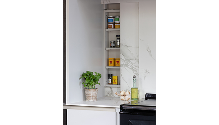
A: The family love to cook and enjoy being together in one socialise space, so the scheme has allowed them to spend much more time together, whilst also being able to prepare food and eat at the islands or simply enjoy the sun coming into the room whilst relaxing on the luxury Leather swivel armchair! One small feature they particularly liked is the sliding splashback in front of the AGA which when slid open reveals a hidden spice rack.
Tags: kitchens, features, the myers touch, keith myers, contemporary