How Martin Moore designed an elegant, beautifully equipped home office
How Martin Moore designed an elegant, beautifully equipped home office
William Rudgard, designer at Martin Moore, reveals how he created the perfect home office space that incorporates all the solutions necessary to enable his client to work comfortably and effectively from home.
Q: What type of property was it in and who was the project for?
A: The property was built between 2005 and 2006 and was of a mock Tudor styling. As the practice of working from home is on the rise, so is the demand for home offices. The owners of this home required a stylish yet practical office space, as they were to be spending more time working from home. I had previously designed a bespoke kitchen for them, and so they entrusted me with designing their office.
Q: What was the brief from the client for this project?
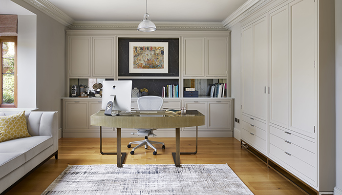
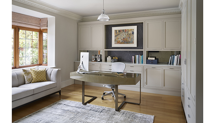
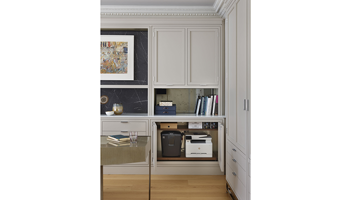
A: The client, appreciating a modern aesthetic, requested our new Deco Umbra collection for their office. Prior to the renovation, the room had freestanding furniture elements, and the space was not utilised efficiently. The client required space designed specifically for box file storage, a safe, a printer, and a shredder, as well as having one permanent desk with a secondary desk area. Ultimately, they wanted to achieve a sleek and functional office space.
Q: How did you go about meeting the brief?
A: As Martin Moore office designs are entirely bespoke, I can create a space perfectly suited to the client’s needs. By carefully listening to their requirements, I was able to solve the storage and functionality issues in the room by designing a space that was far more practical than the former layout, whilst also creating balance and symmetry for a pleasant working environment.
Q: What type of cabinetry did you choose and what made it the perfect choice?
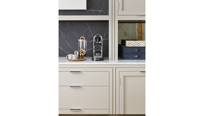
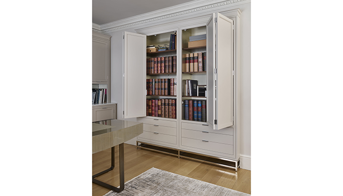
A: The Deco Umbra collection cabinetry provided ample storage for organising office equipment and keeping it out of sight to maintain a streamlined and pared-back aesthetic.
Q: How does designing a home office differ from other projects you work on?
A: As we largely work on designing kitchens, the lack of appliances on this project meant we had greater freedom with the layout of our cabinetry and other furniture. It was a matter of simply creating a functional yet beautiful space from scratch.
Q: What were the particular challenges that you faced and what were your solutions to overcome them?
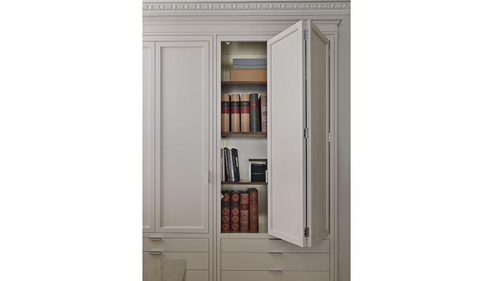
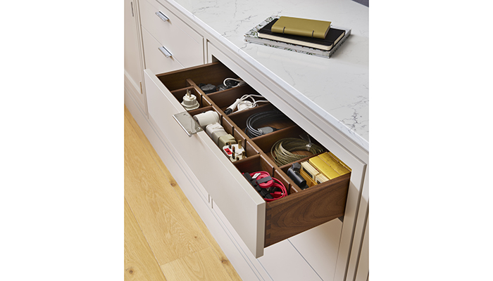
A: The challenge was to make the office as practical as possible; the client wanted to access everything they needed day-to-day without having to leave the desk area. Before the re-design, the middle of the room was completely void of furniture, so the client found a freestanding desk that took the original wall-facing desk out into the middle of the room to create a marvellous focal point whilst enhancing the symmetry of the space. Therefore, I designed the cabinetry behind the desk to contain all essential equipment and resources.
Q: Are there any design elements that you’re particularly proud of?
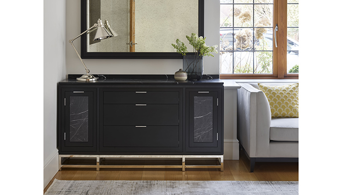
The different materials used in the room produced a compelling space: the neutral cabinetry, ebony-stained hardwood desk, marble laminate panels, and antiqued mirror all worked in harmony. Despite having more furniture in the room than the previous office layout, the space felt larger and complete.
Q: What is the client's favourite part of the finished project?
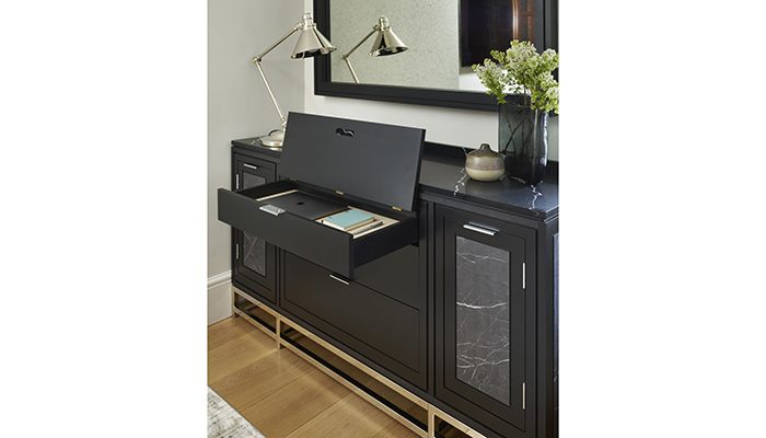
A: The client particularly liked the hidden secondary writing desk in the ebony sideboard. It was a neat solution that created a secondary desk solution when required without taking up space on a permanent basis.
Tags: insight, features, home office design, william rudgard, martin moore, kitchens


