How Sigma 3 designed a contemporary kitchen for a couple of keen cooks
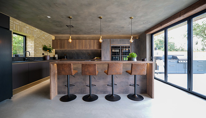
How Sigma 3 designed a contemporary kitchen for a couple of keen cooks
When the team at Sigma 3 in Esher were tasked with creating a showstopping space for clients who love to entertain, they turned to Masterclass Kitchens for cabinetry that is both beautiful to look at and highly practical.
Q: What type of property was it in and who was the project for?
A: Zara and Giuliano undertook a remarkable new build project in Lincolnshire. Inspired by the architectural lines of an 1800s malthouse, the couple’s vision was to create a contemporary masterpiece that drew heavily on traditional design principles. The result is a stunningly modern home with a nod to history, one that you may have caught on a recent episode of Grand Designs.
Q: What was the brief from the client for this project?
A: The couple’s brief was clear from the start – they wanted a showstopping space that would become the heart of their home, perfect for hosting family and friends. Both Zara and Giuliano are passionate cooks, and their kitchen needed to be both an entertainment hub and a highly functional workspace. This dual focus on style and practicality was key to delivering a design that truly reflected their lifestyle.
Q: How did you go about meeting the brief?
A: With the clients having a distinct vision for a dark, atmospheric design, we knew that every element had to complement this theme. But while aesthetics were crucial, practicality couldn’t be compromised.
In our showroom, we worked closely to develop a colour palette that balanced richness and sophistication, while incorporating functional storage solutions that would make daily use a breeze. The couple really appreciated seeing and feeling the cabinet materials firsthand, allowing us to fine-tune the design to meet both their stylistic and practical needs.
Q: What type of cabinetry did you choose and what made it the perfect choice?
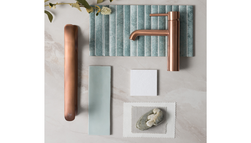
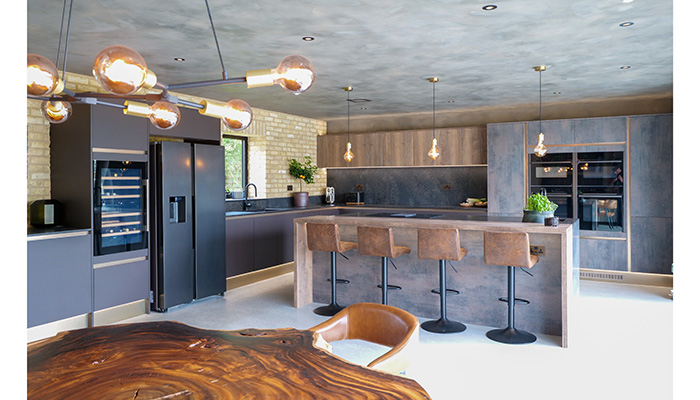
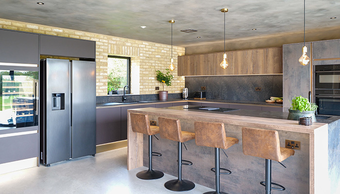
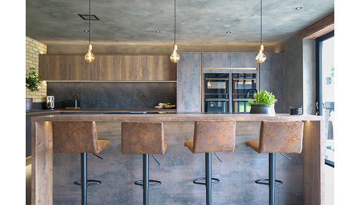
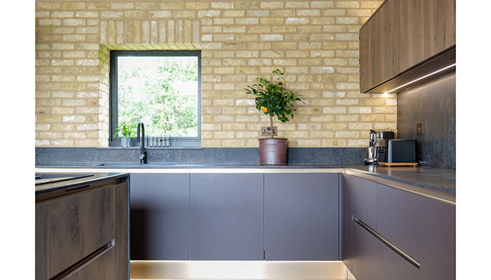
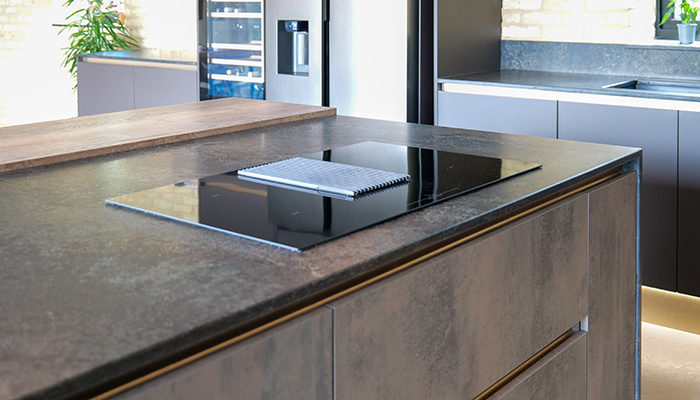
A: For this project, we selected Masterclass Kitchens’ H Line handleless range. It was the ideal choice for its sleek, modern feel, which perfectly suited their dark and moody theme. We chose a sophisticated blend of Sutton Burnt Umber, Madoc Urban Suede, and Ligna Farmhouse Oak, enhanced with Brass handle rails and plinth accents. To tie it all together, Zara and Giuliano opted for Caesarstone’s 5820 Darcrest worktop – a stunning complement to the overall look.
Q: What were the particular challenges that you faced?
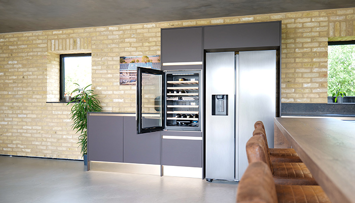
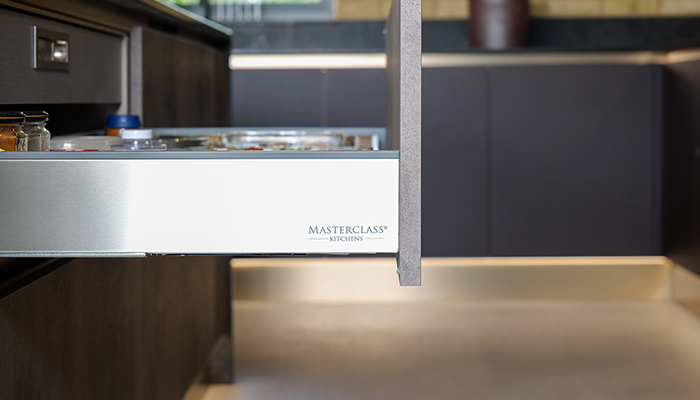
A: One of the biggest challenges was incorporating a walk-in pantry, which was high on their wish list. Unfortunately, the room dimensions wouldn’t allow for this without compromising valuable space. To resolve this, we suggested pull-out larder storage and heavy-duty drawers, which maximised storage capacity without sacrificing floor space. Zara was particularly impressed by how sturdy the drawers were, making them perfect for her collection of heavy stone cookware.
Q: Are there any design elements that you’re particularly proud of?
A: My favourite part of the finished project has to be how seamlessly the design elements work together to create a space that’s as practical as it is stunning. I loved working with Zara and Giuliano as they pushed the boundaries of the norm by blending multiple textures and finishes to create their dream dark and moody look.
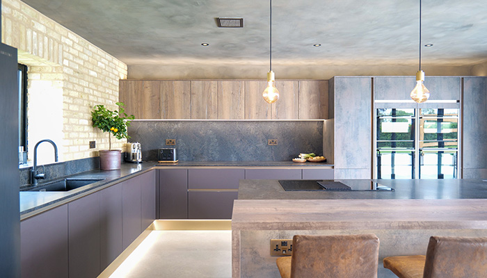
Their kitchen is a true hub for entertaining and daily use, blending functionality with a sleek, handleless aesthetic that complements the rest of the cabinetry. I’m especially proud of the choice to integrate a mix of Sutton Burnt Umber, Madoc Urban Suede, and Ligna Farmhouse Oak, accented by brass details, which elevate the space and make it feel truly unique and tailored to their style.
Q: What is the client's favourite part of the finished project?
A: For Zara and Giuliano, their kitchen island with its integrated breakfast bar stood out as a highlight. They loved how the hob was positioned to face the living space, ensuring they could cook while staying engaged with their guests. The sleek, handleless design was everything they had envisioned, delivering a minimalist yet functional aesthetic. And the ample storage – including pull-out larders and drawers with impressive weight capacities – sealed the deal for them, especially given how perfectly they housed their stone pots and pans.
Tags: kitchens, features, sigma 3, masterclass kitchens


